Client: Kaleidoscope Therapy
Year: 2022
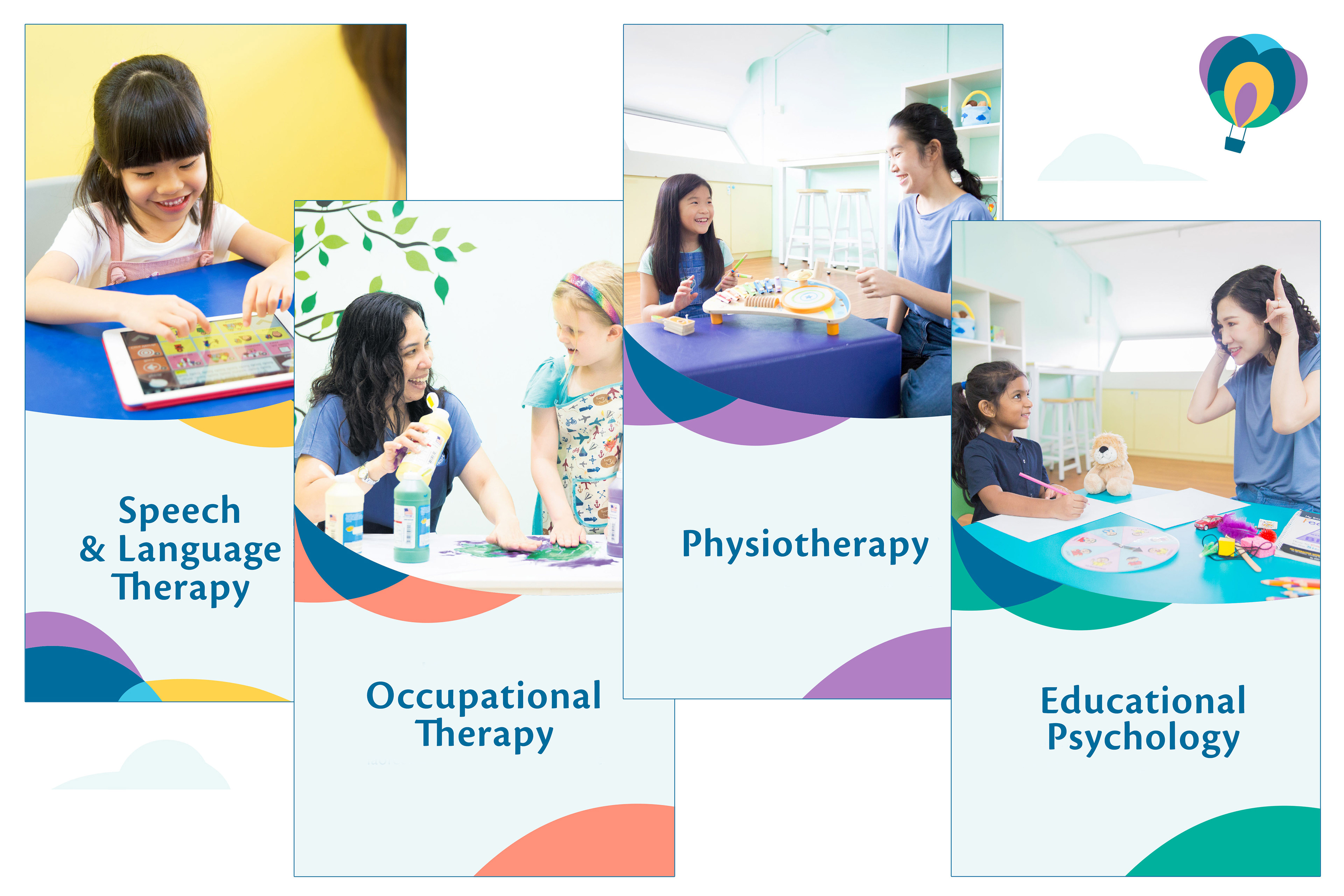
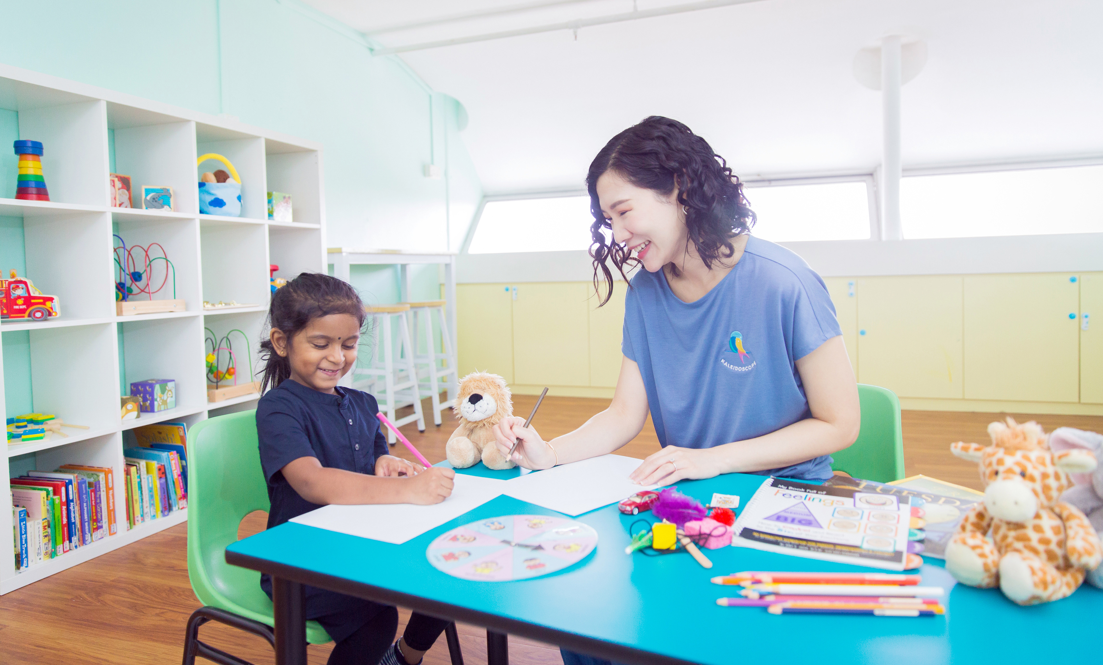
Established since 1999, Kaleidoscope Therapy is one of Singapore’s premium therapy center and also one of the first Early Intervention Programs in Singapore. Kaleidoscope Therapy started off as a Speech Therapist and Occupational Therapist clinic and as a place by therapists, for therapists, because of the lack of resources/awareness during that time, but with the idea of providing multiple services, all under one roof.
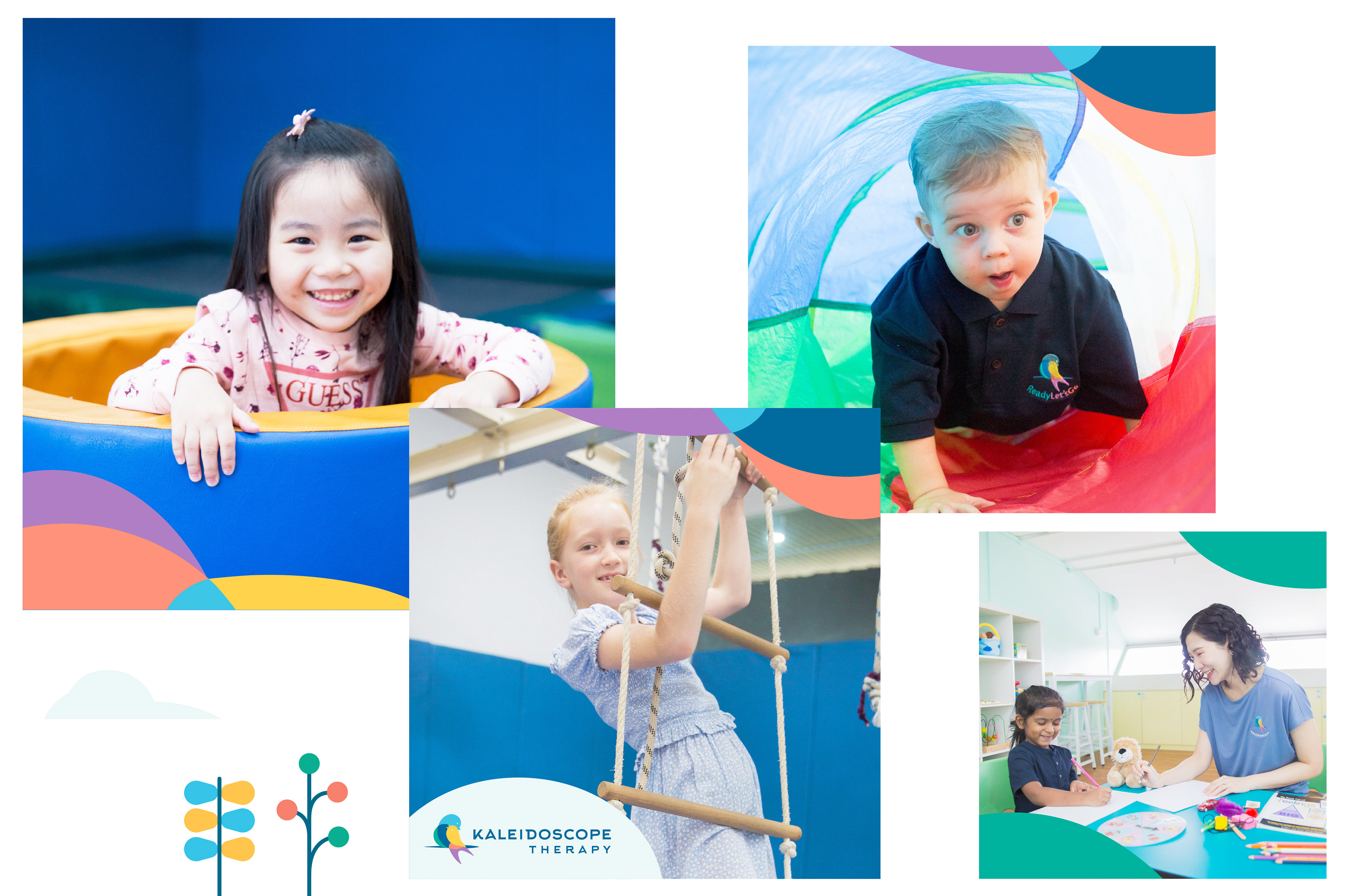
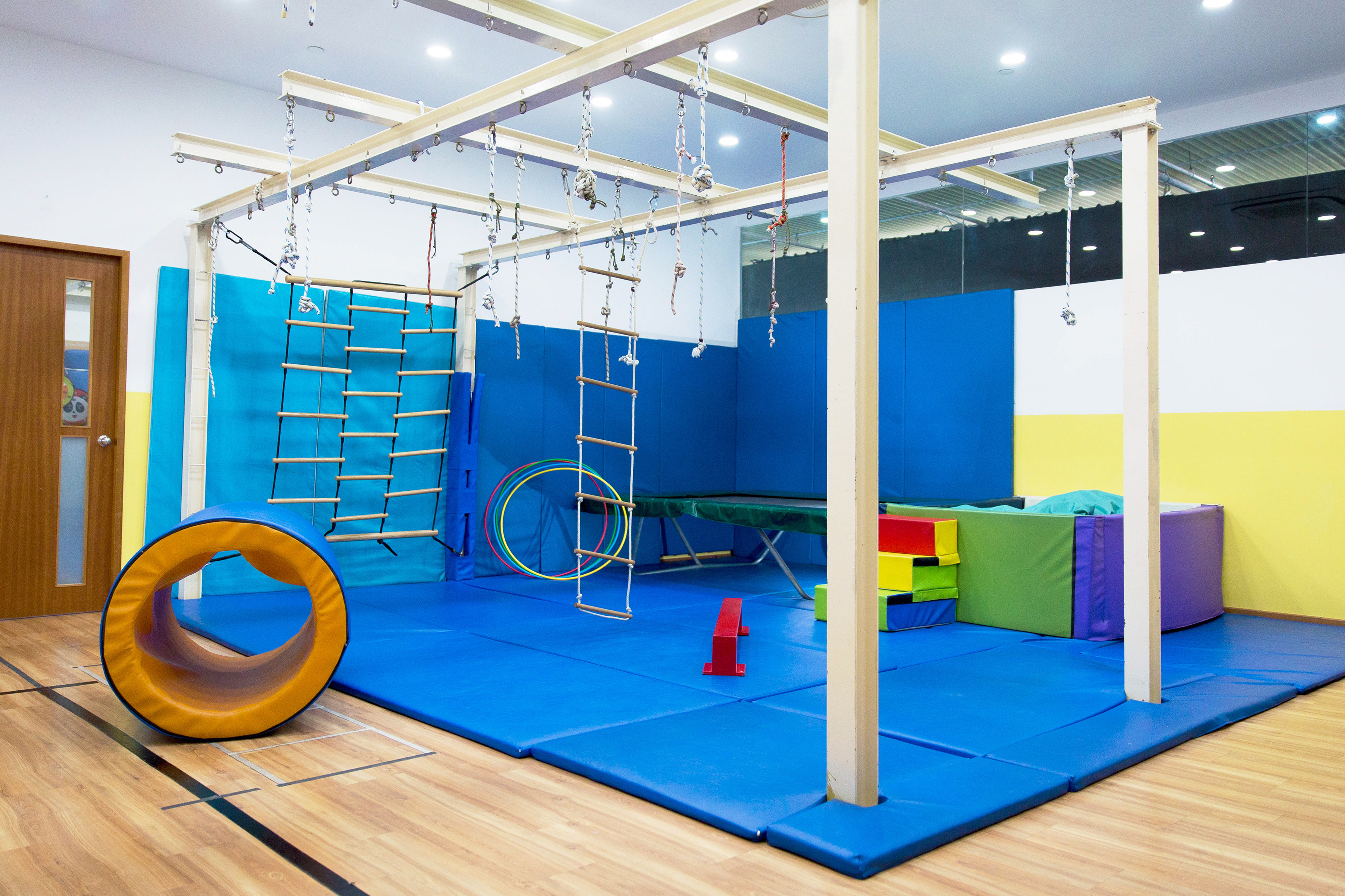
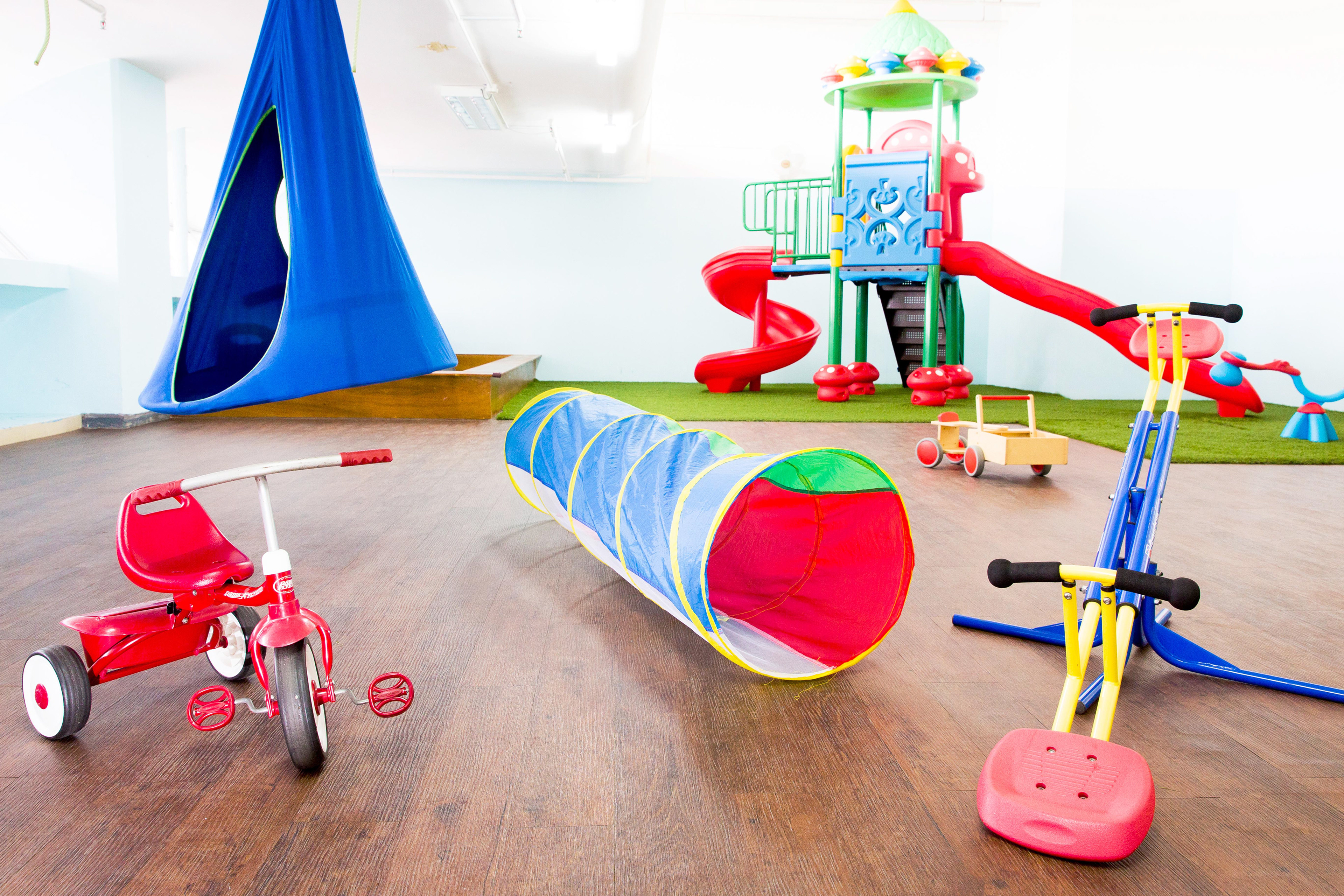
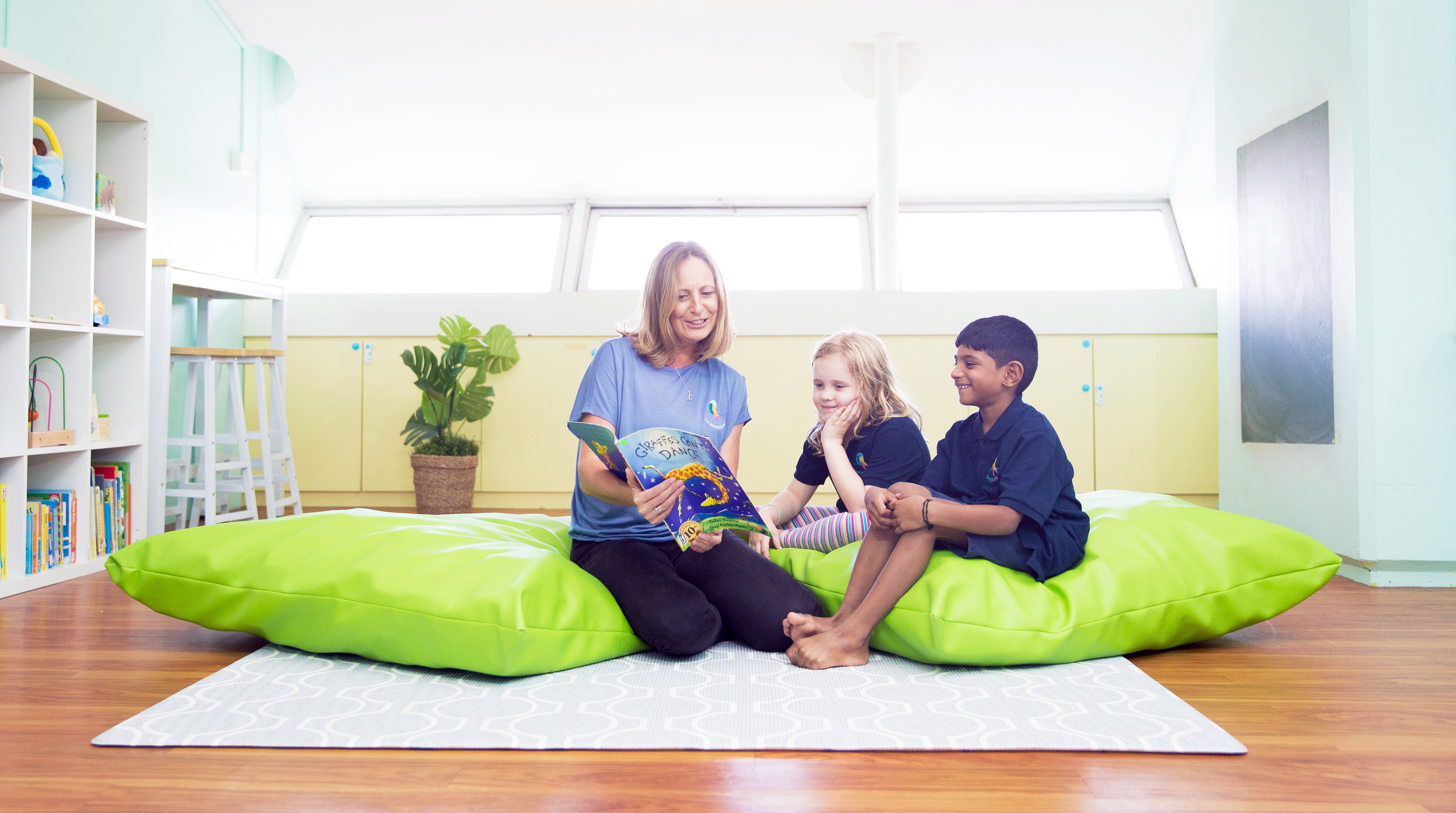
The clinic is family-oriented where they build relationships with families to address their unique needs. The approaches are strength-based, results-based therapies that are engaging and fun, while the space is carefully designed to provide a safe environment for intervention or therapy sessions.
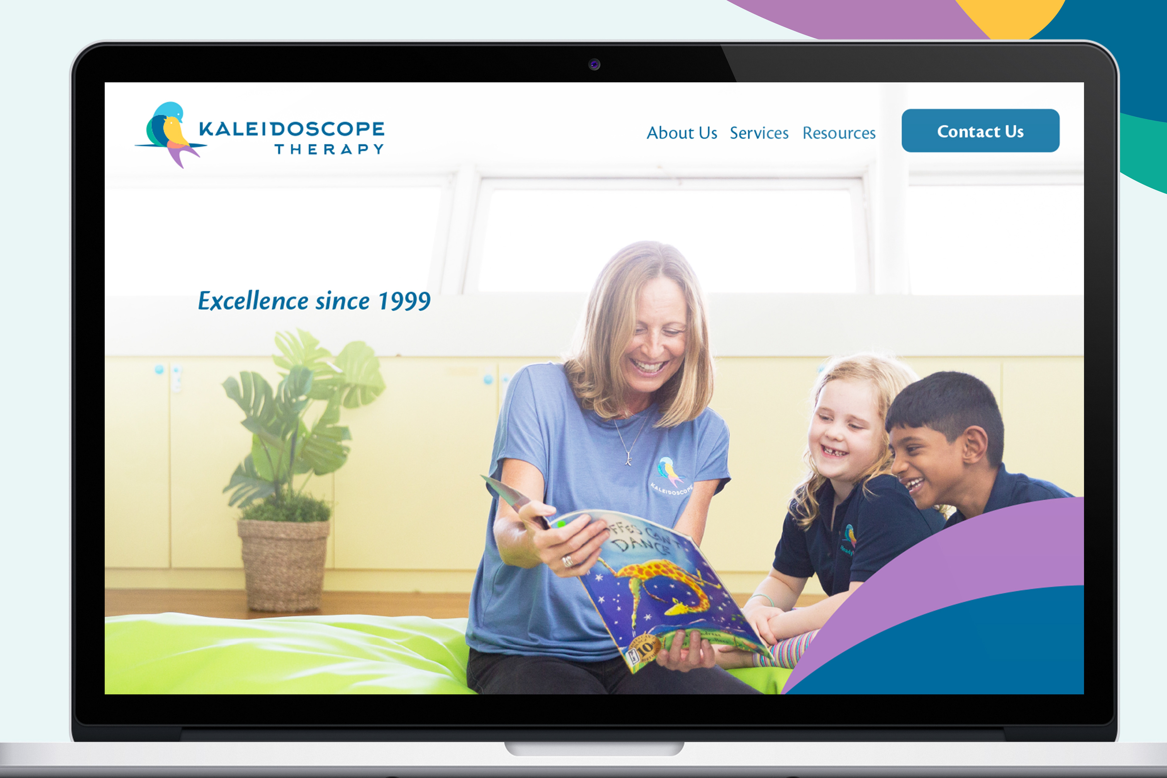
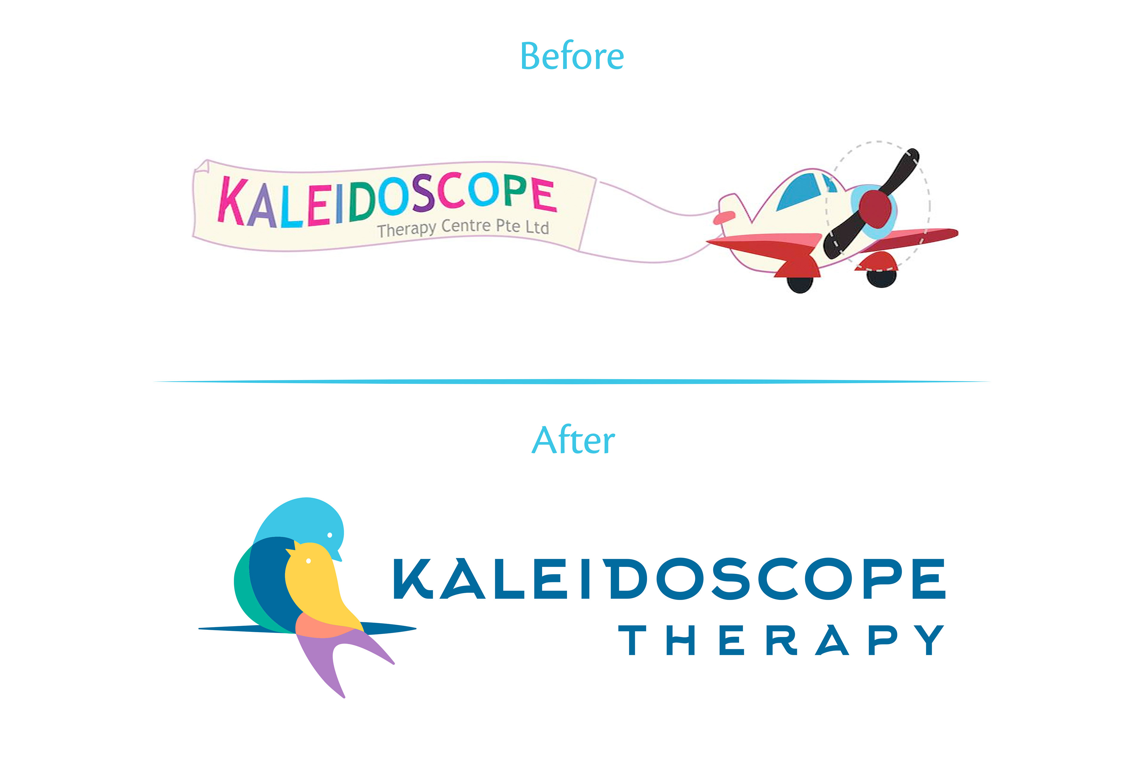
In a highly fragmented and competitive industry, Kaleidoscope Therapy seeks to redefine their position in the market and bring their business to greater heights. We stepped in to provide a fresh new brand identity and positioning for Kaleidoscope Therapy to differentiate from the rest of the competition.
---
Our new brand positioning:
To be an experienced leader in the private therapy field. Fueled by an innate passion to nurture, Kaleidoscope Therapy focuses on the individual strengths to deliver a wide range of therapy for your child.
---
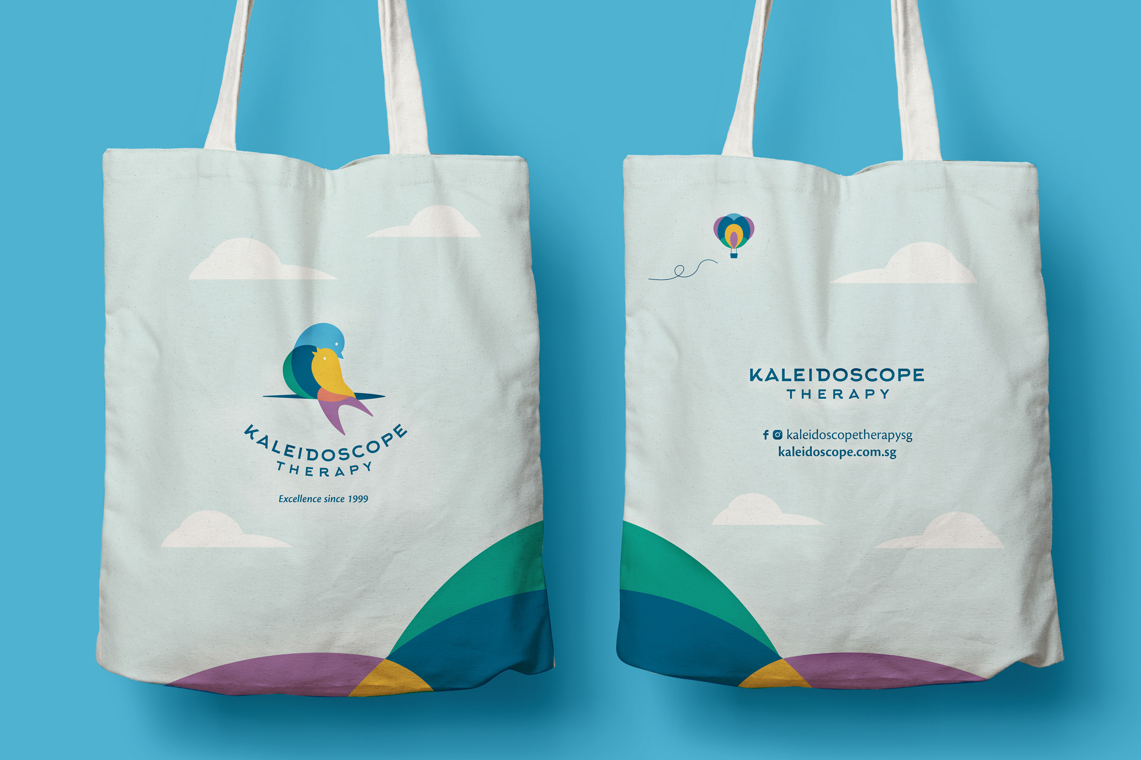
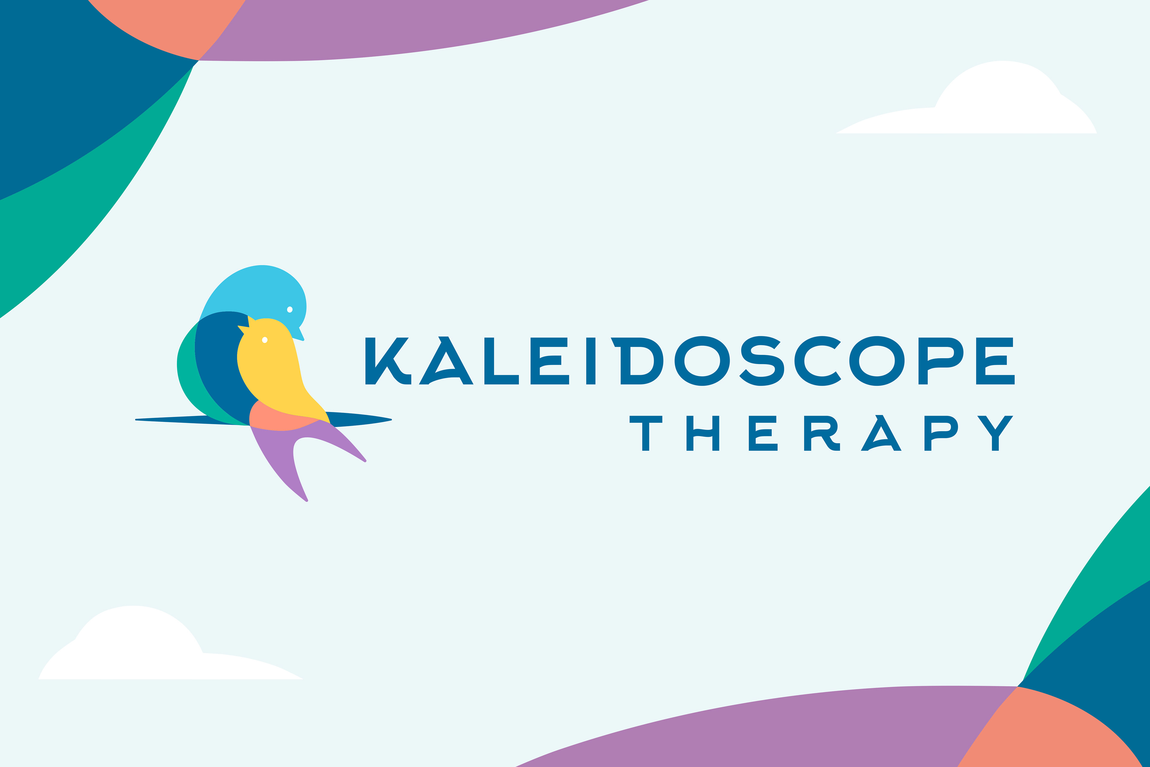
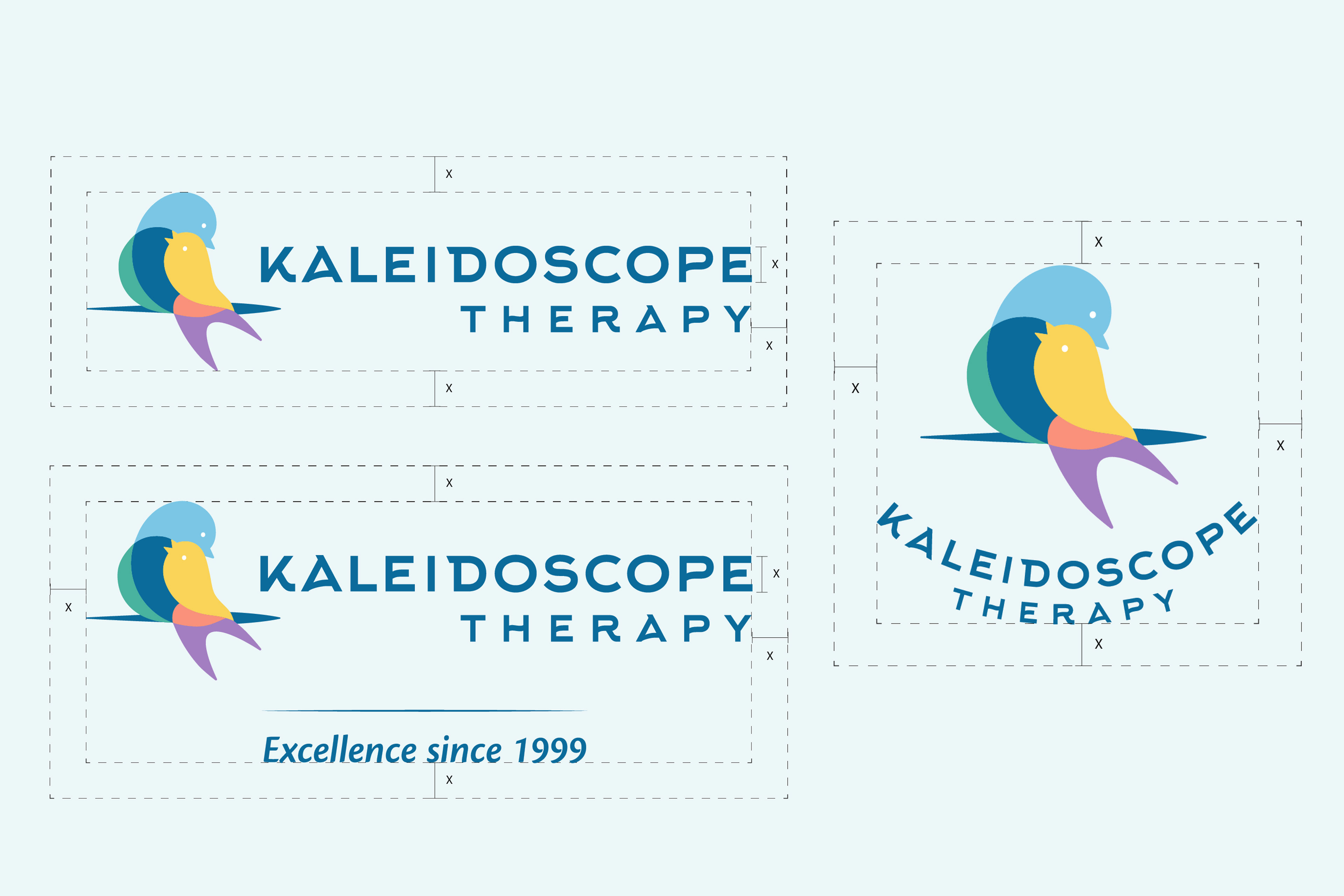
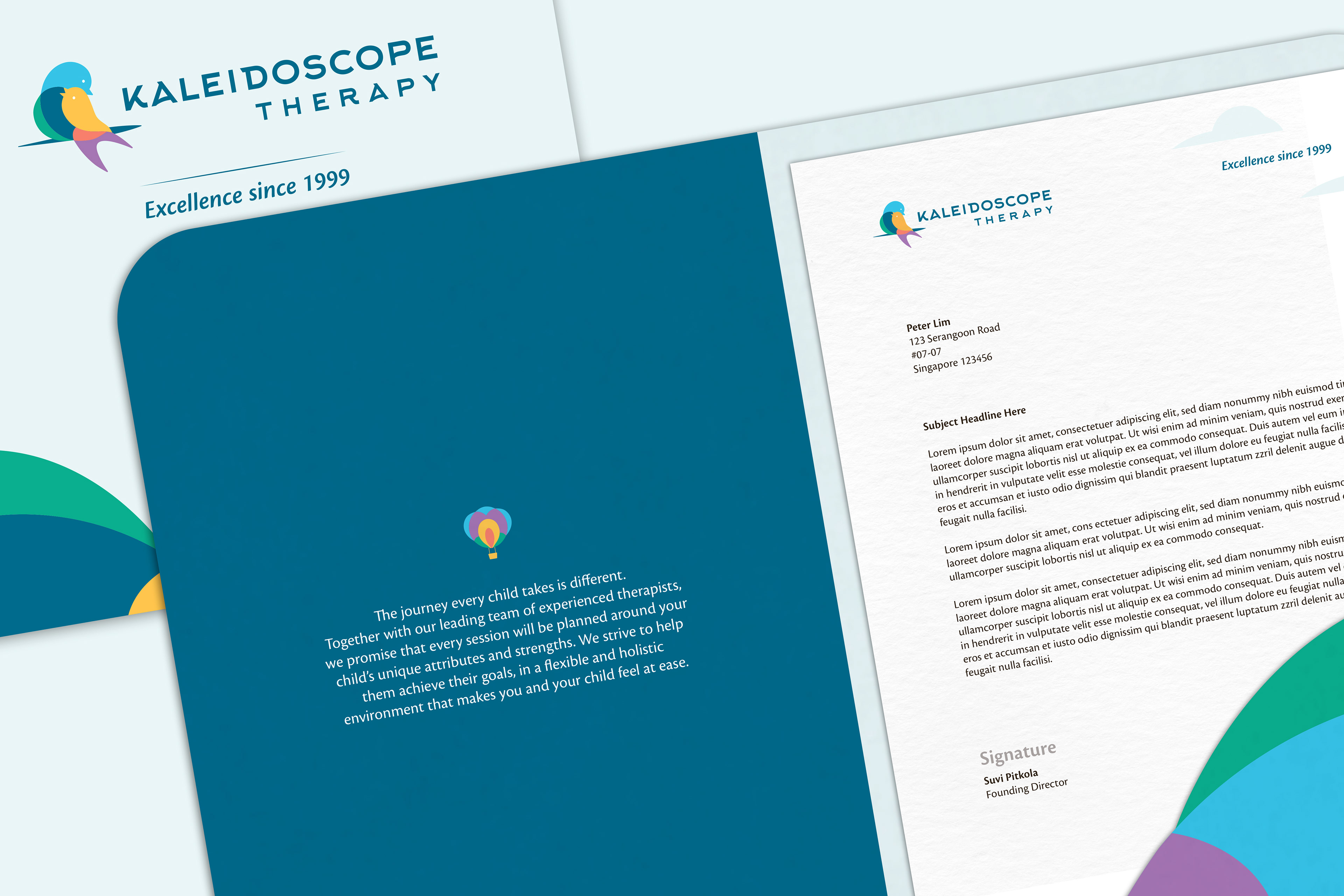
Our design concept revolves around the idea of a Safe Haven, where we adopt the idea of having a spirit animal to represent Kaleidoscope as a brand personality, and at the same time be a totem animal for the children as a form of guidance. The swallow, being graceful and family-oriented makes a good representation of Kaleidoscope — the warm and loving “home away from home”. The swallow also signifies protection and trust, which would be a symbol of assurance to parents that their children would be in good hands. Kaleidoscope’s unique strengths-based approach, which aligns with the character of the goal-oriented swallow, embodies the spirit of how the therapist, the child and the parent can work together to bring the child to the next level.
The swallow brings the children on this fruitful journey with heart and joy, as it carries on with its life-long learning while constantly seeking to evolve and improve. Kaleidoscope Therapy is a child’s safe haven until it is time to return home.
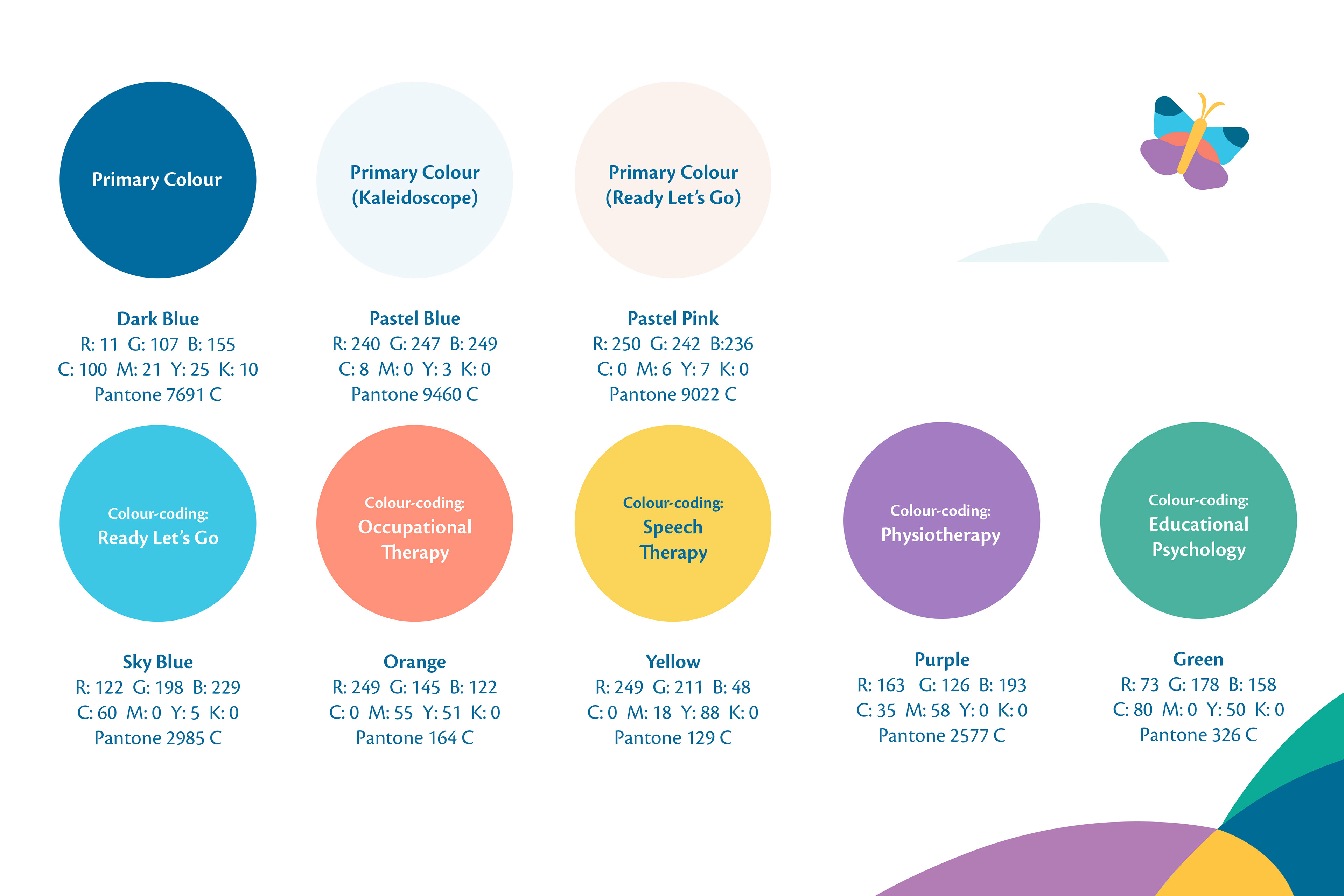
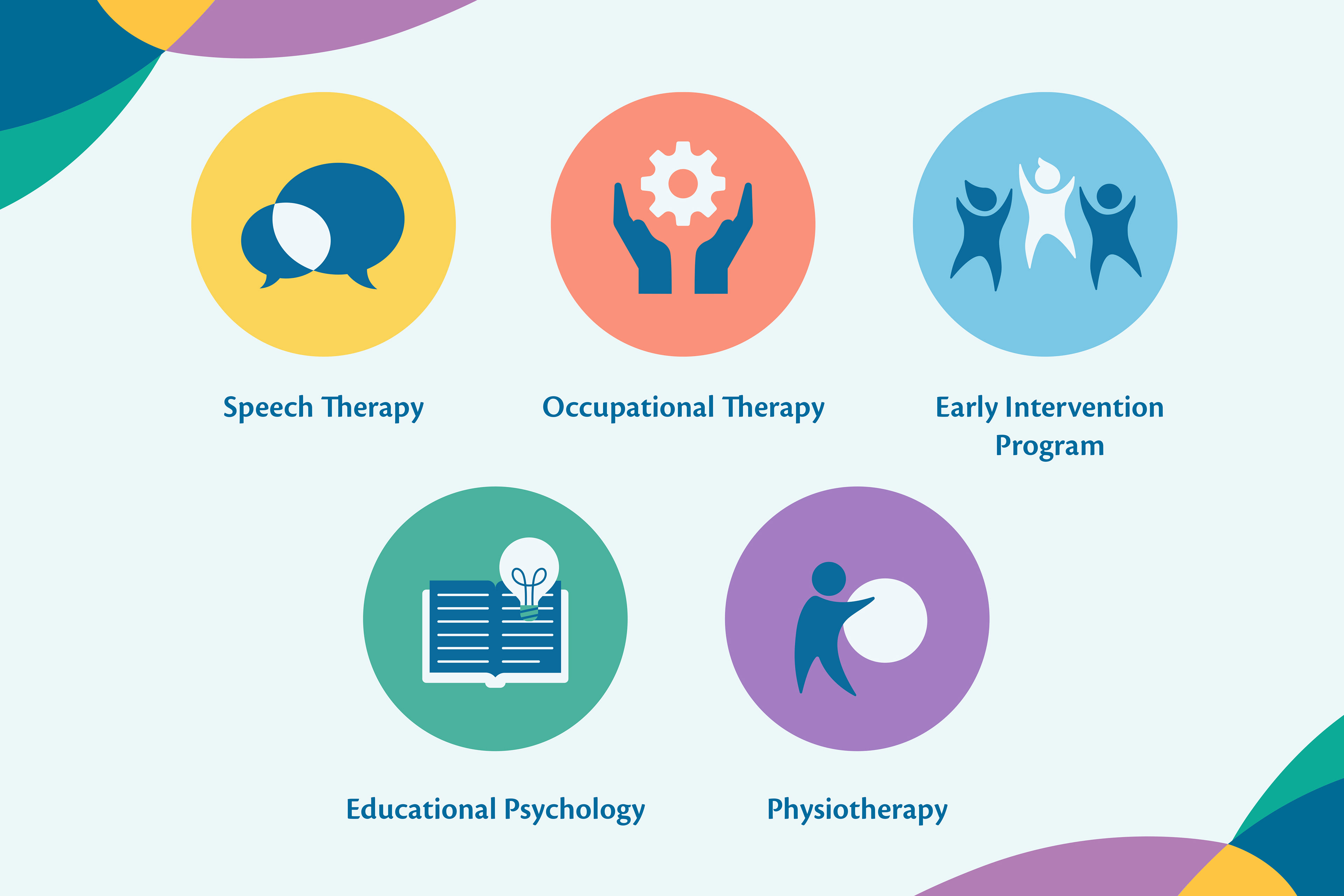
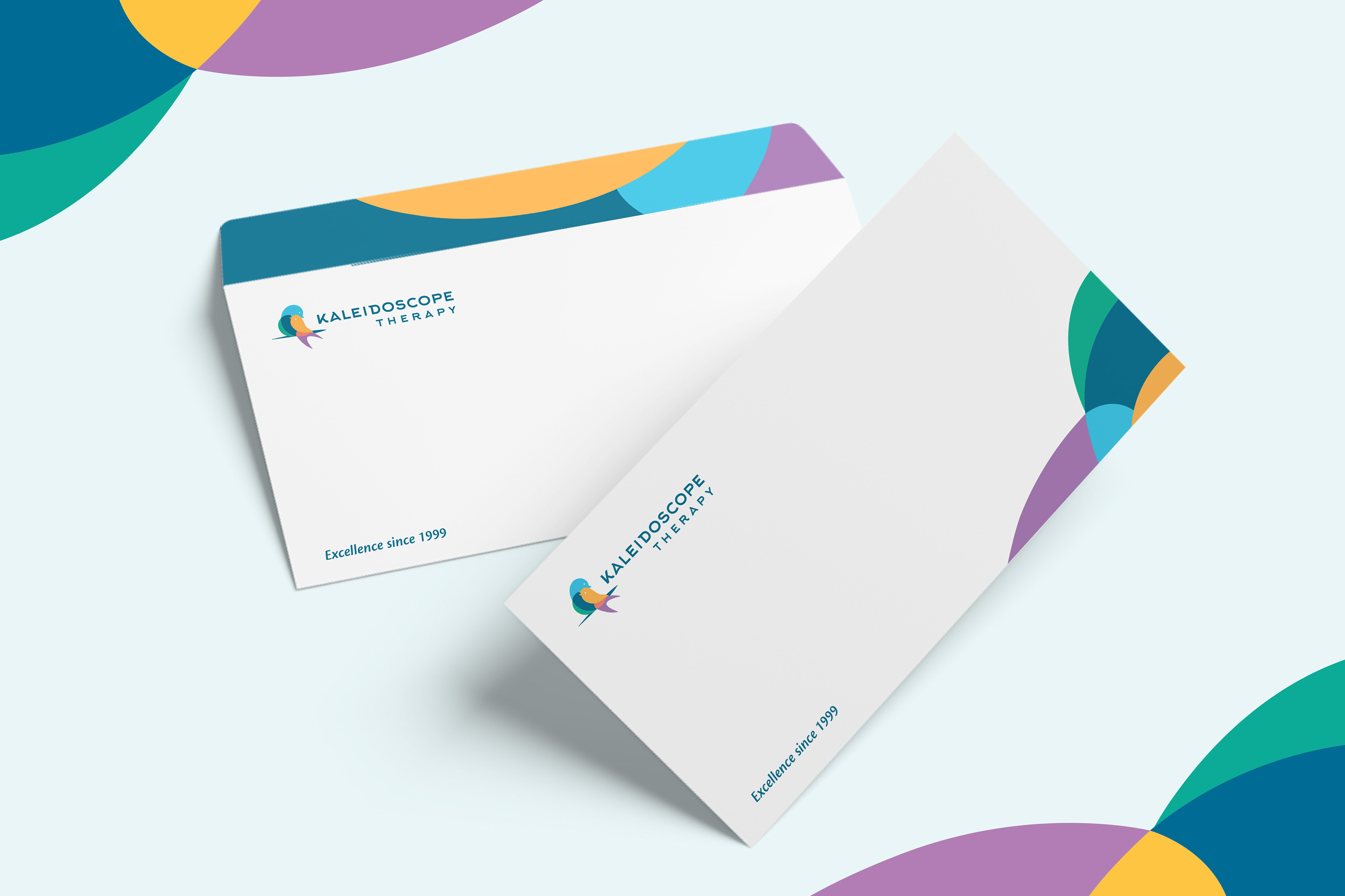
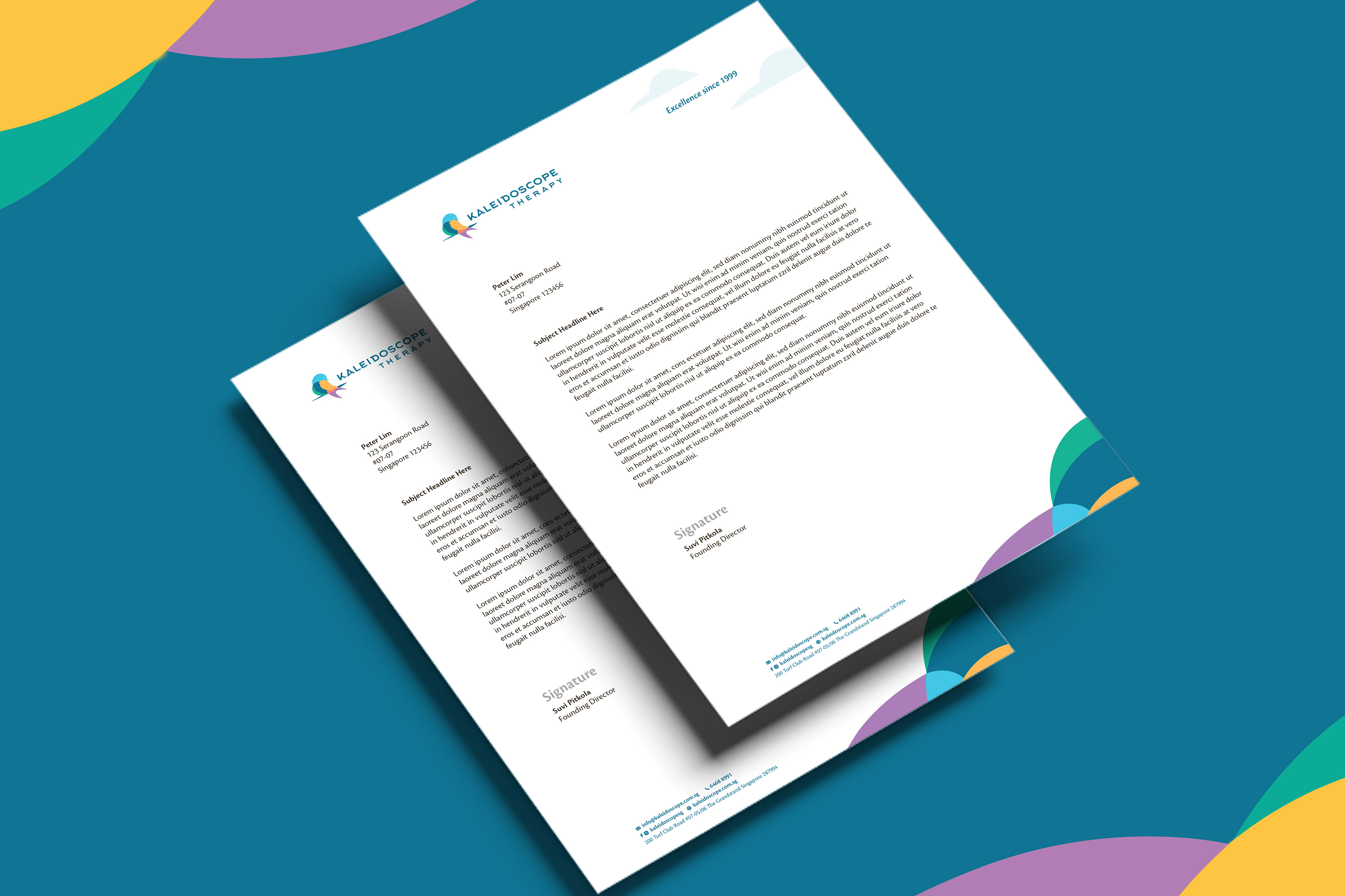
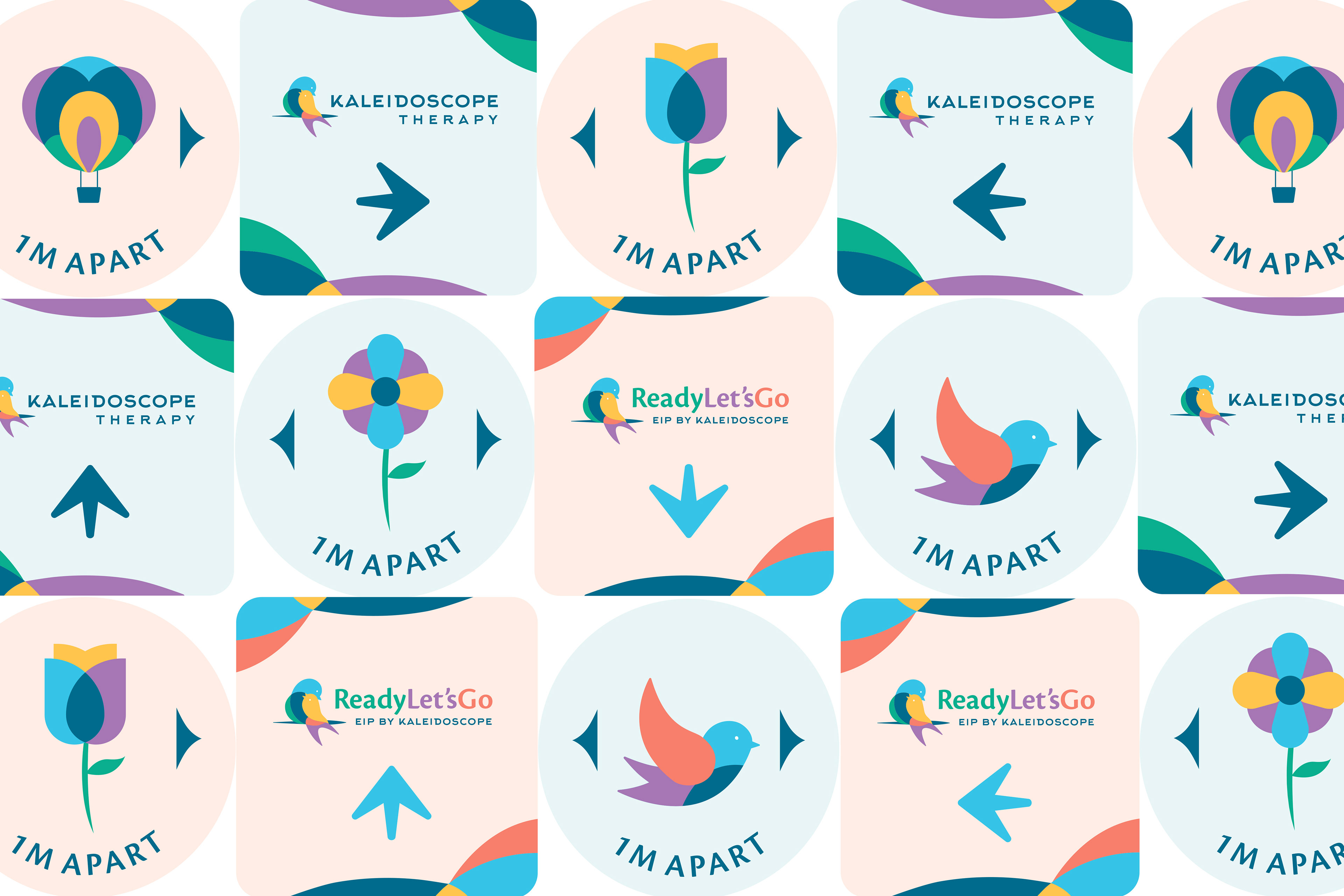
Our design language is built around the core symbolism of a kaleidoscope: the identity is colourful with overlapping shapes, to represent the clinic being multidisciplinary. As a whole, the brand mark and the logotype comes together to create a professional look, at the same time encompassing the warmness of a therapy centre. By also simplifying the logo identity into graphical shapes, they become versatile visual assets that can be scaled to form abstract landscapes and framing elements.
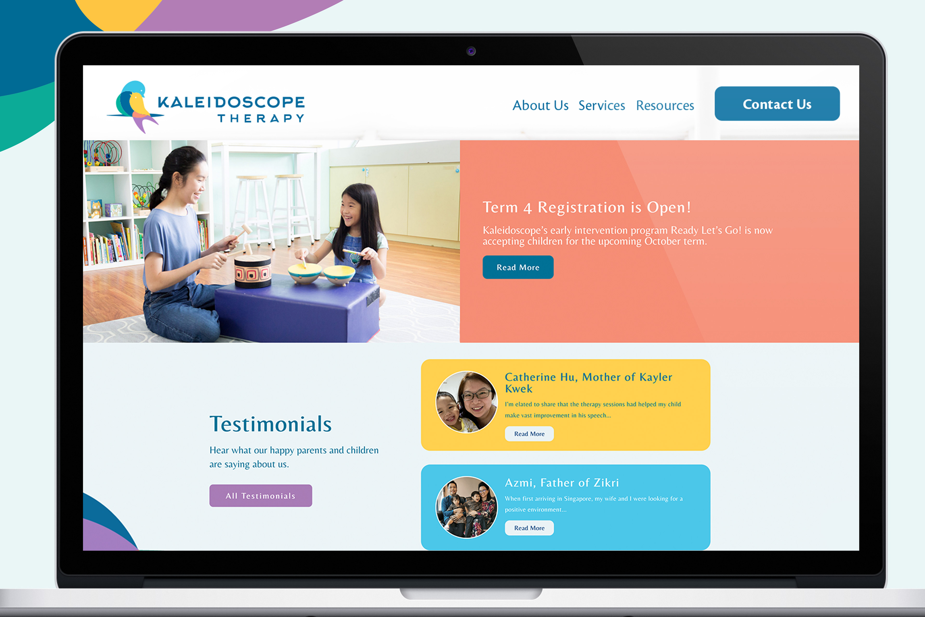
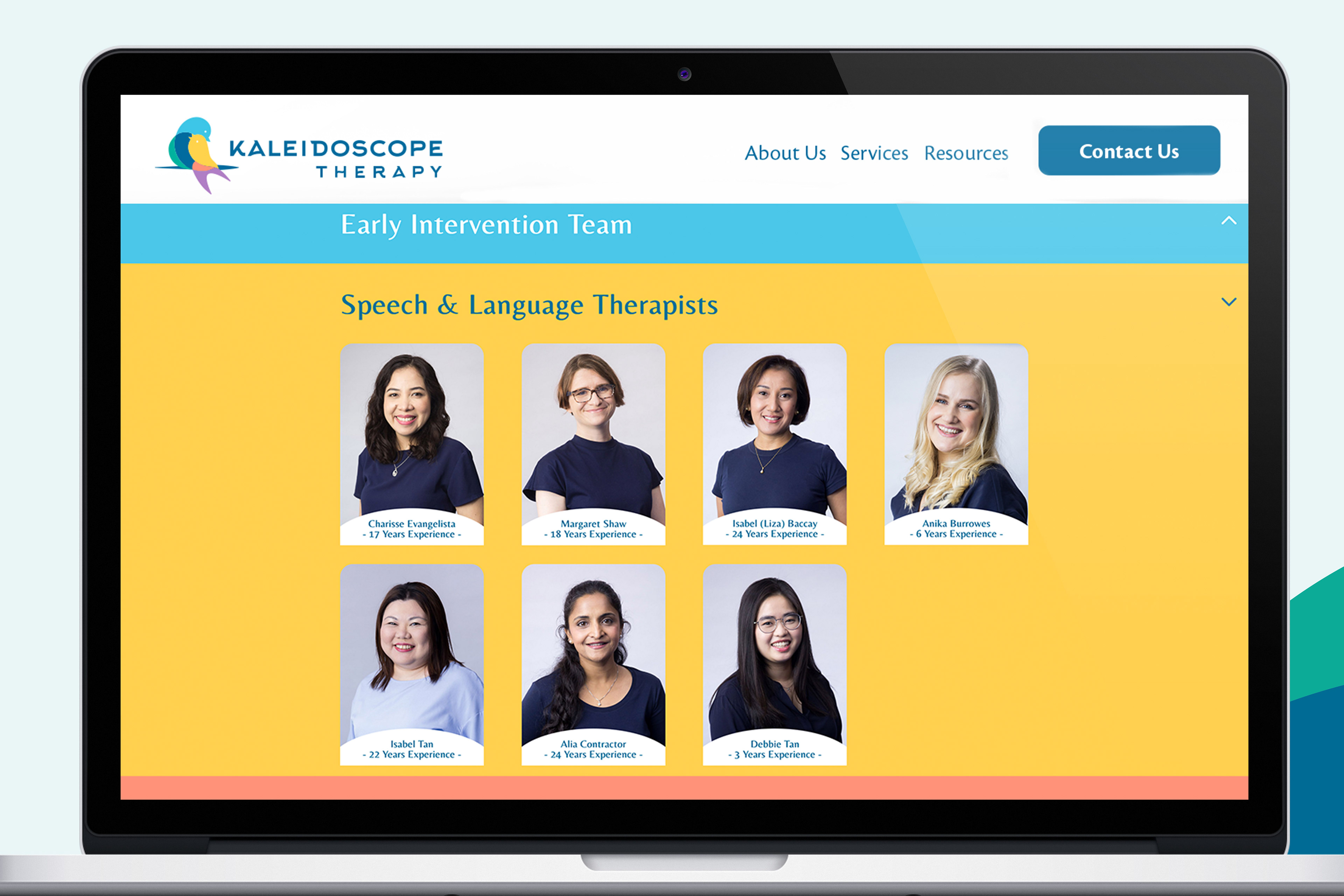
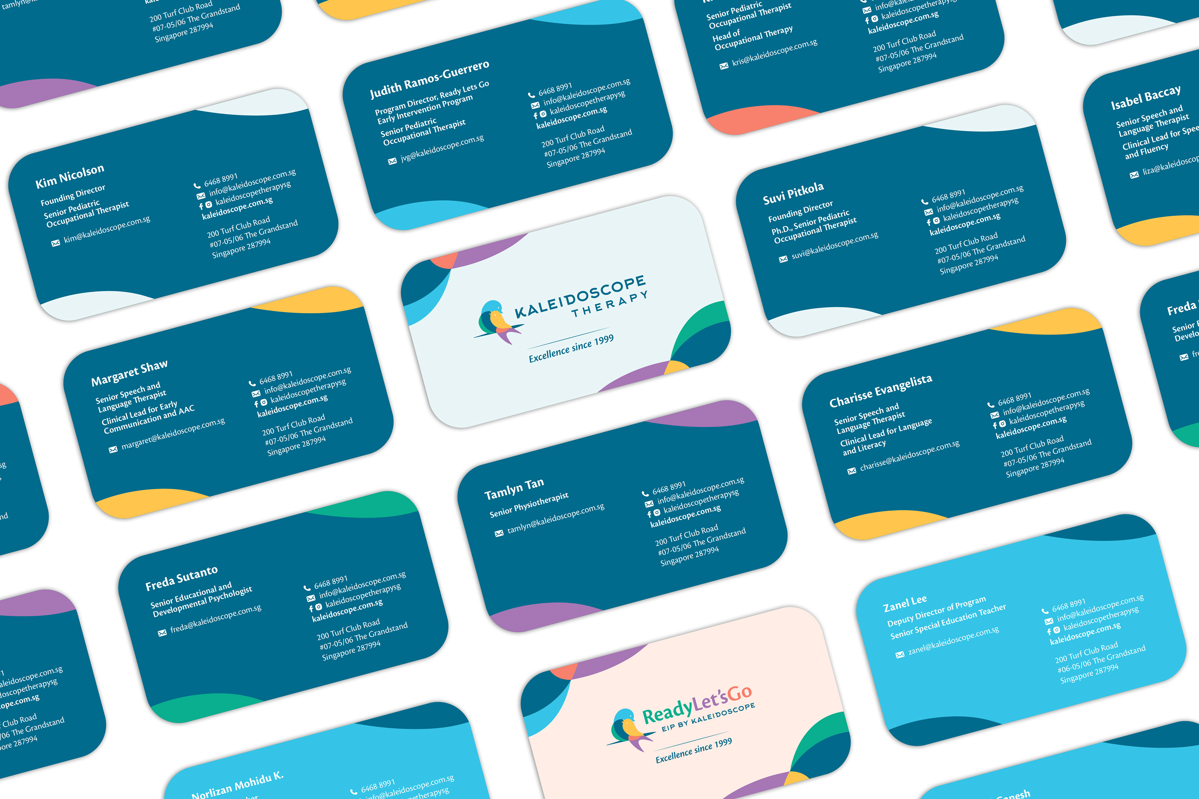
The final deliverables were branding, identity, marketing, digital and social collaterals, wayfinding signages and website design.
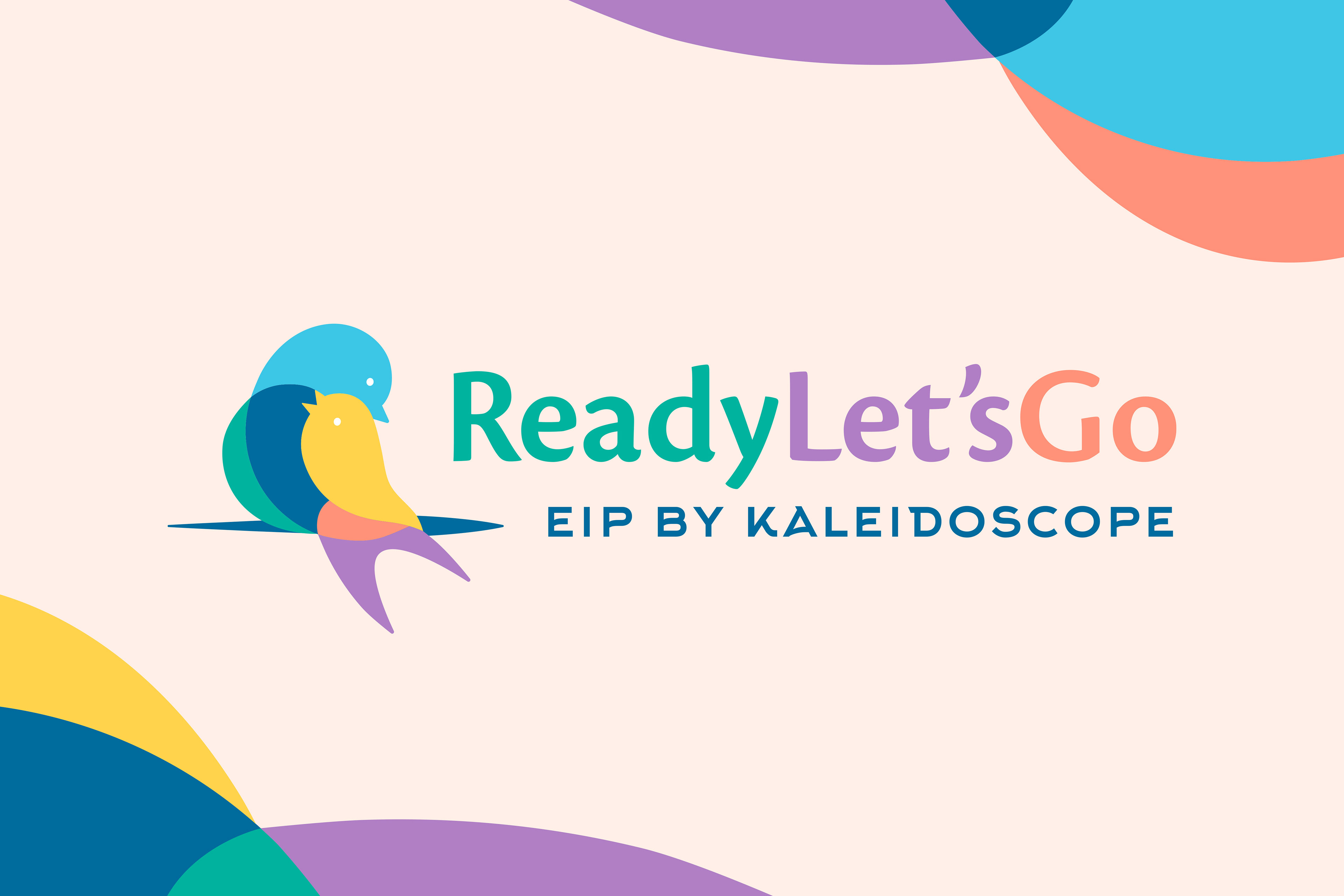
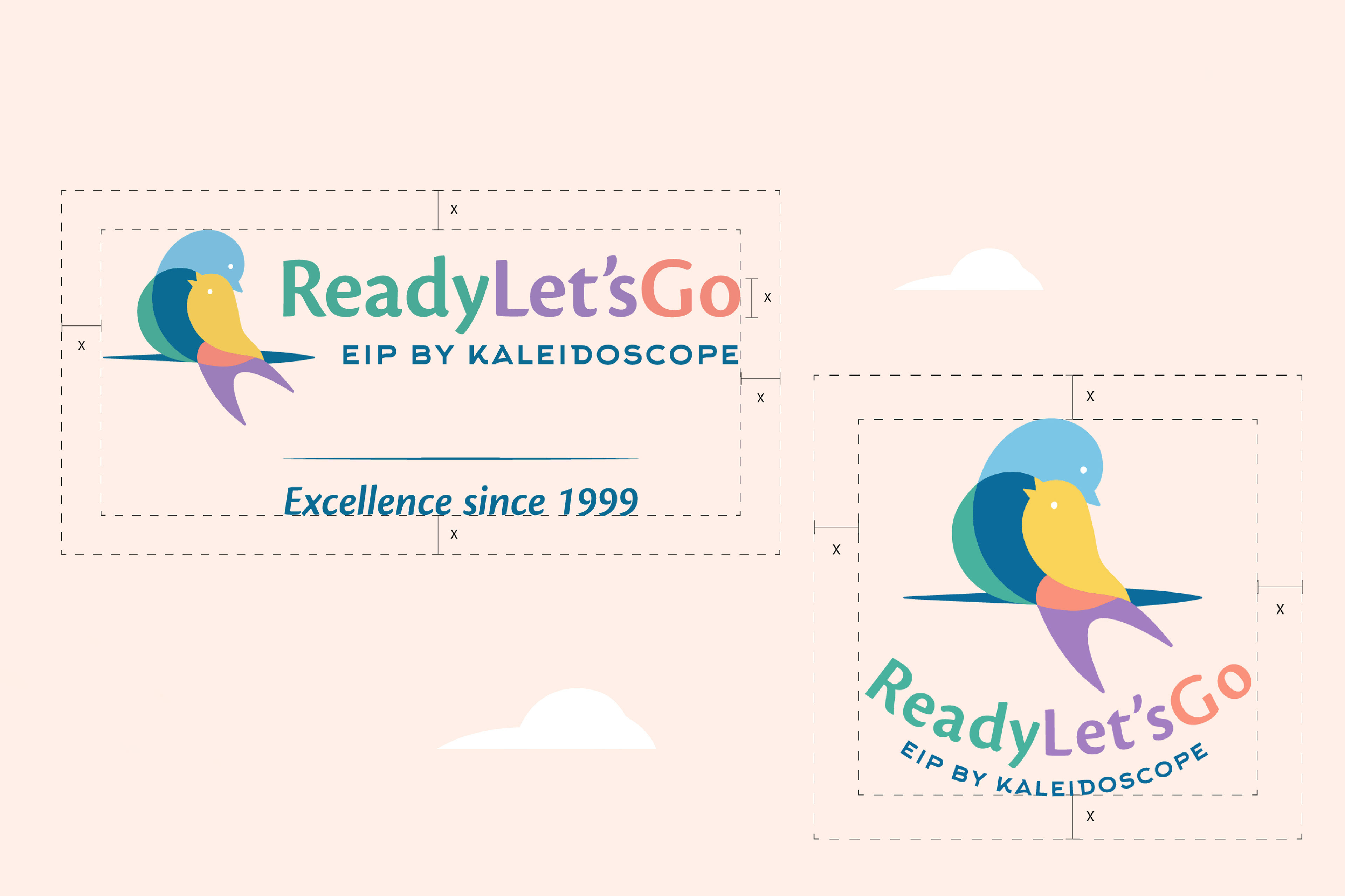
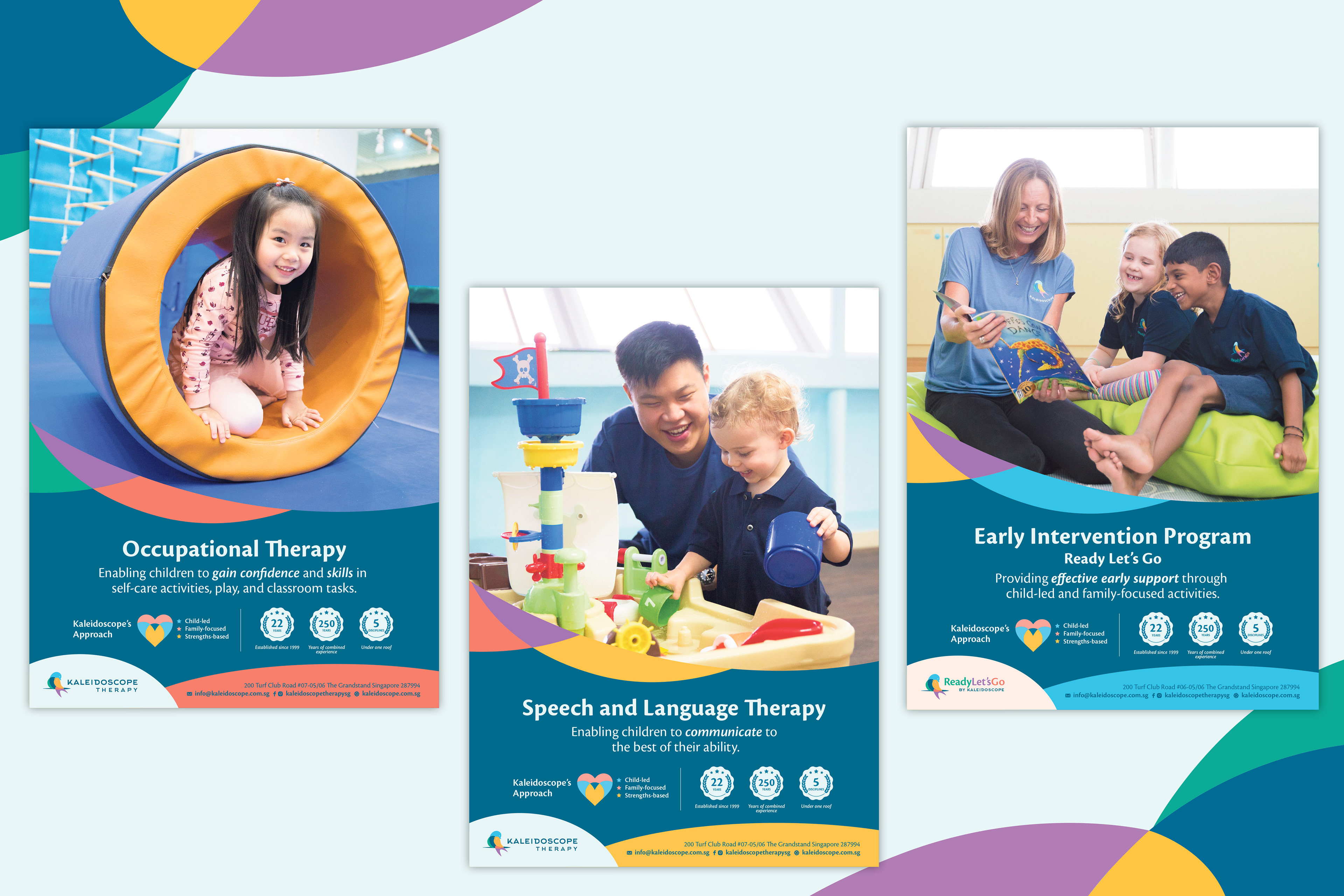
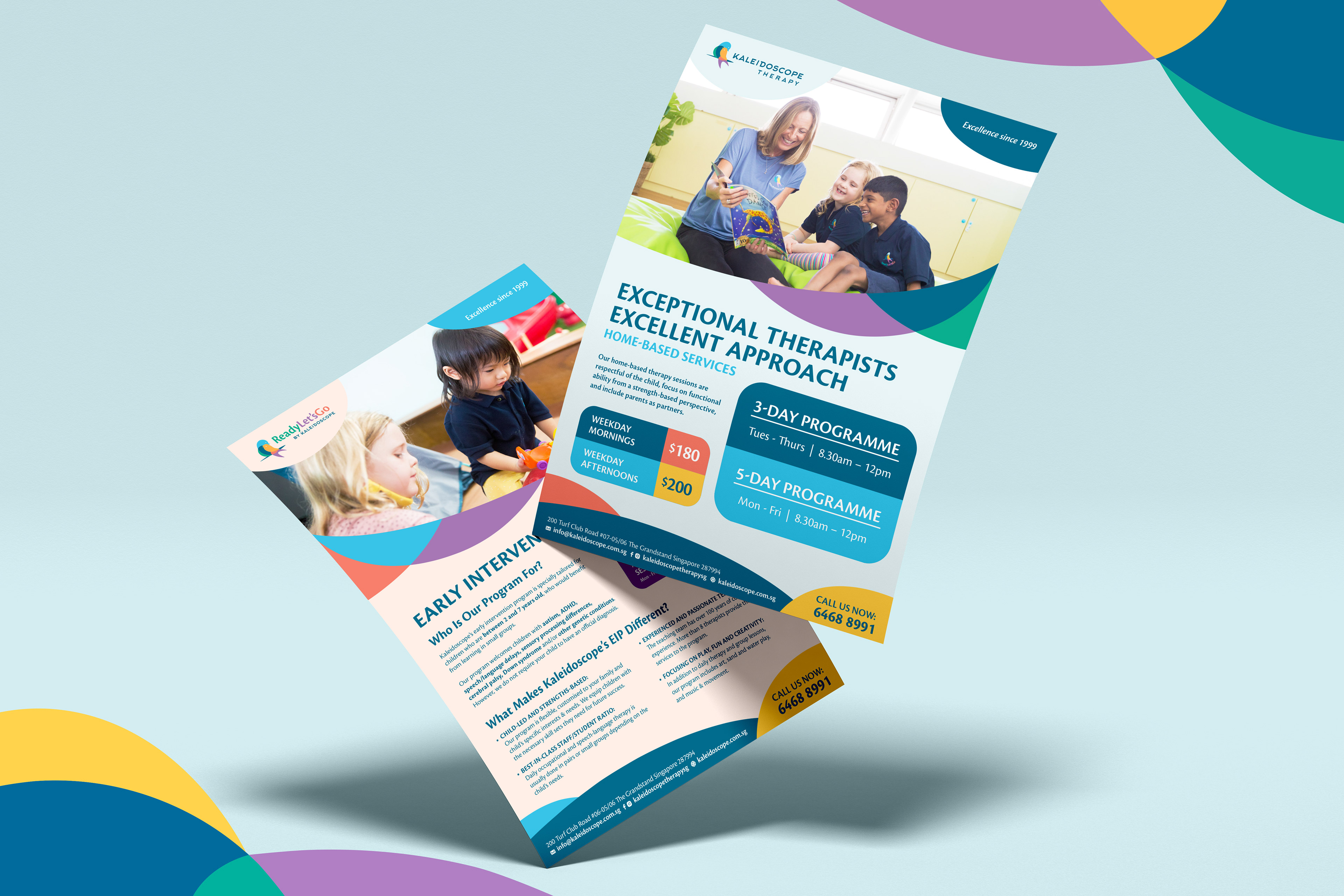
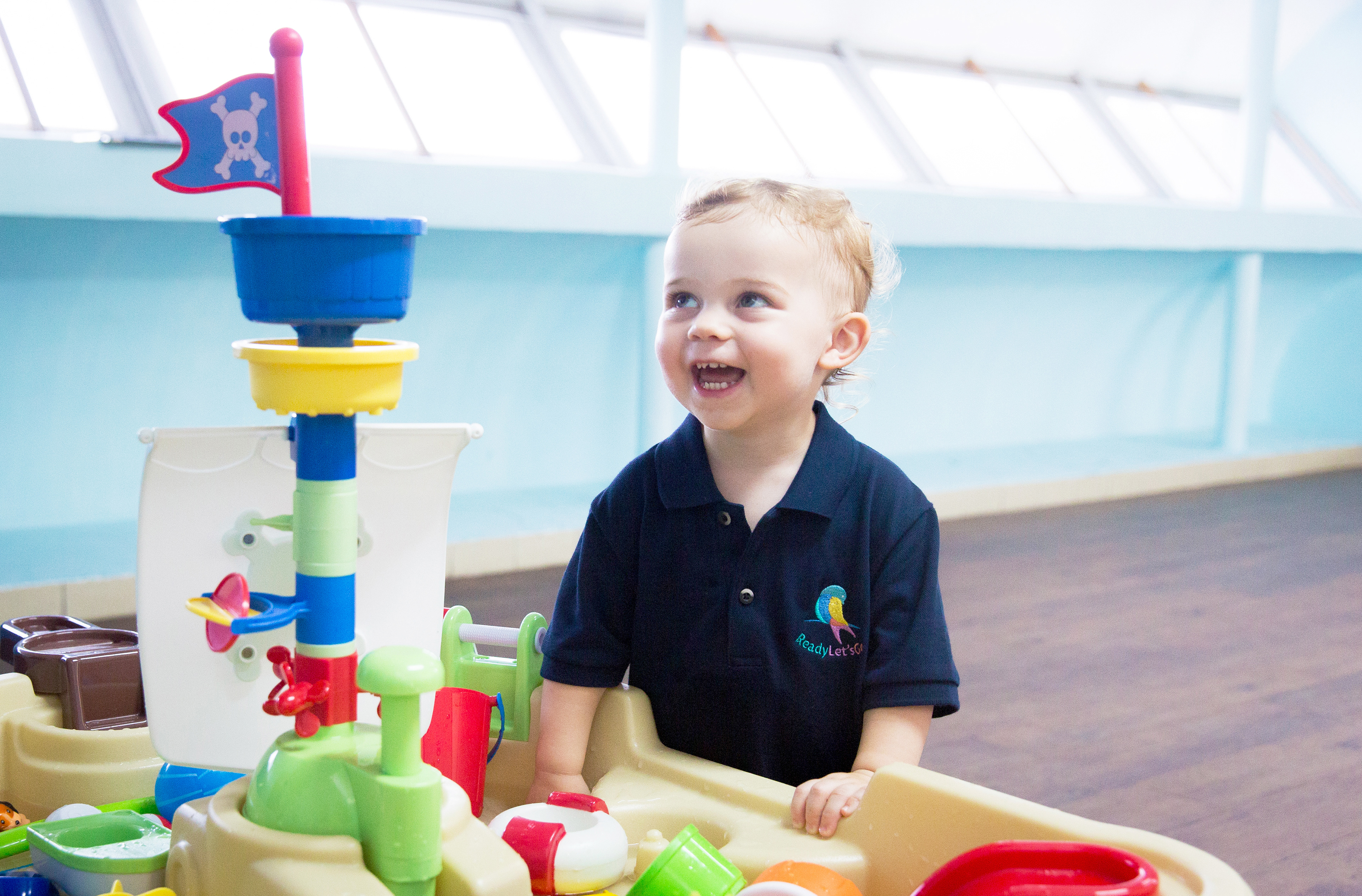
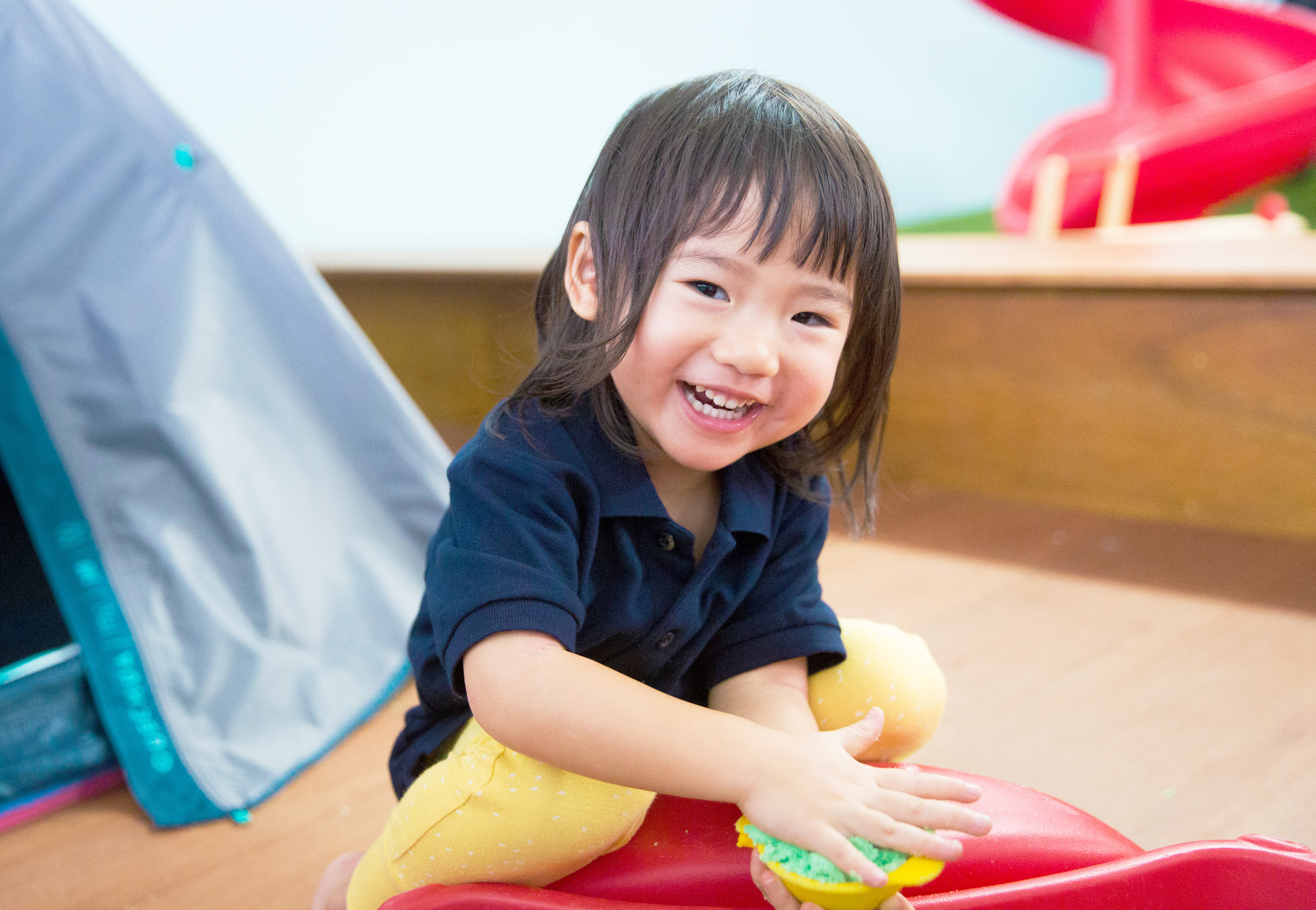
Ready Let’s Go (Early Intervention Program for children aged 2-7) will retain the brand mark of Kaleidoscope Therapy logo but with a more simplistic font (Basis Grotesque Pro) to bring out the child-like energy of this subsidiary, giving it a slight differentiation to the sophisticated master brand.
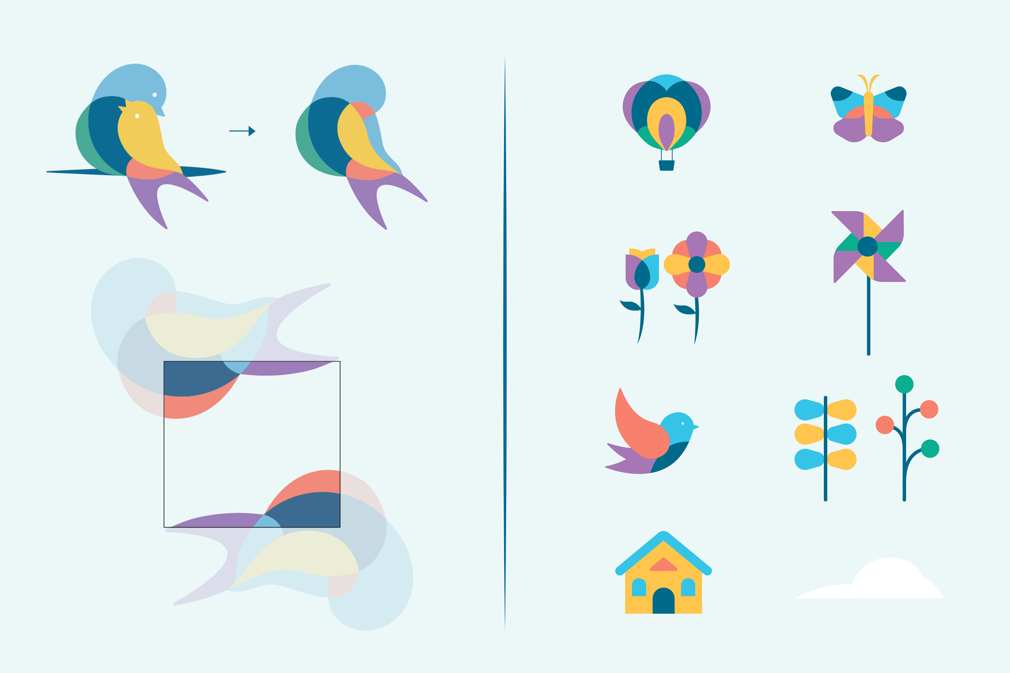
Child-centric graphics are created to introduce an element of fun to the overall branding to appeal to children. These elements are reminiscent of colourful toys with an innocent spark, complementing our sleek branding.


Photography by StudioPlay.