
Client: Lightfoot Travel
Year: 2015
Lightfoot Travel is a luxury tour operator with offices in Singapore, Hong Kong and Dubai, specialising in designer holidays to countries spanning six continents around the world. At Lightfoot, no two itineraries are the same. Because each of the travel designers is a travel addict with great insider knowledge, and because they never recommend somewhere they haven’t been themselves, no one is better positioned than Lightfoot to craft the perfect luxury trip just for you.
“Even if it’s a Phuket villa, you should get out there and explore. Whatever you’re doing, do it more. Take the next step.”
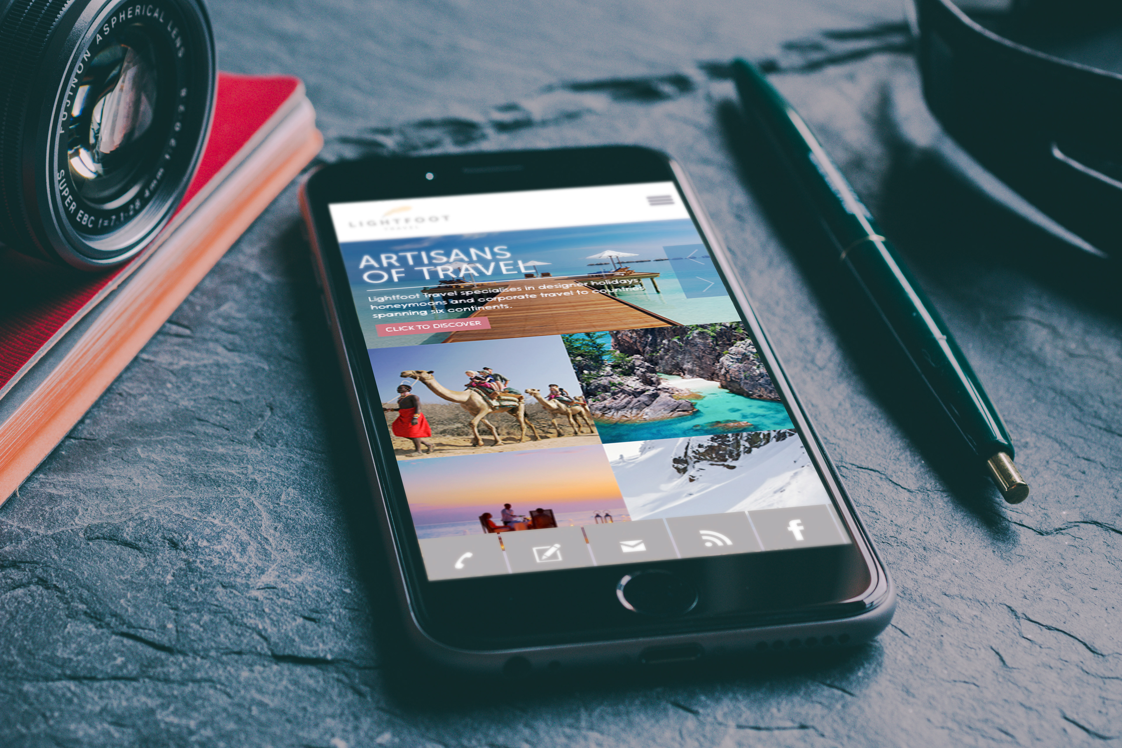
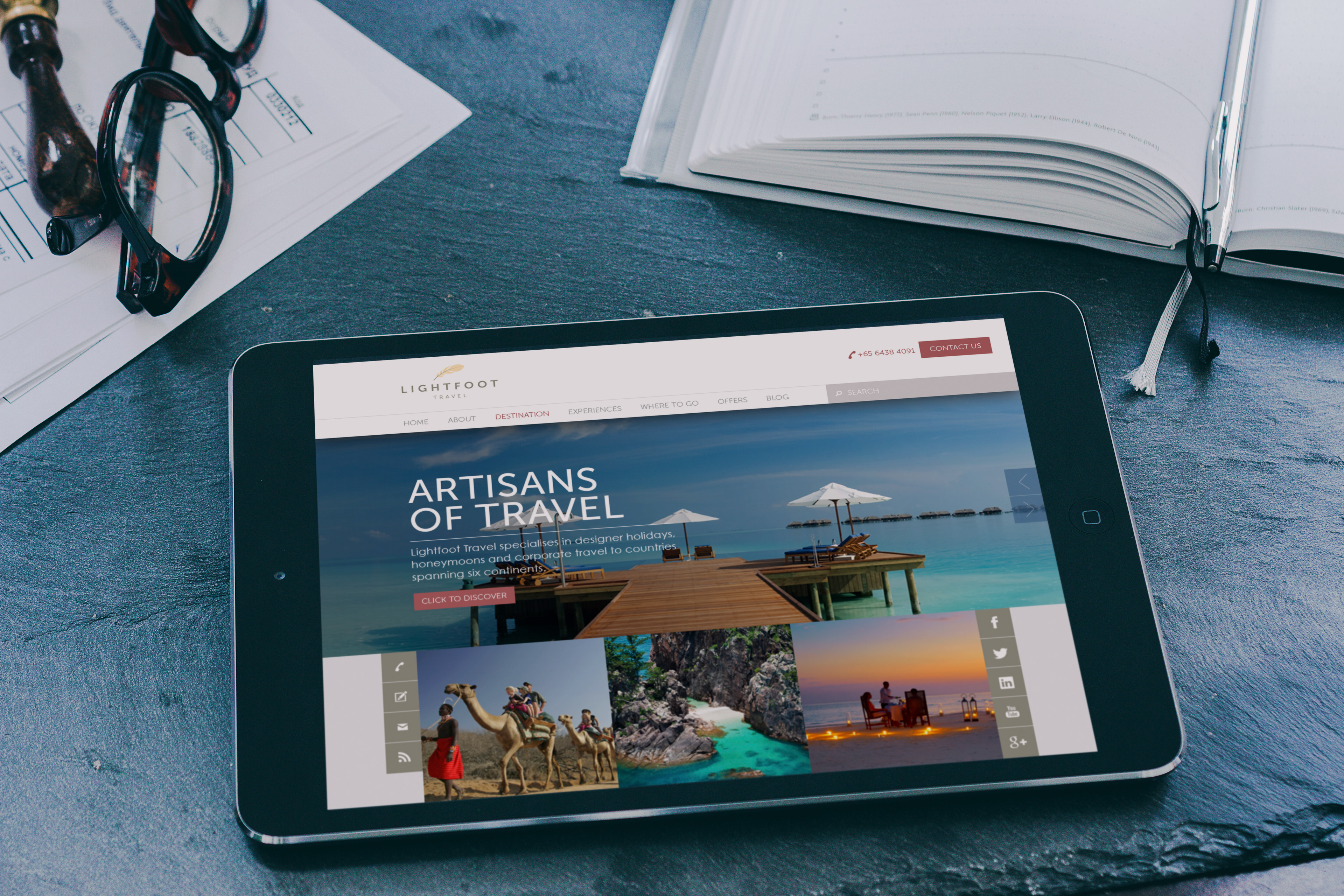
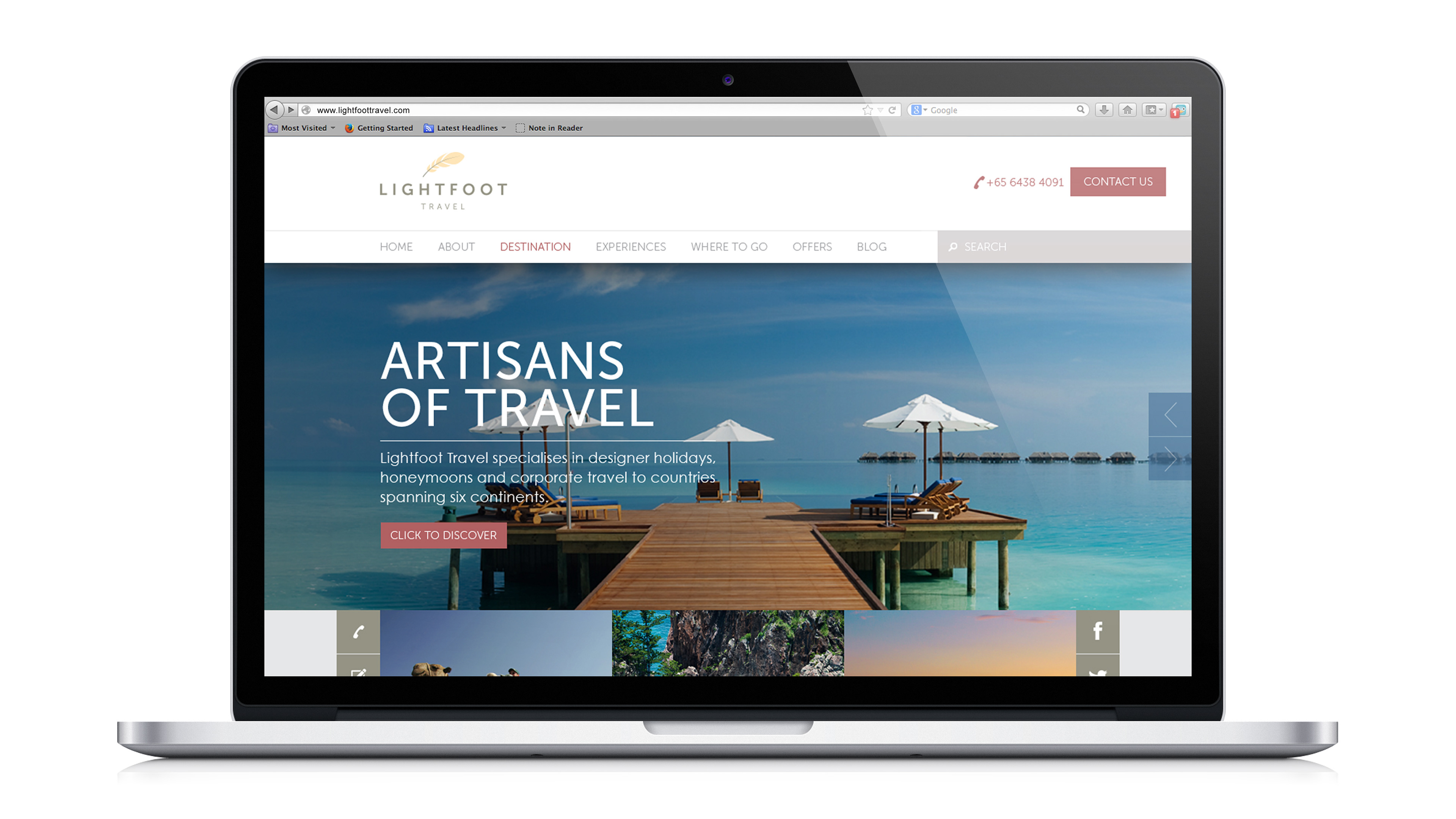
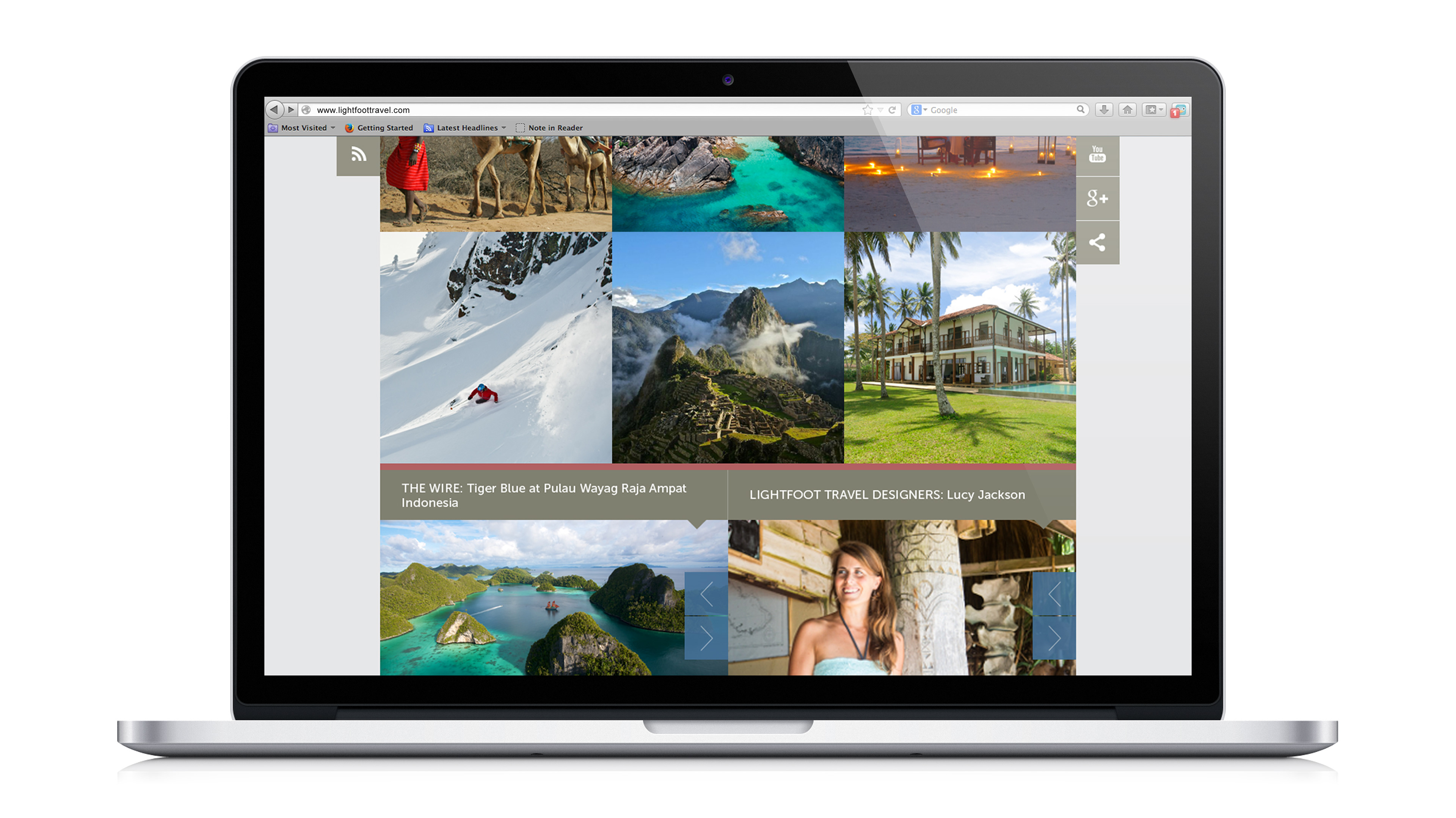
A collaboration with Host Singapore, the active brand idea here is Artisans of Travel where luxury travellers are moving from status symbols to one-of-the-kind status stories. They want to experience and be inspired by original travel itineraries that have been crafted only for them and no one else.
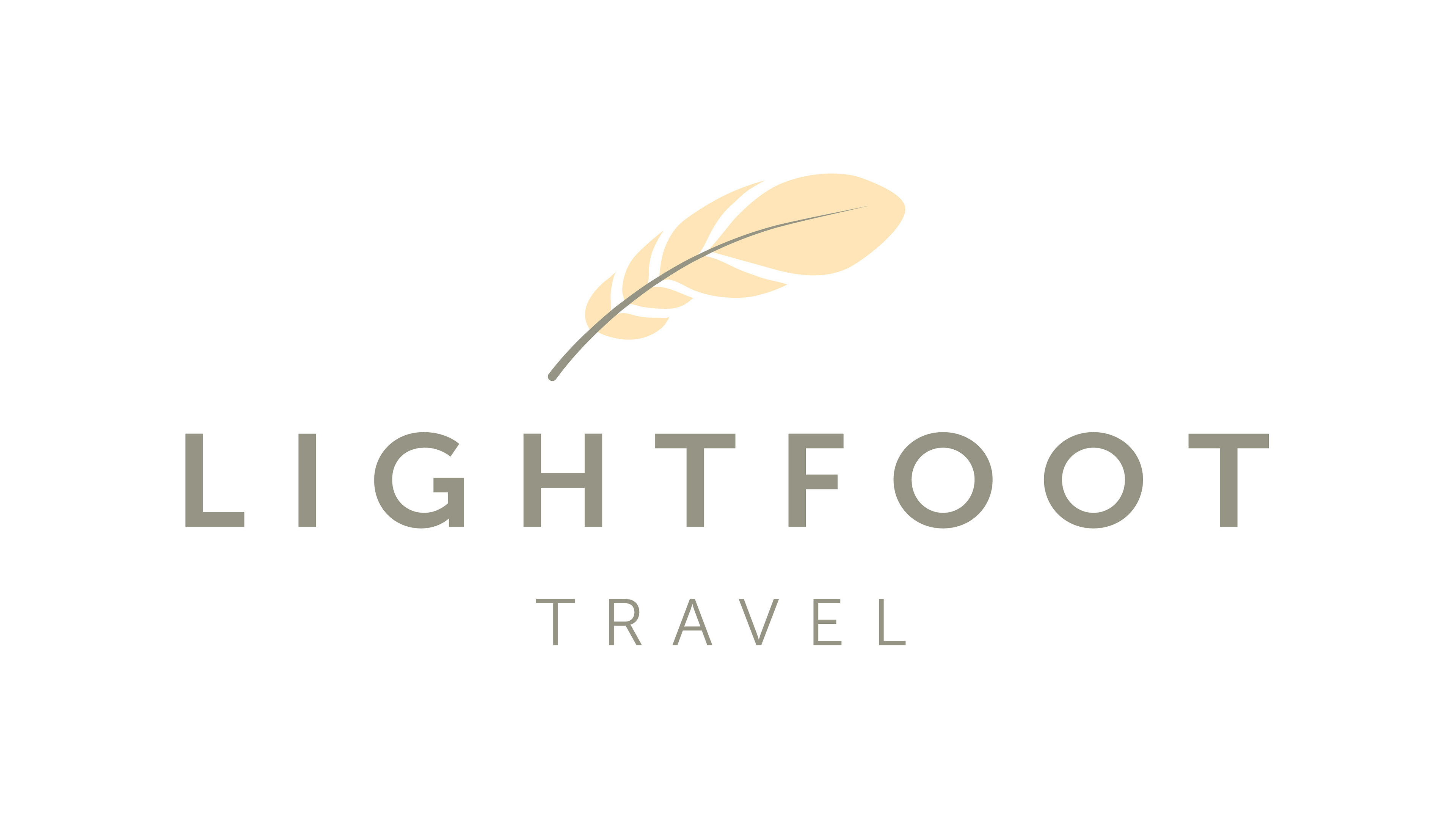
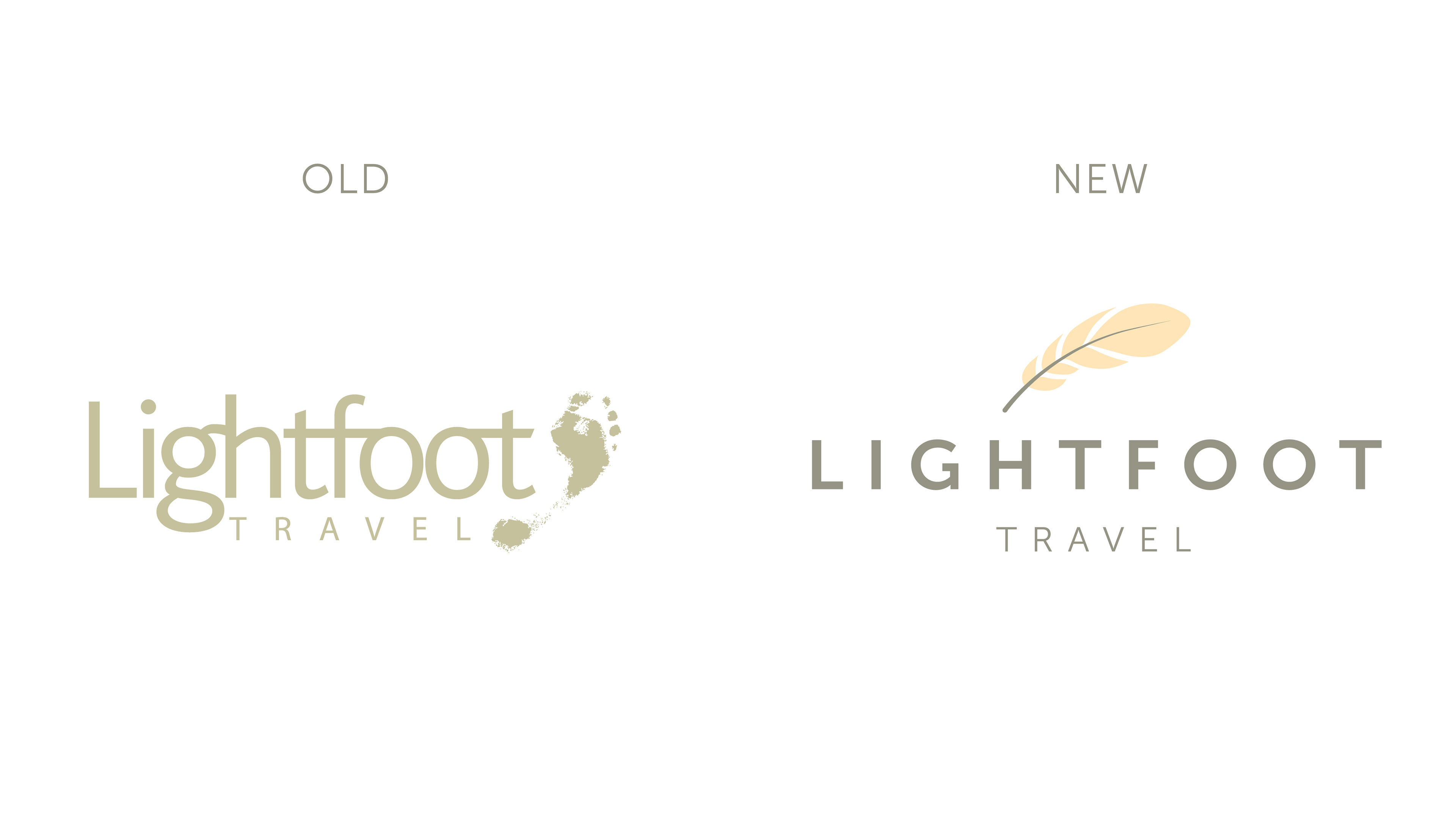
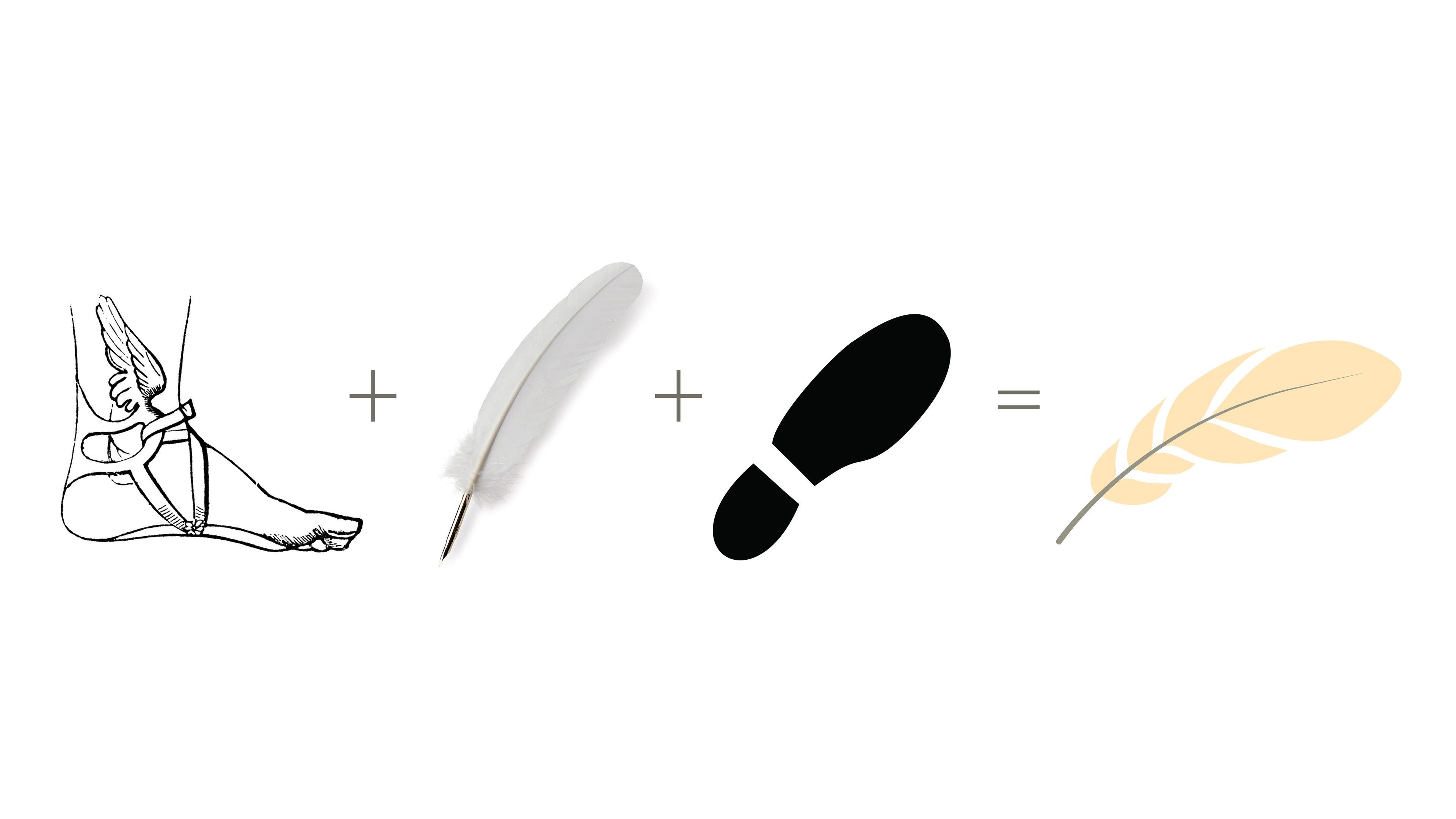
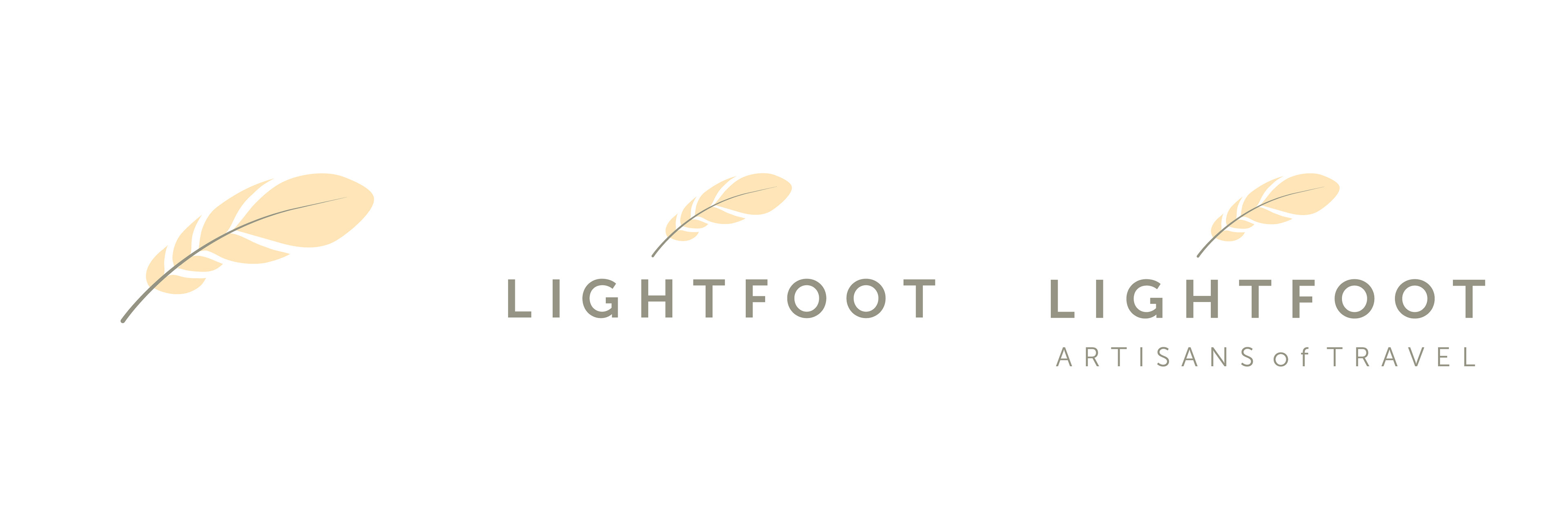
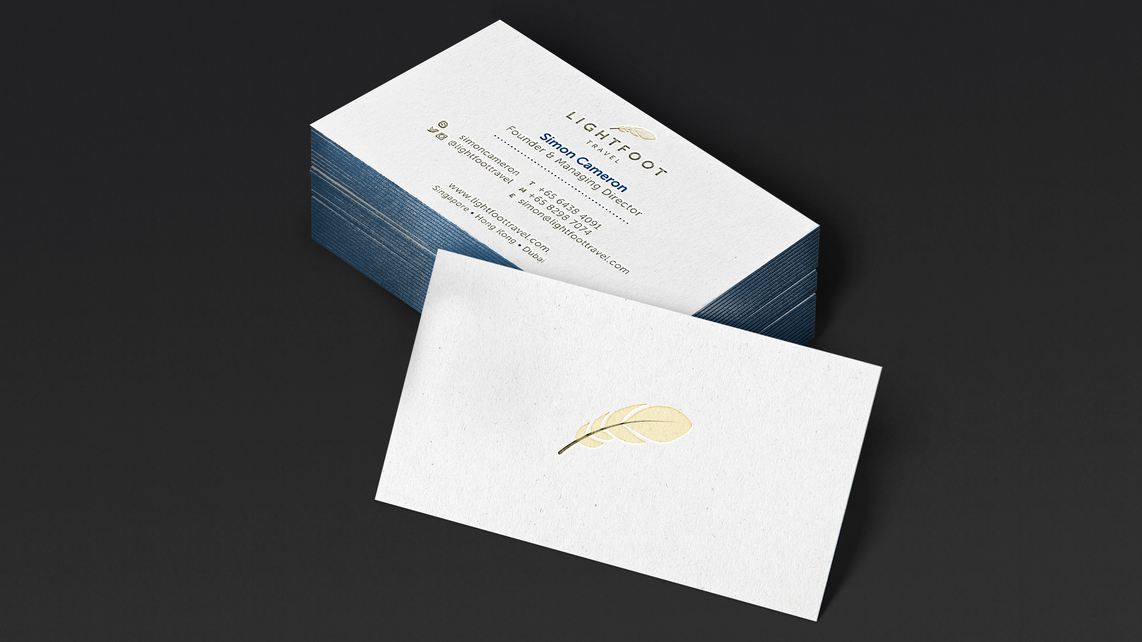
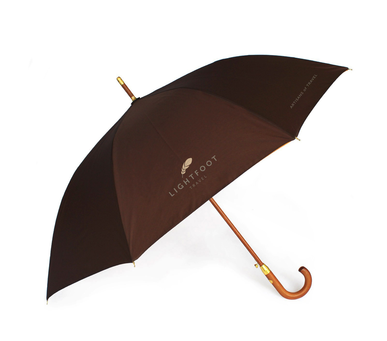
Our logo inspiration is inspired by Greek mythology. In tradition Greek mythology, Hermes - an Olympian god of transitions and boundaries, and the patron of travellers - had in his possession a pair of winged sandals, also known as the Talaria. The Talaria allowed him to transit between the realms of mortal and divine freely. The bearer of Talaria is, therefore, endowed with the ability to go anywhere he wants, seek any adventure his heart so desires and create a travel tale matched by no other. In essence, the bearer becomes “Light Footed”. We have stripped the winged sandals of the Talaria down to a single feather - which of course carries strong associations with flight and travel. The logo symbol is also shaped to resemble a quill which in itself seeks to represent the act of “writing one’s own travel tales”. Quills are very classical, organic, natural and wholesome at the same time. In addition, the shape of the feather is moulded into a shoe/foot print. So this becomes a visual identity that is both ‘light’ and ‘foot’.
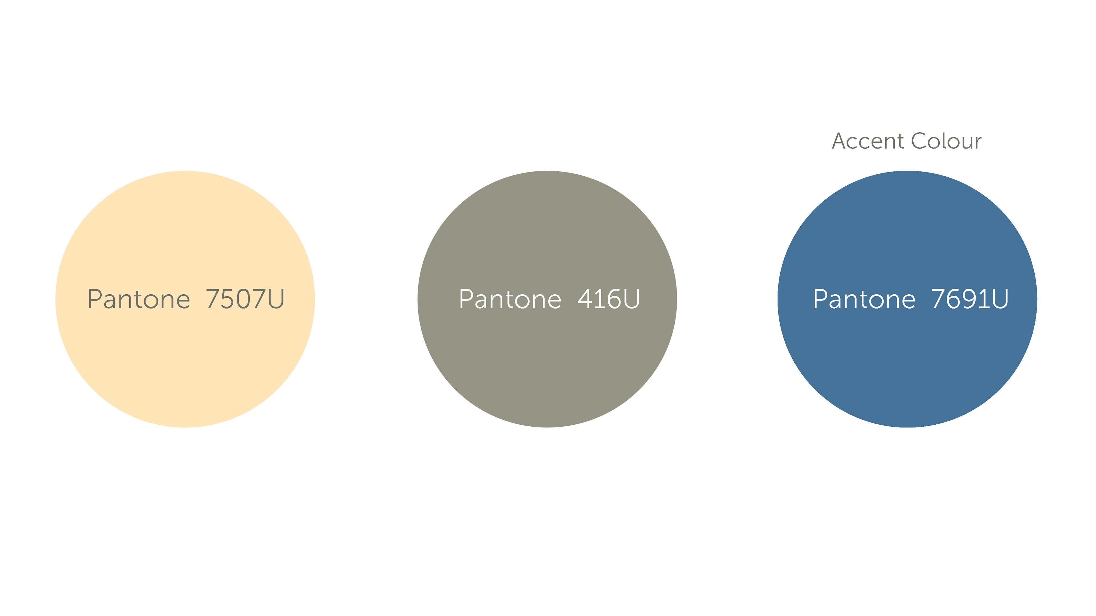
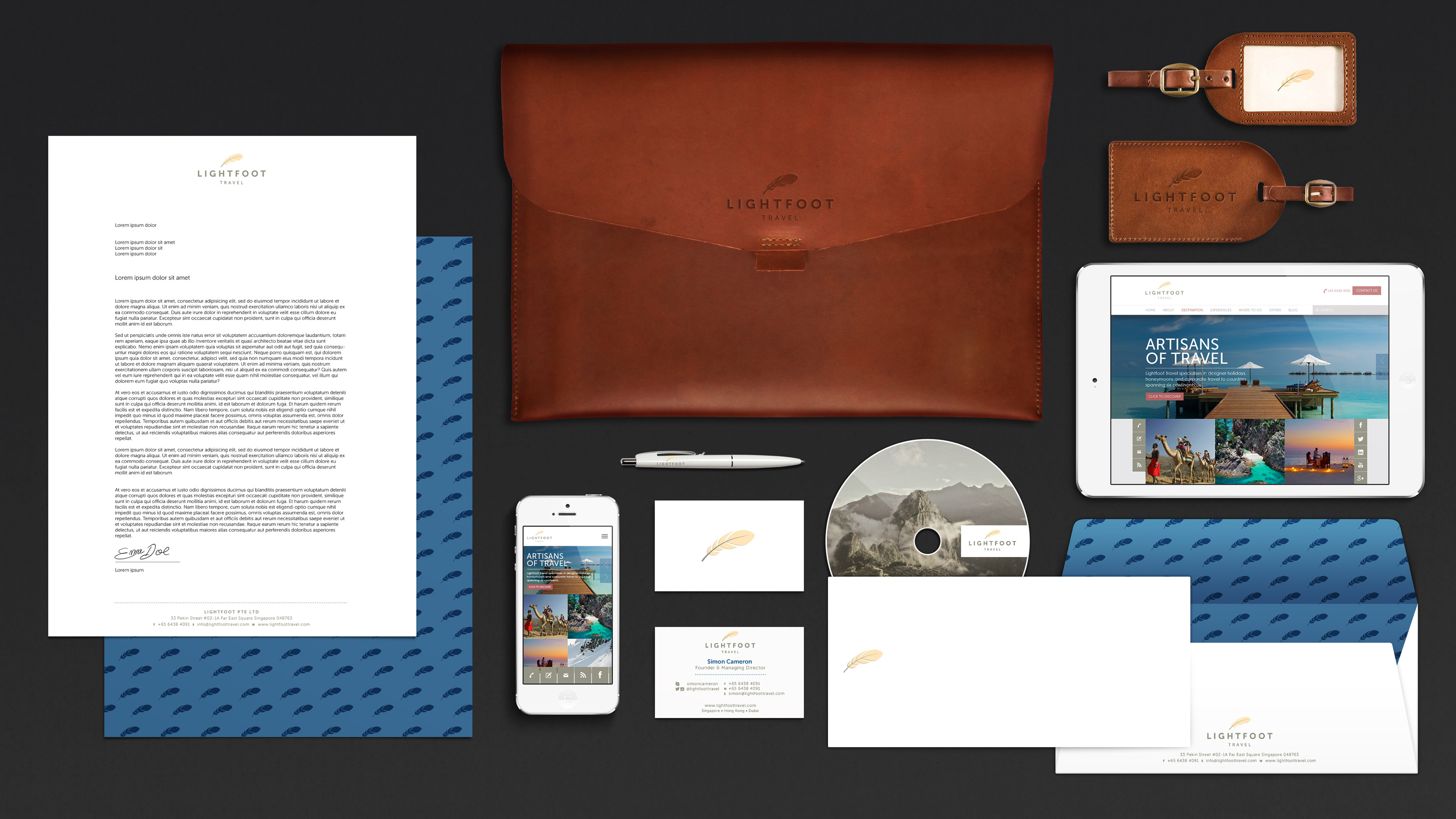
Museo Sans has been chosen as the primary font for the Lightfoot visual identity system. The versatile weights make this typeface applicable on all fronts and should be used at all times. There is also a supporting graphic which utilises the feather symbol in our brand signature, creating an elegant motif pattern to bring an additional dimension to our design system. Collaterals were printed on Antalis ArjoWiggins Village White paper stock.
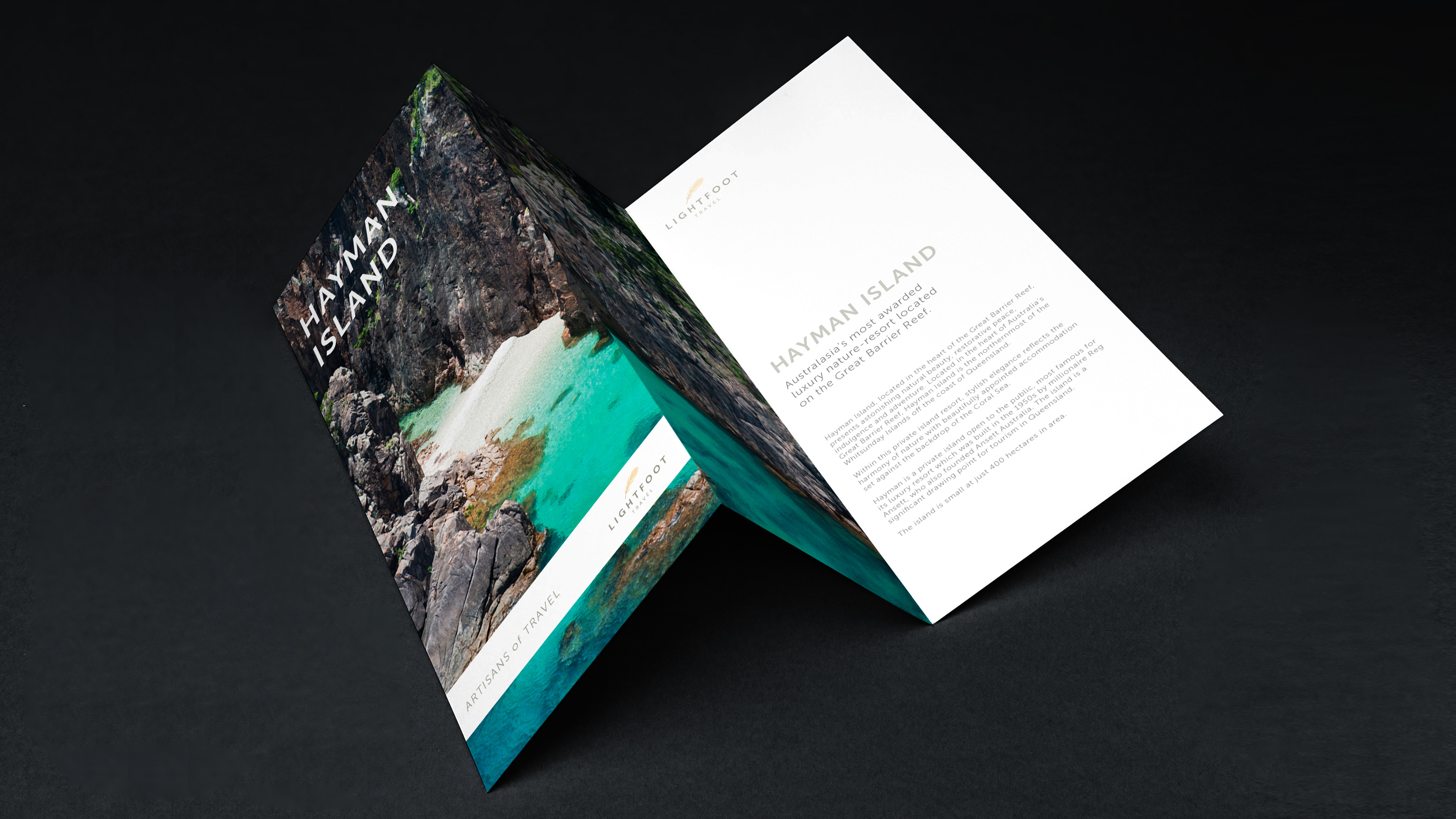
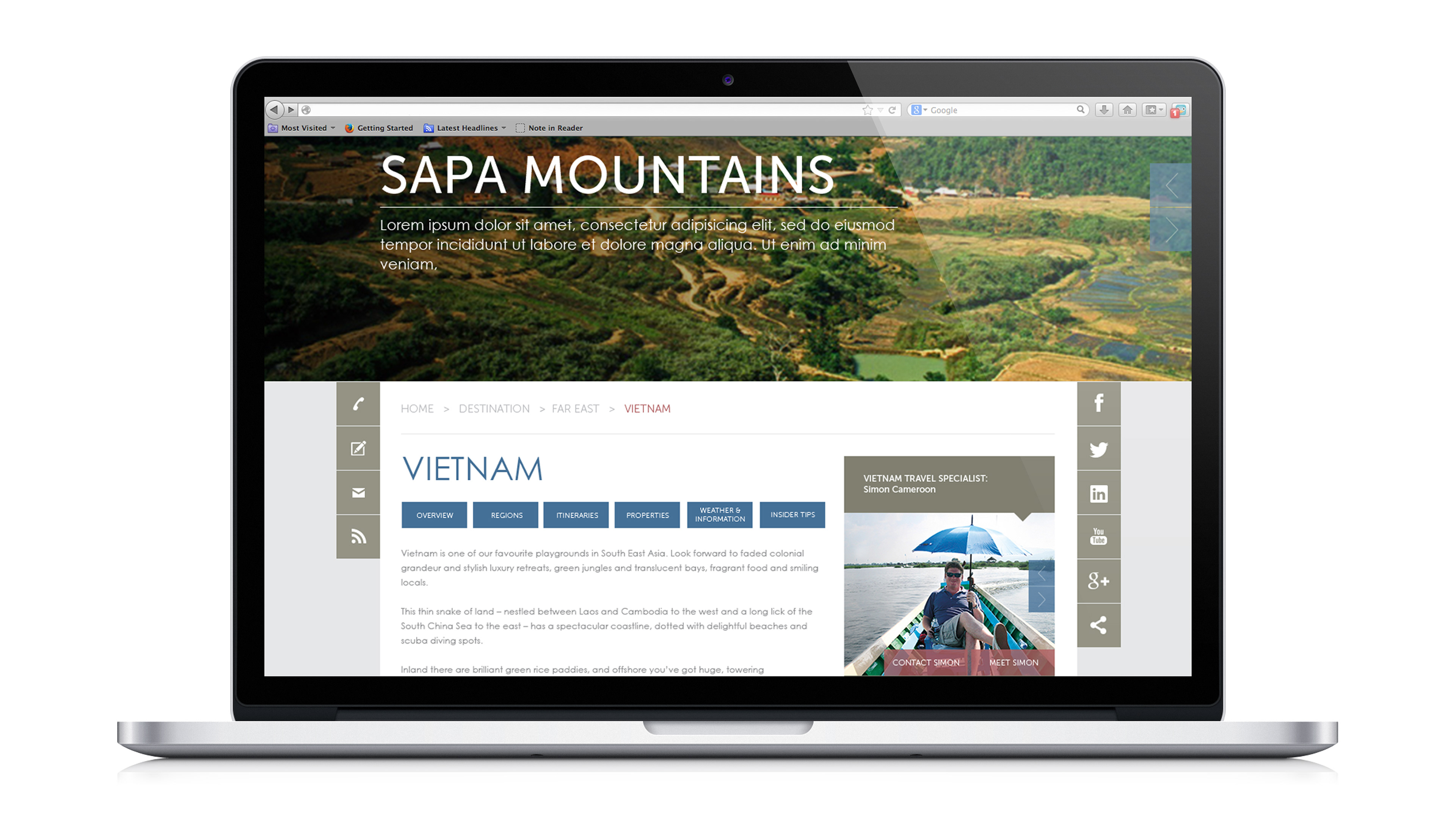
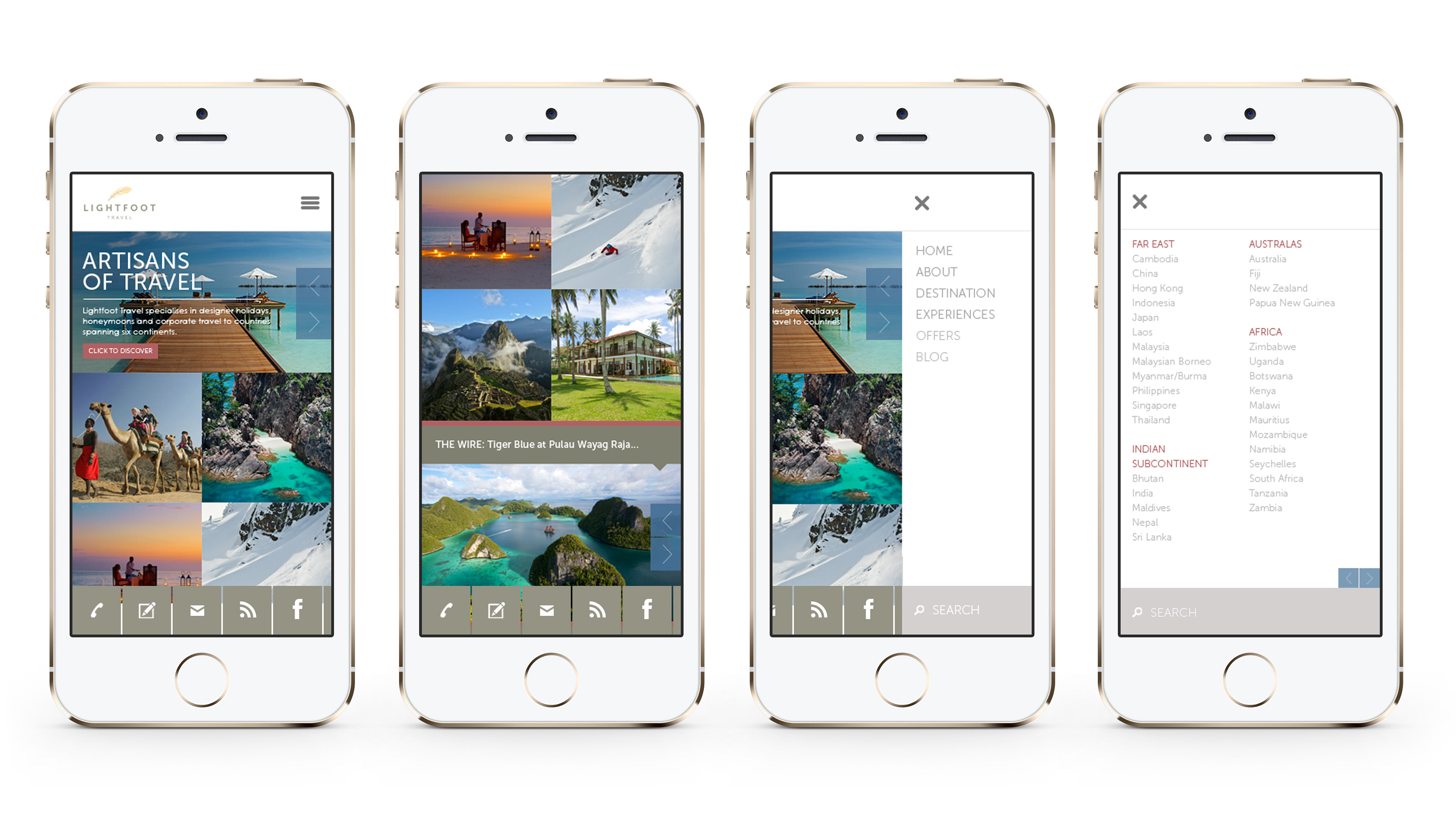
From there, we expanded the brand platform to various collaterals and communications to truly deliver the Lightfoot brand experience that exudes a sense of timeless luxury, premium sophistication and classic contemporary.