
Client: Freeman Asia Pacific
Year: 2014
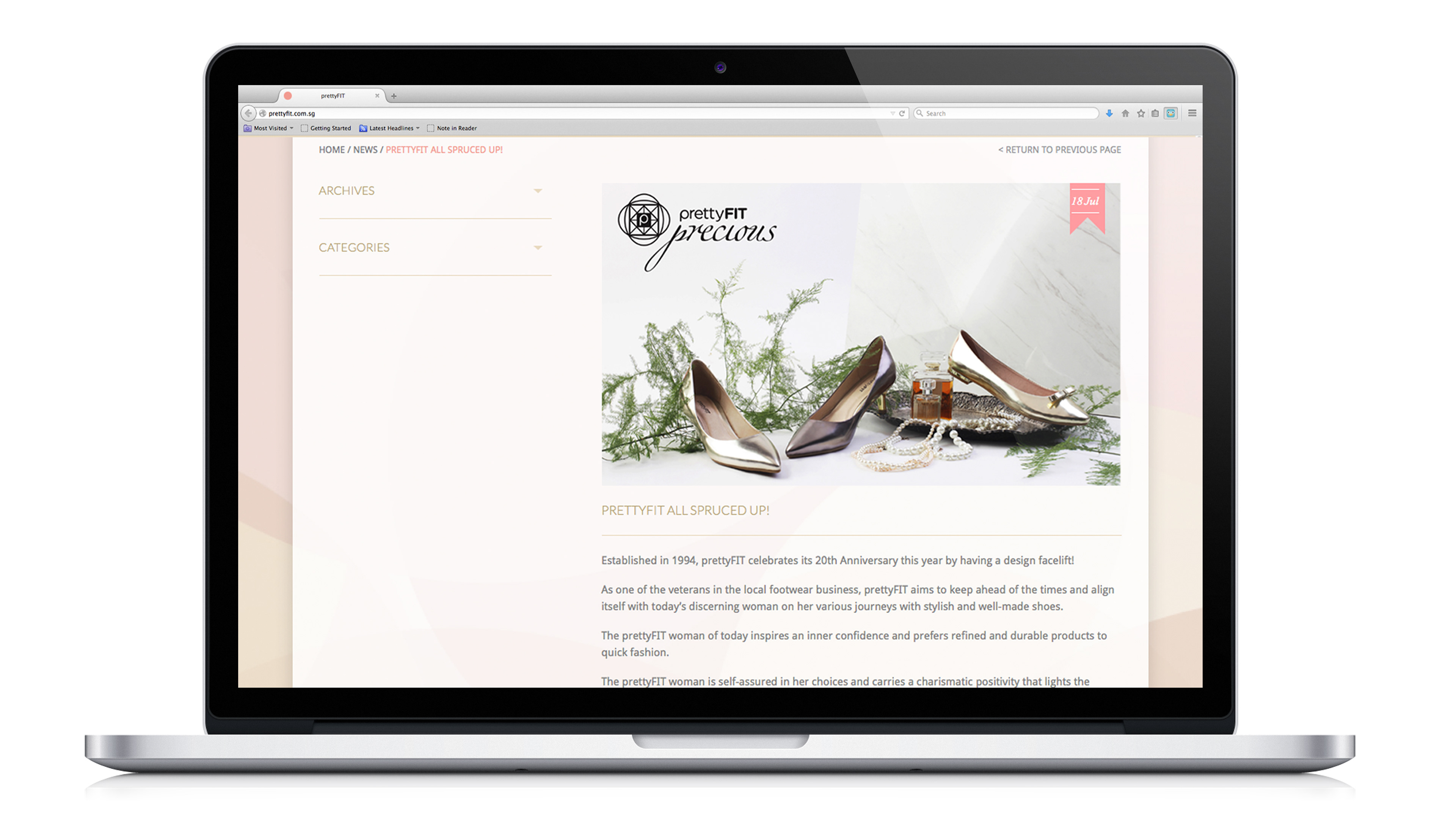
Established in 1994, prettyFIT celebrates its 20th Anniversary this year by having a design facelift. As one of the veterans in the local footwear business, prettyFIT aims to keep ahead of the times and align itself with today’s discerning woman on her various journeys with stylish and well-made shoes. The prettyFIT woman of today inspires an inner confidence and prefers refined and durable products to quick fashion. The prettyFIT woman is self-assured in her choices and carries a charismatic positivity that lights the room. She is not ostentatious, but rather, her understated elegance comes from dressing fittingly and tastefully. She knows how to distinguish glass from synthetic, leather from plastic. She appreciates good workmanship, clean lines and quality embellishments – sometimes, an unexpected color that uplifts her mood.
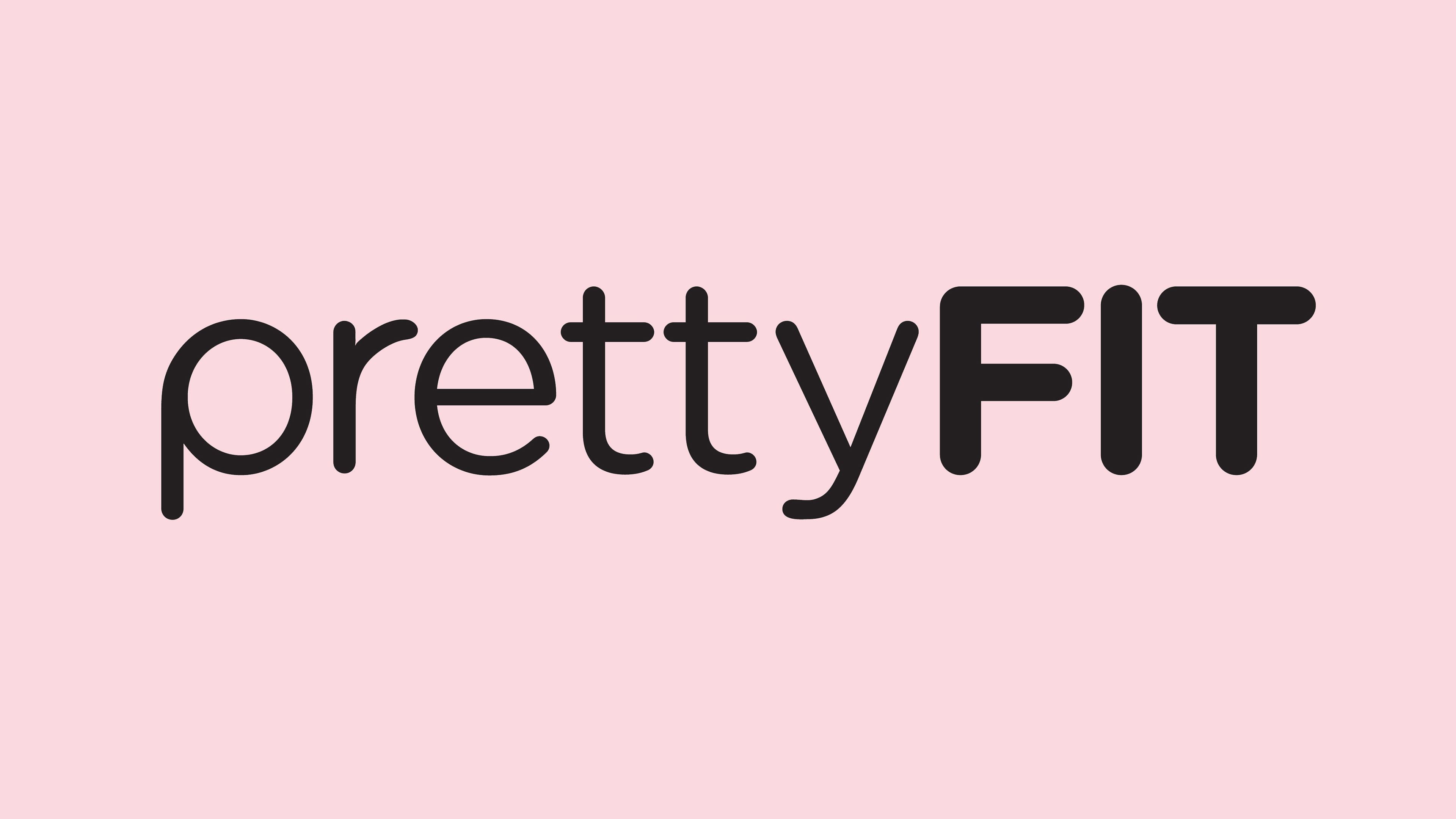
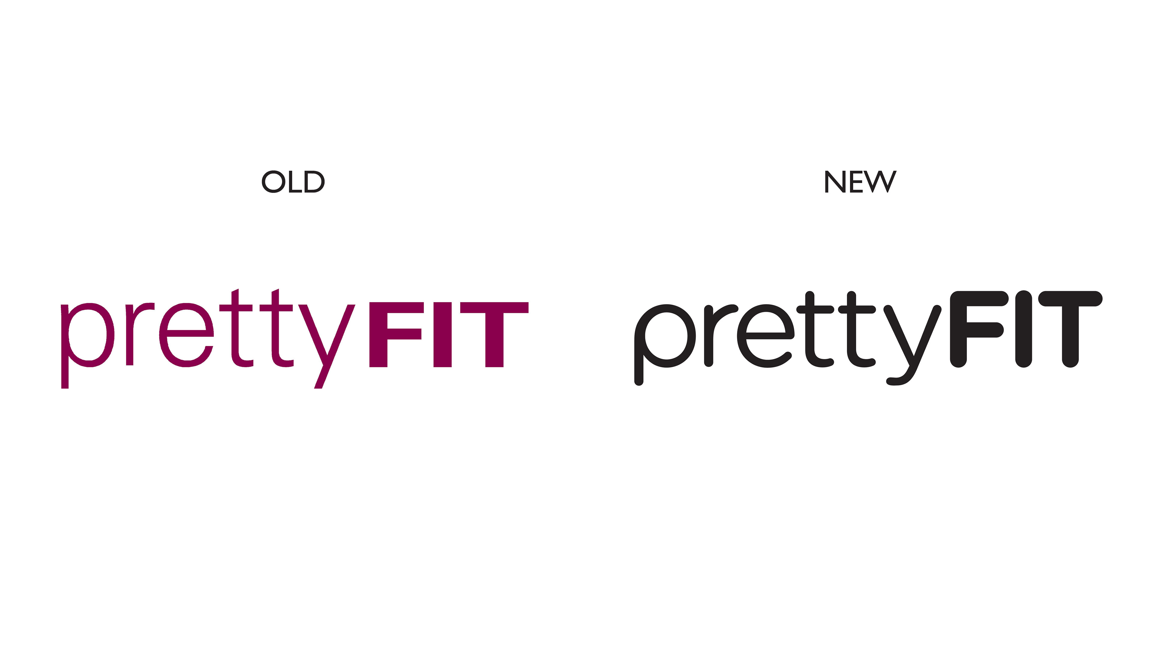
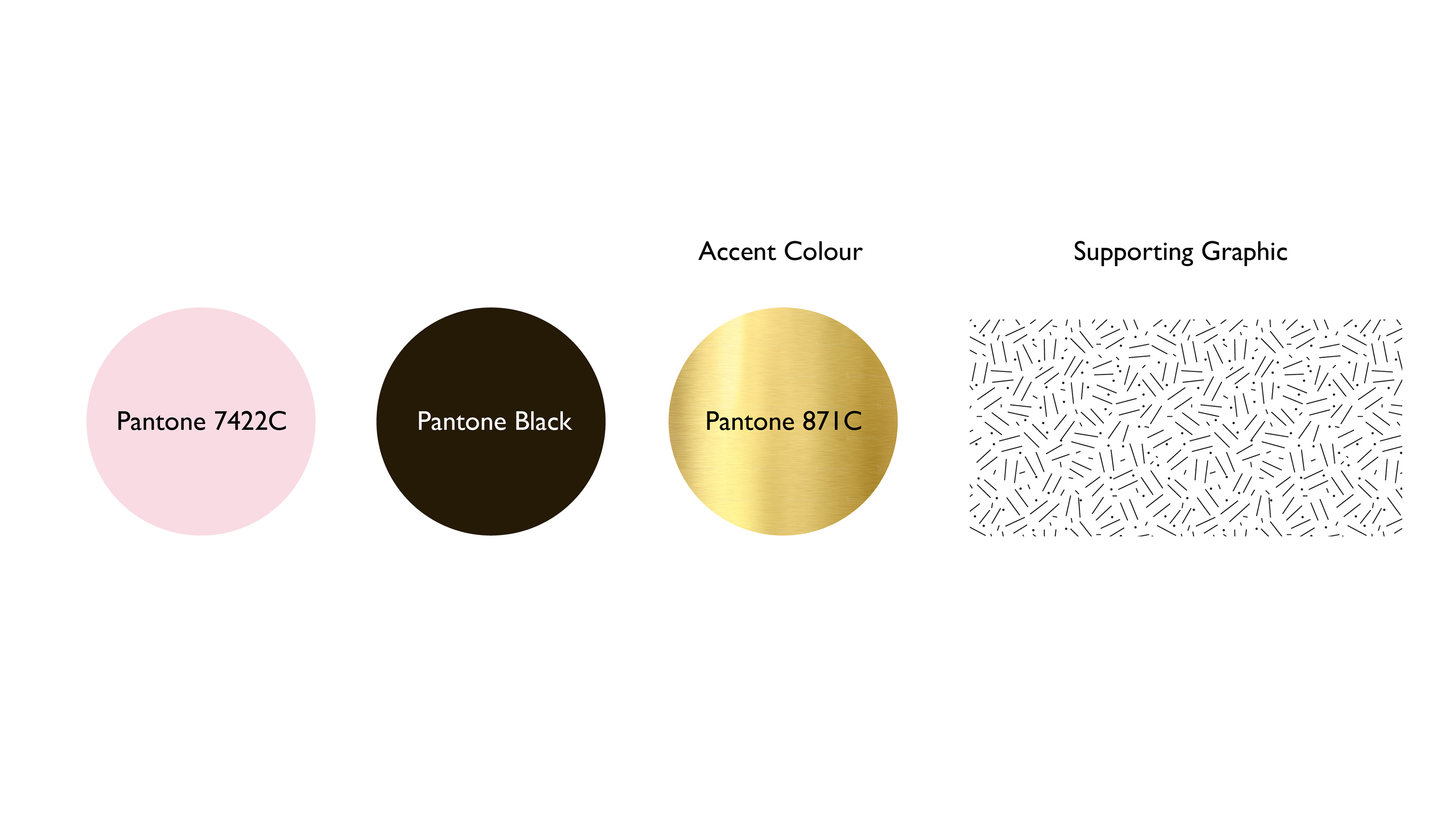
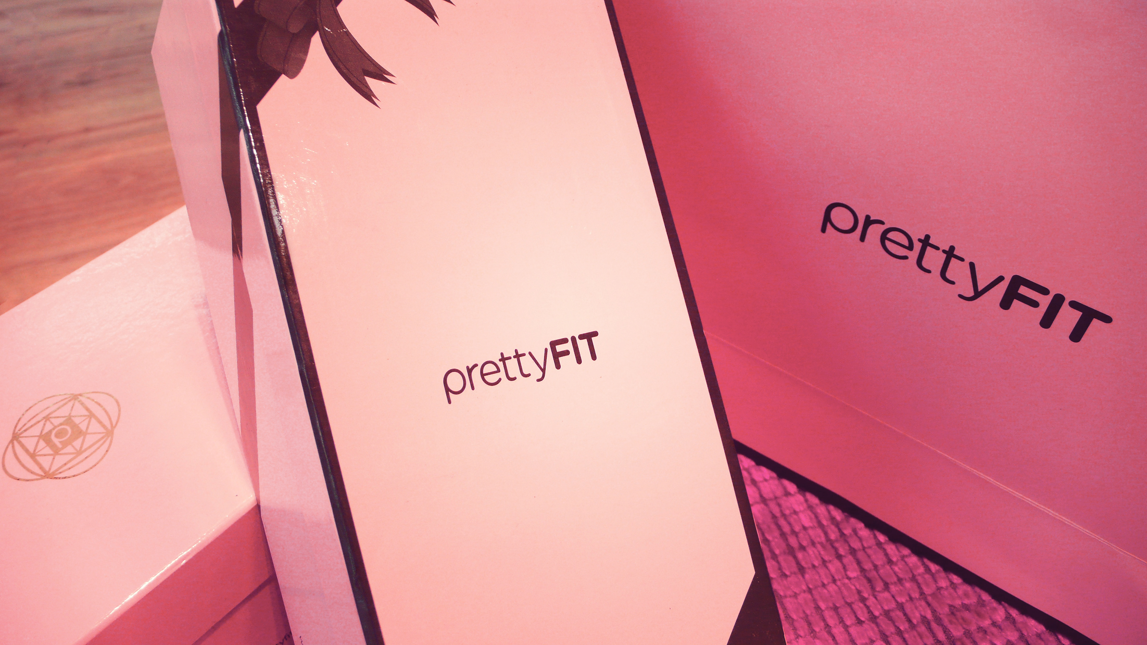
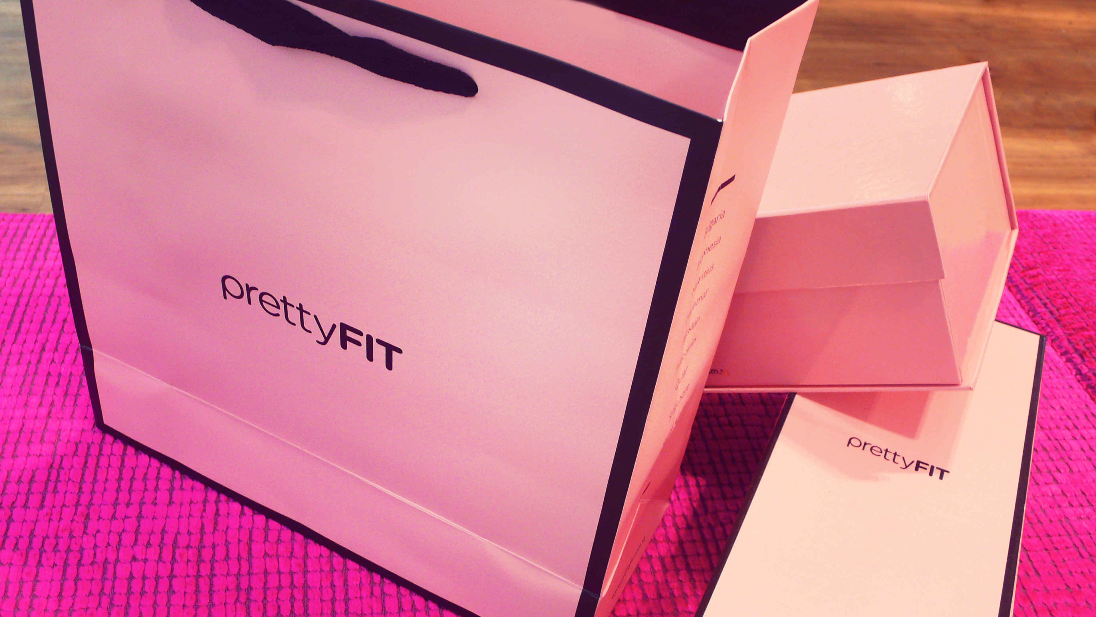
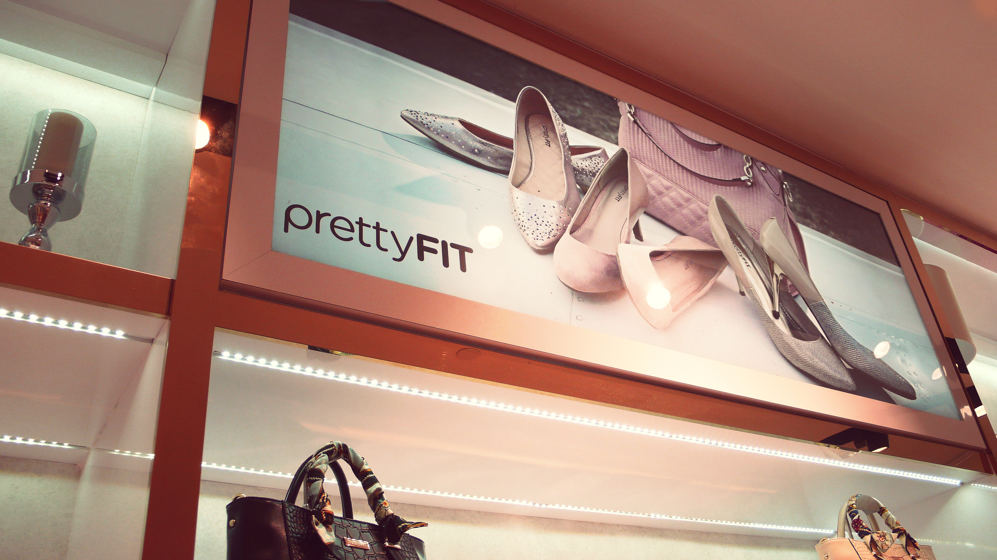
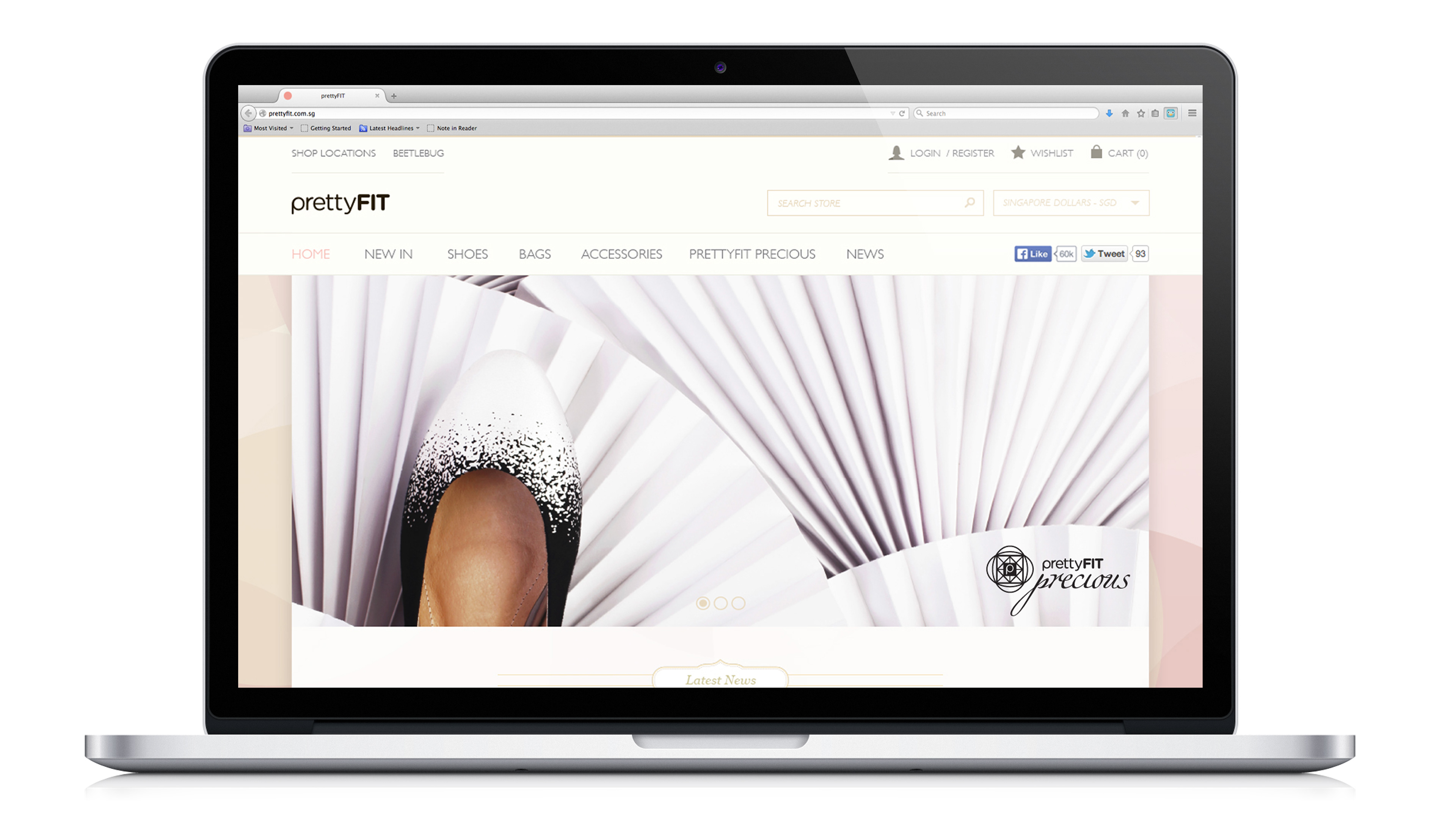
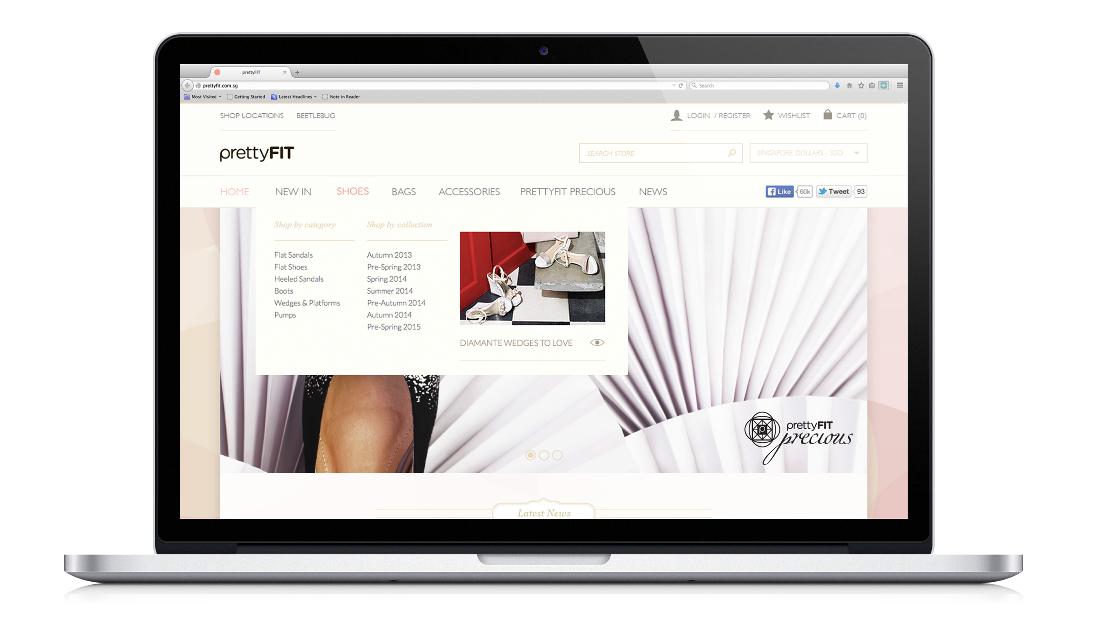
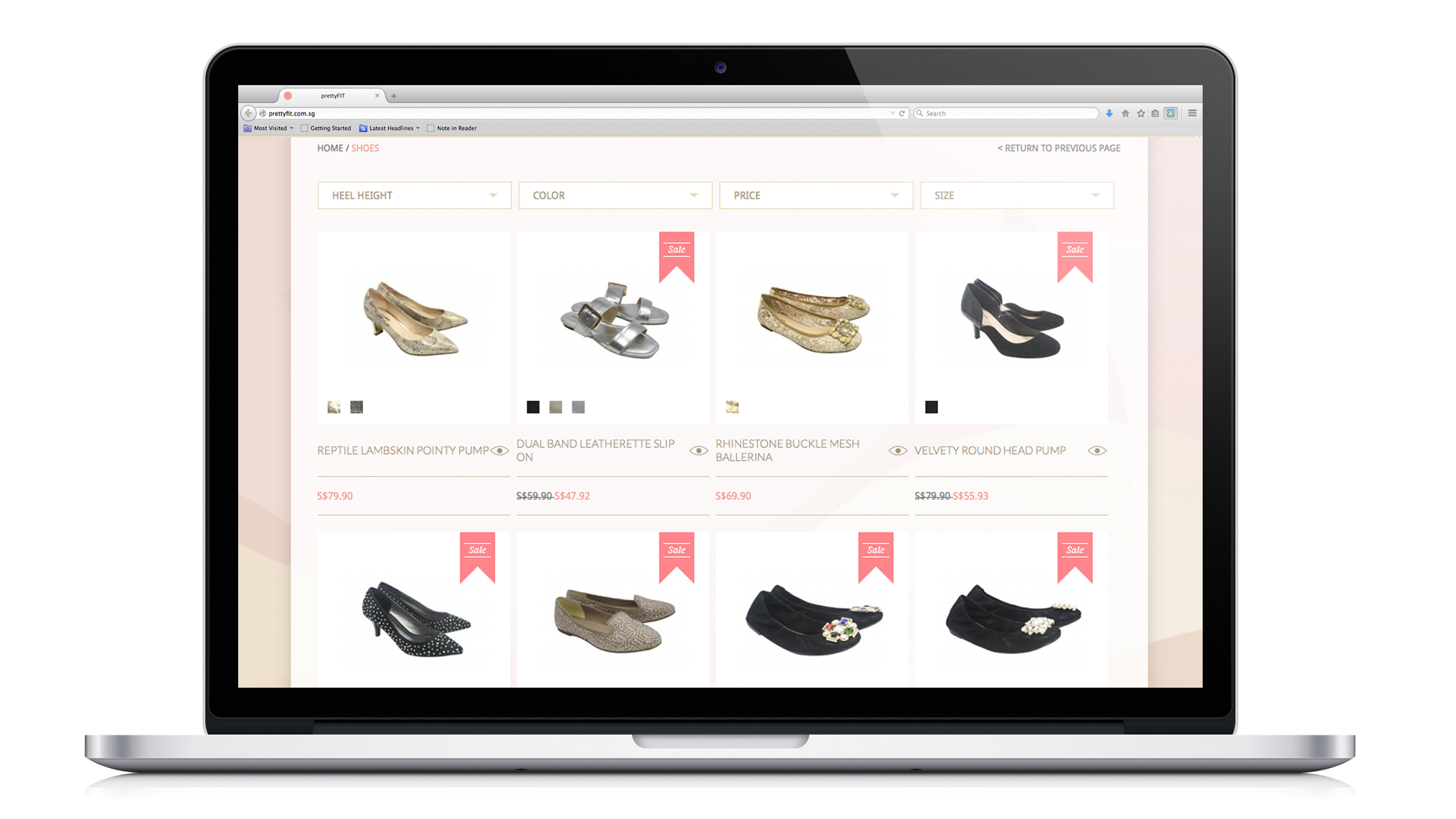
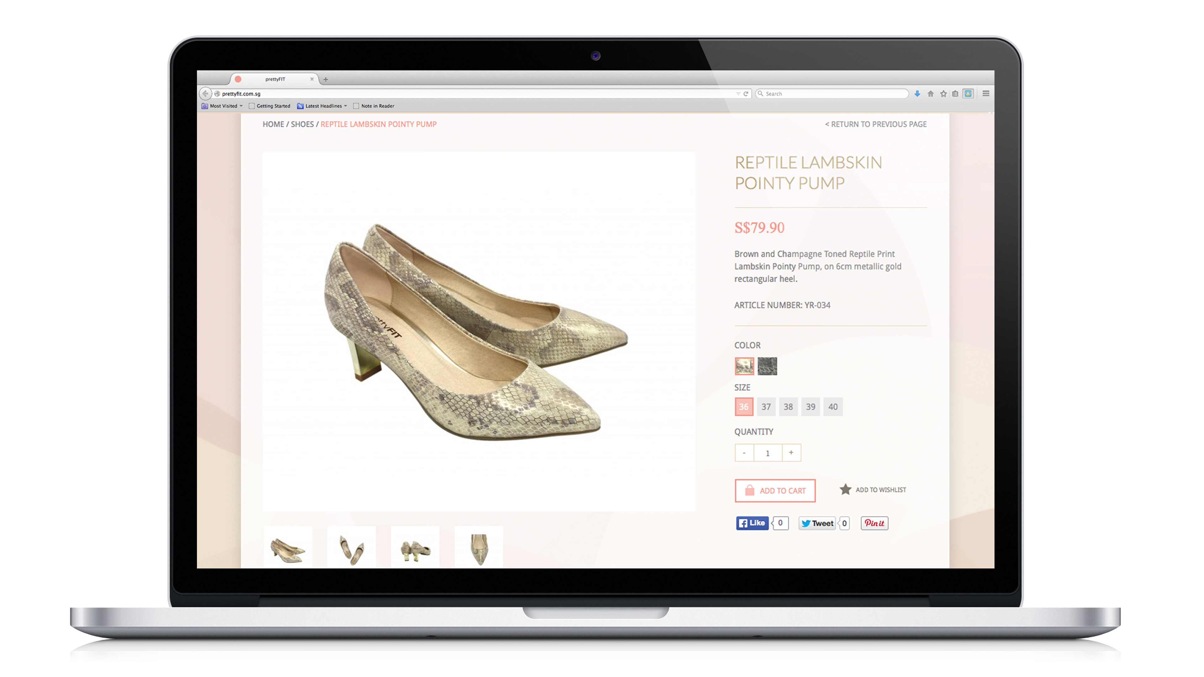
To embody this, we have polished prettyFIT's logo to have a feminine touch. The identity is given a more trendy and edgy feel. A new corporate colour – the prettyFIT pink is introduced as opposed to the previous colour of magenta. In addition, we have also revamped prettyFIT's website to make it more shopper-friendly for the more digitally connected customers.
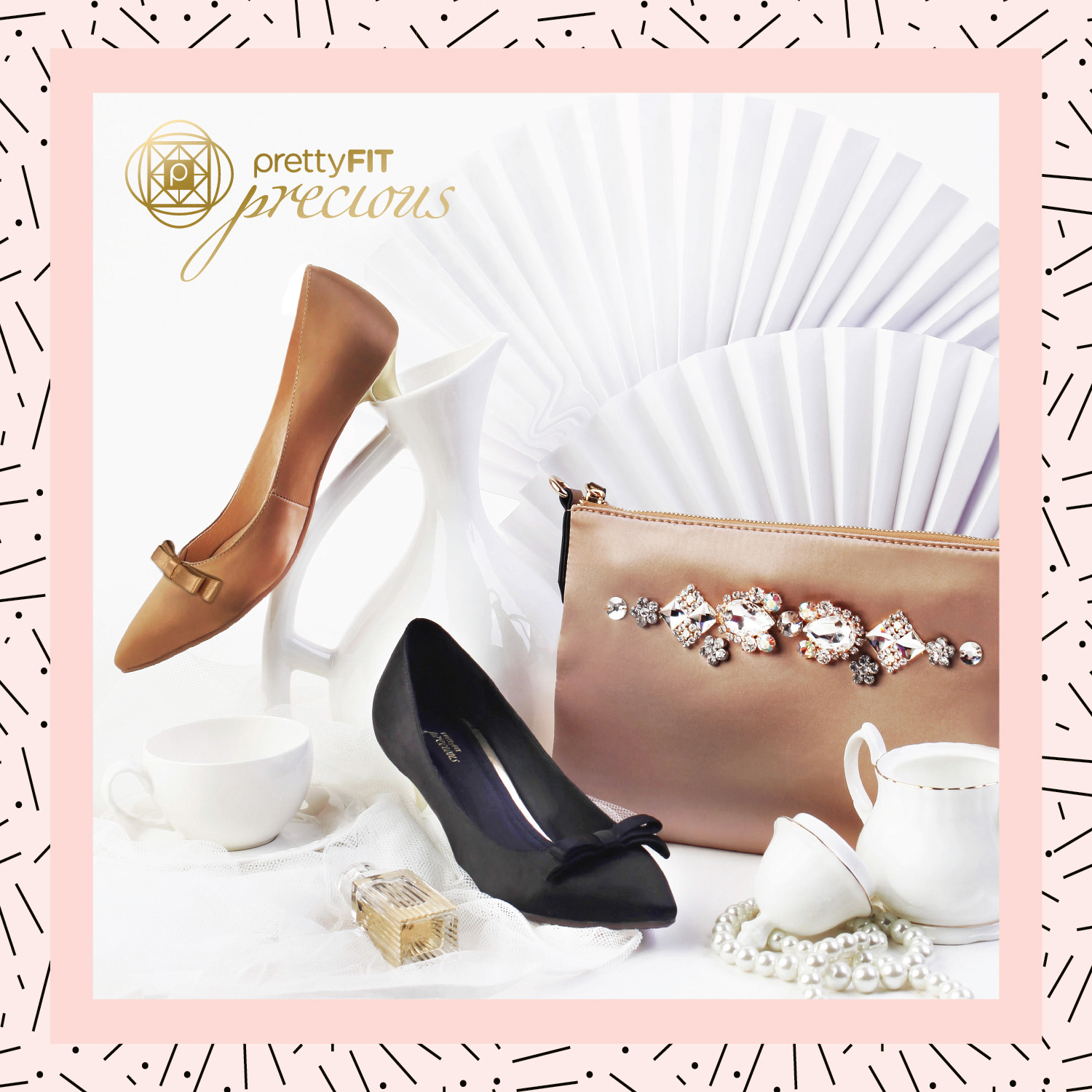
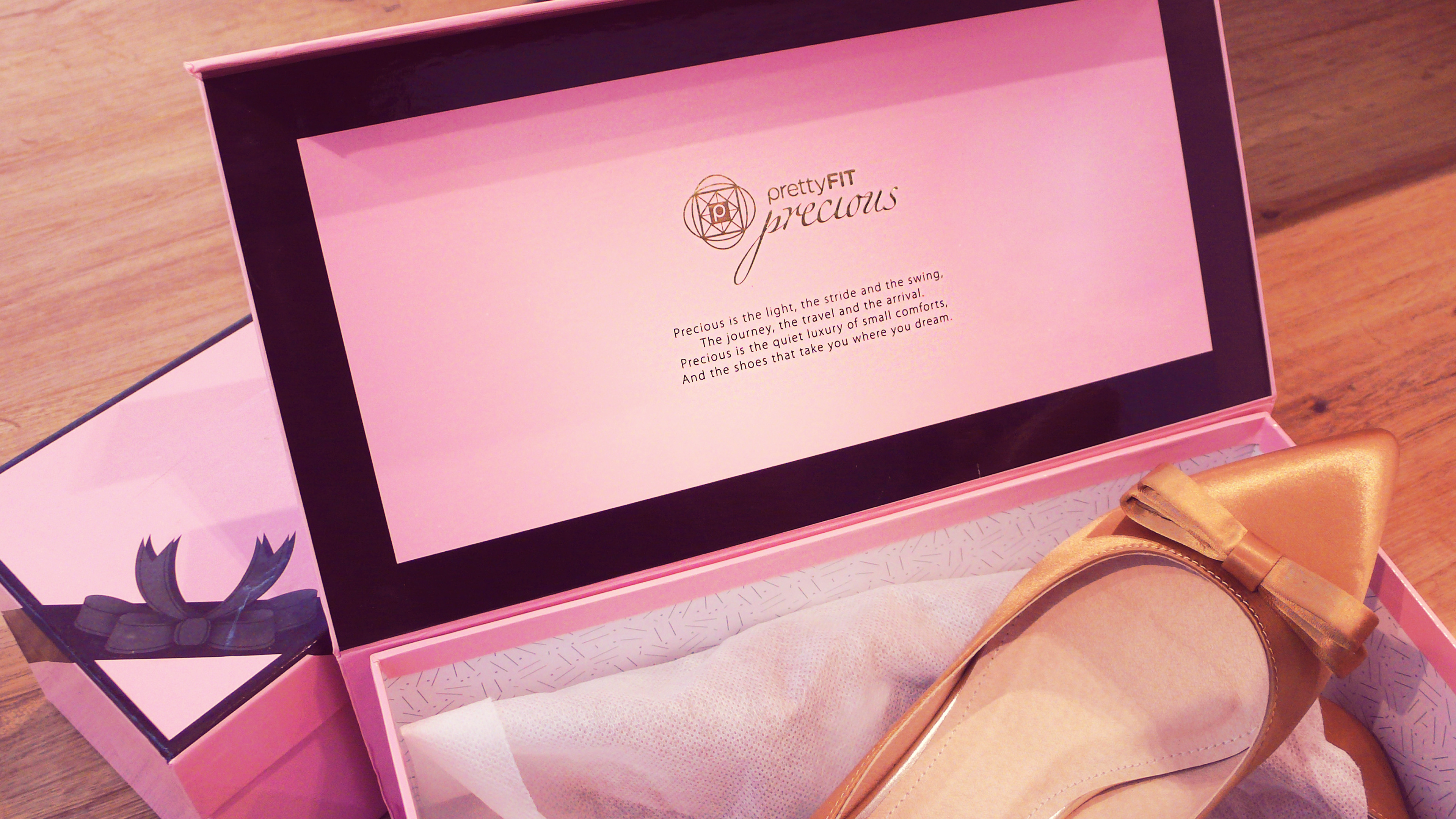
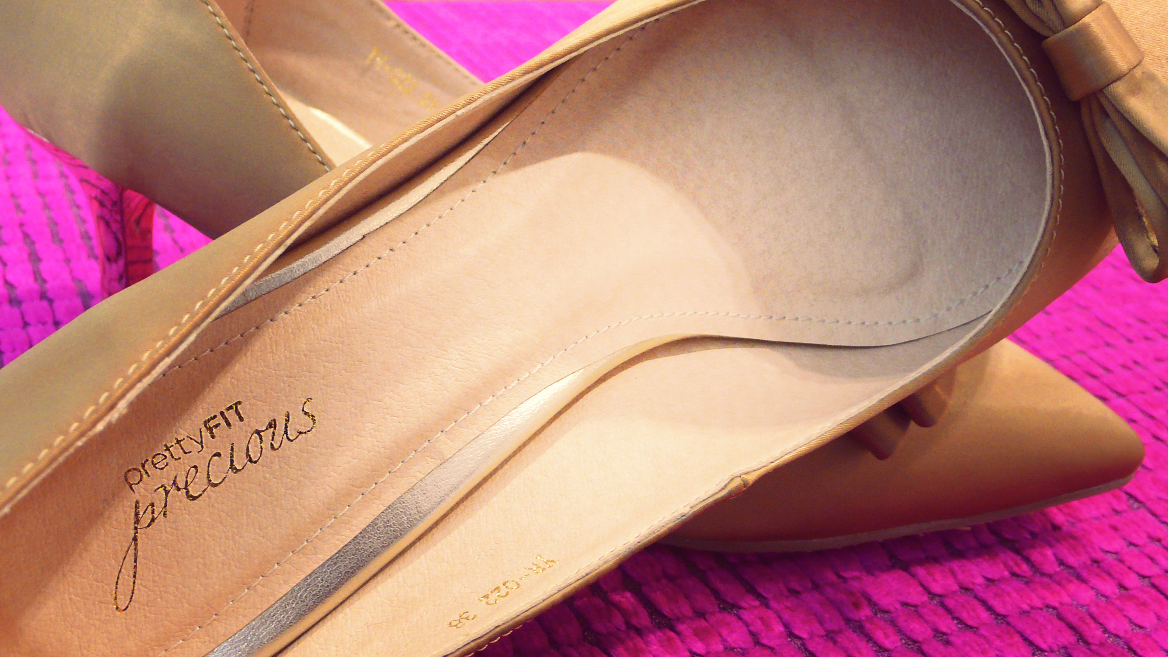
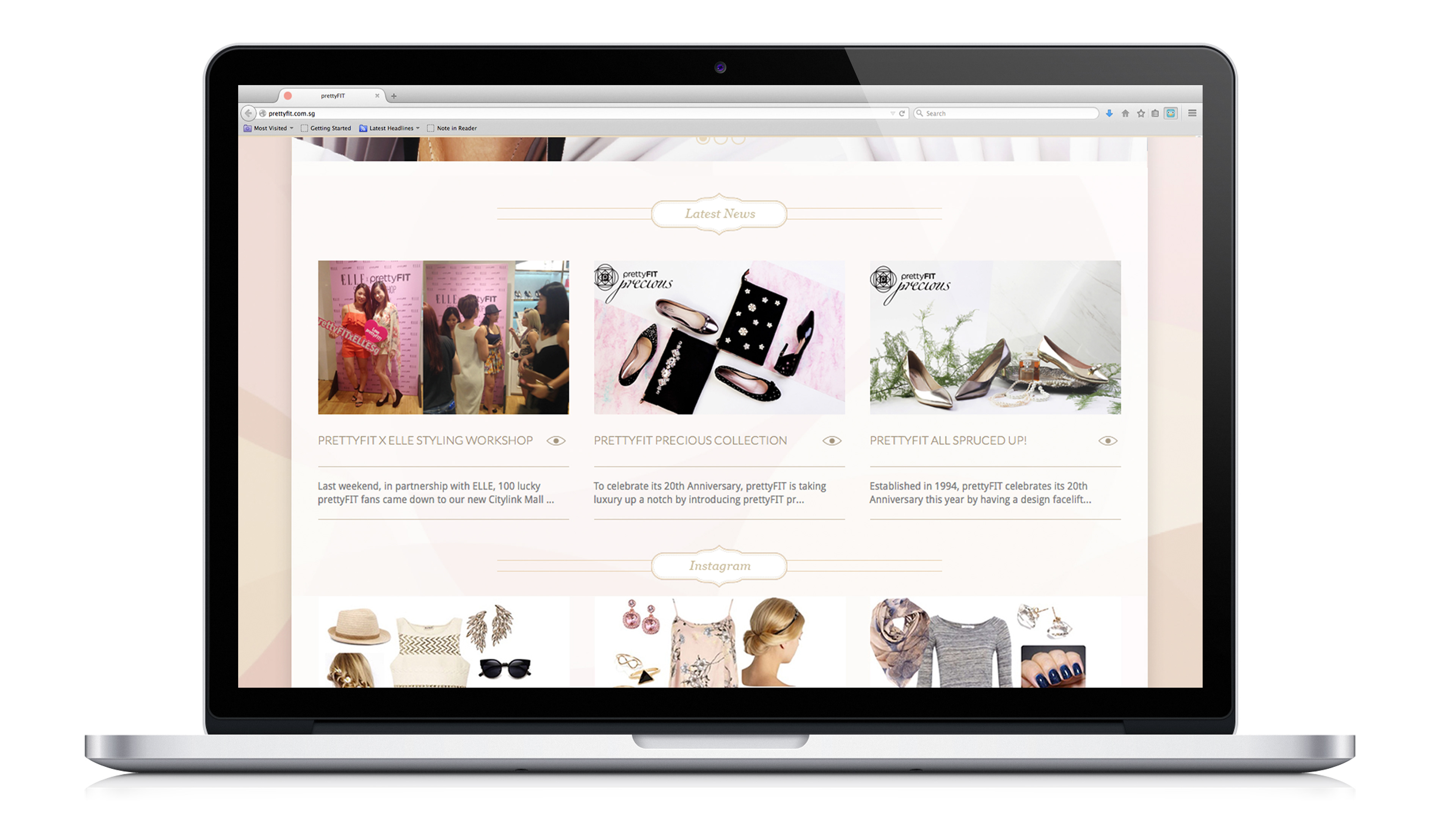
To celebrate its 20th Anniversary, prettyFIT is taking luxury up a notch by introducing prettyFIT precious as a platform to collaborate with other brands and designers on themed collections. The symbol is inspired by art deco movement to exemplify the modern and fashion forward direction of this new platform.
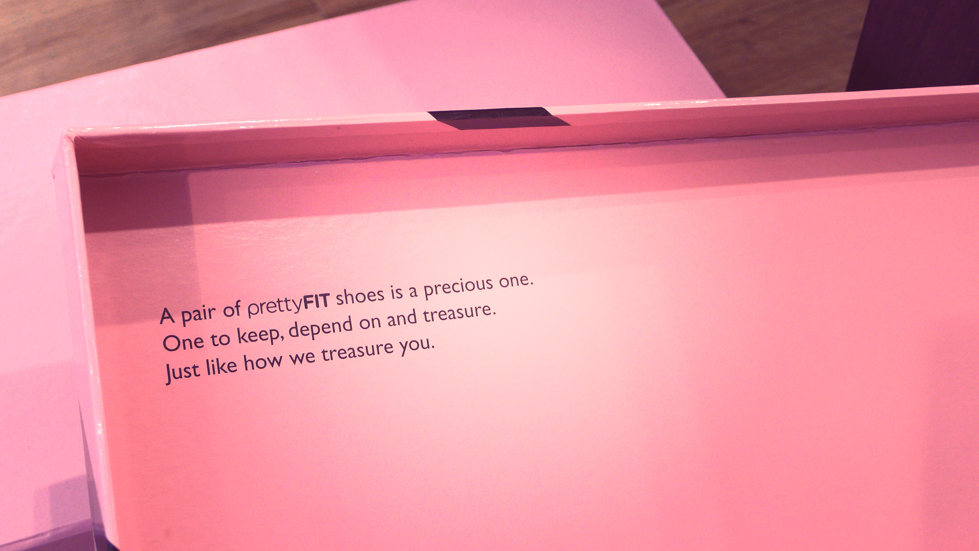
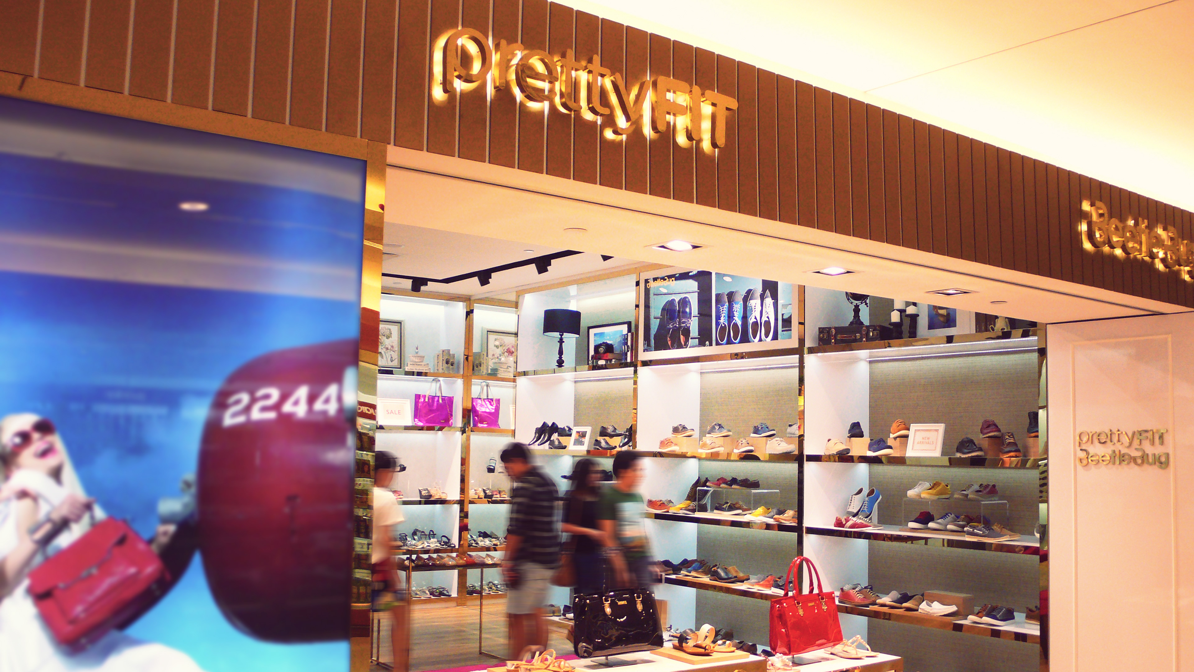
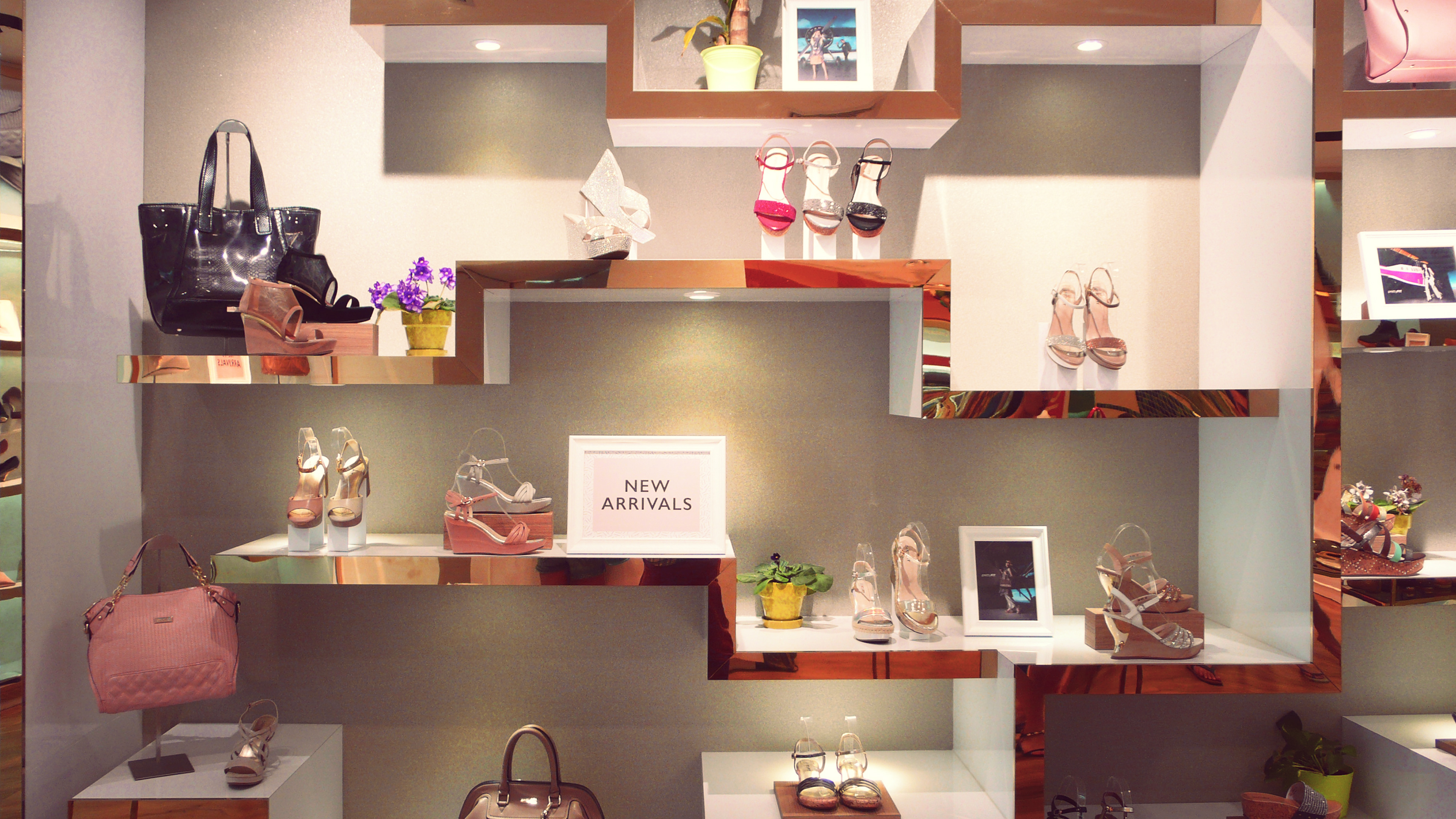
The refreshed new look and feel is translated into the new outlet at Citylink Mall as well as other various collaterals such as carrier bags, vouchers & VIP application forms, signages, store policy cards, product tags, point of purchase systems, press & media kit, shoe packaging boxes etc.
Done in collaboration with The Largest Continent.