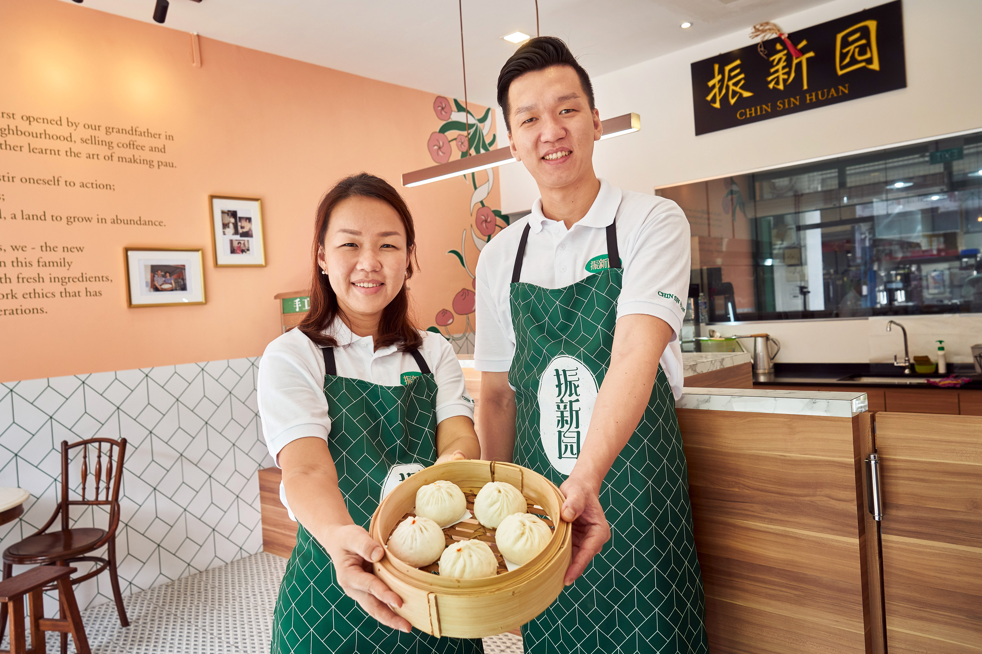

Client: Chin Sin Huan
Year: 2018
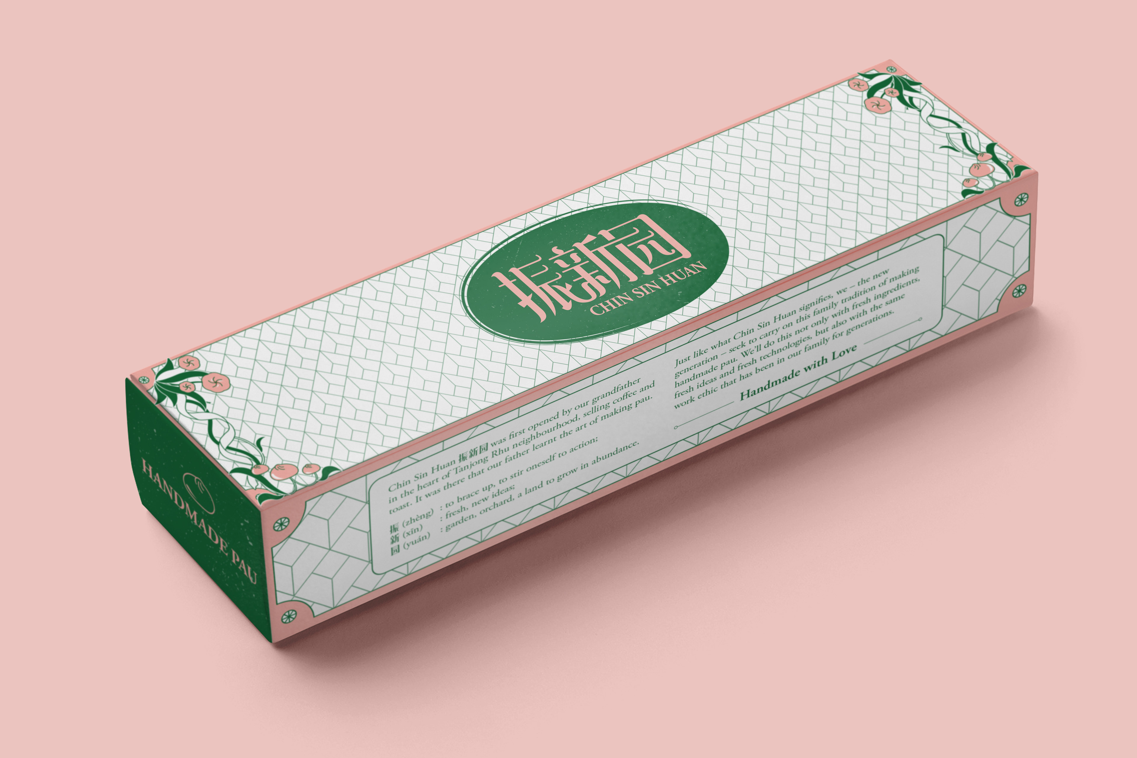
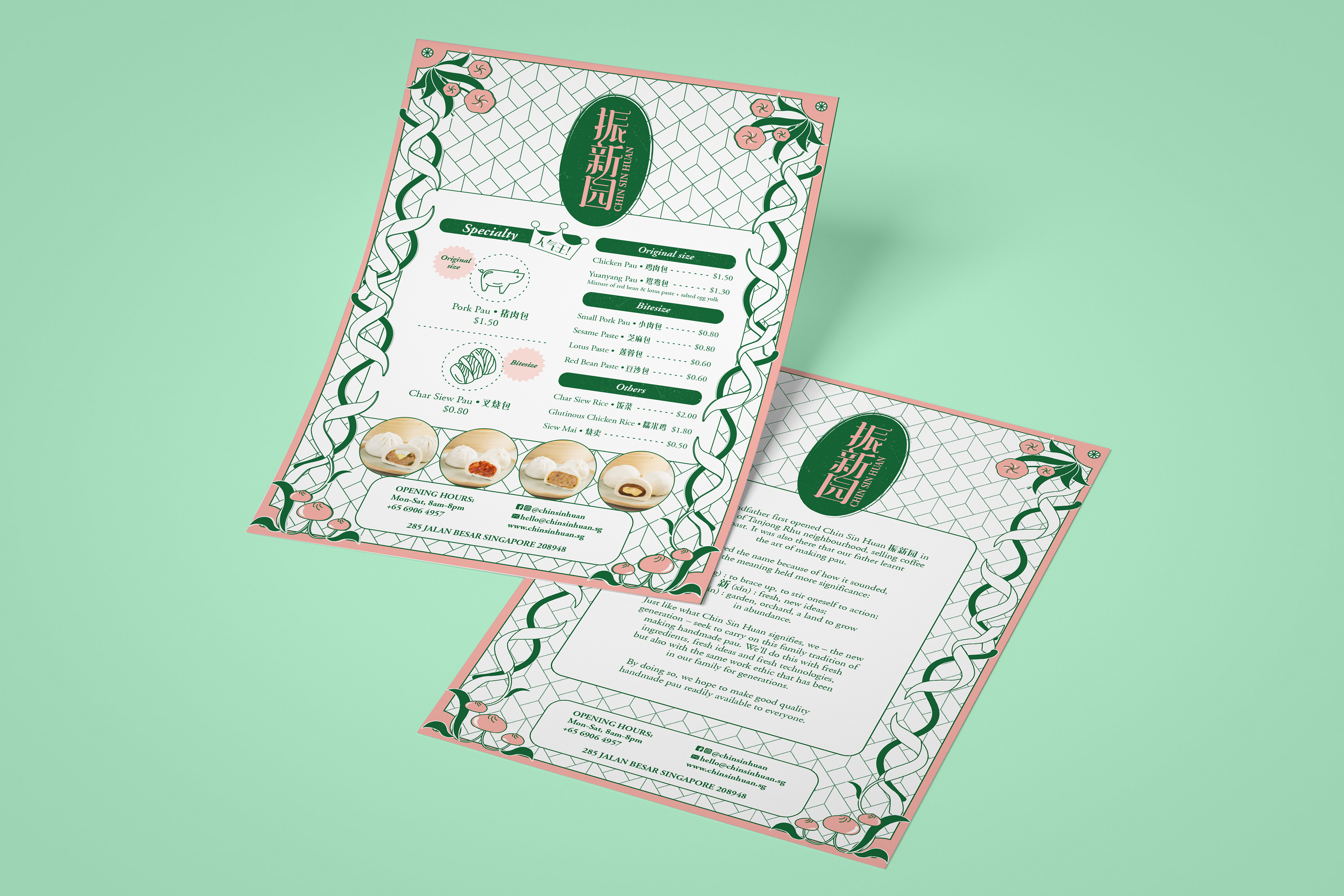
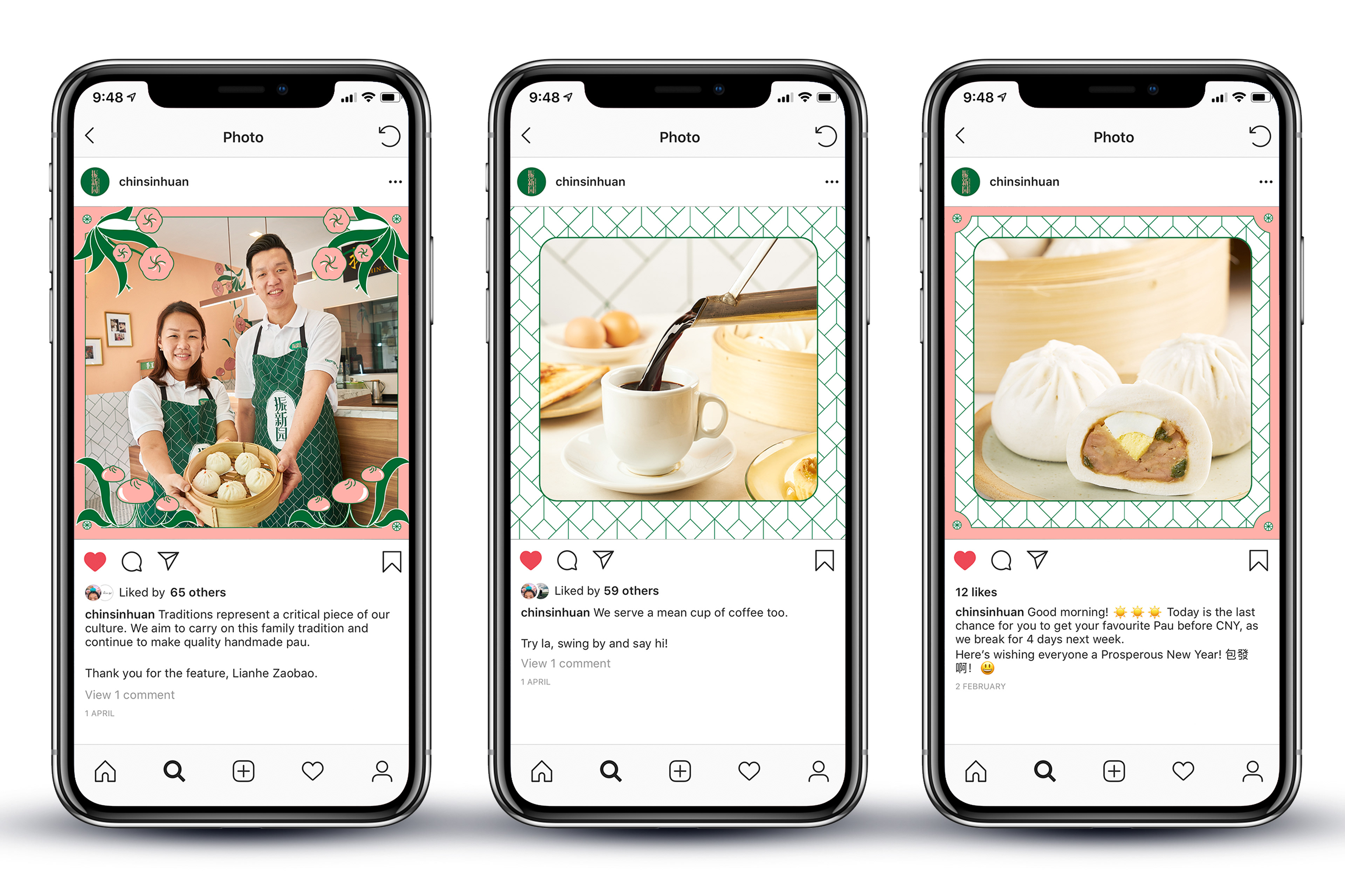
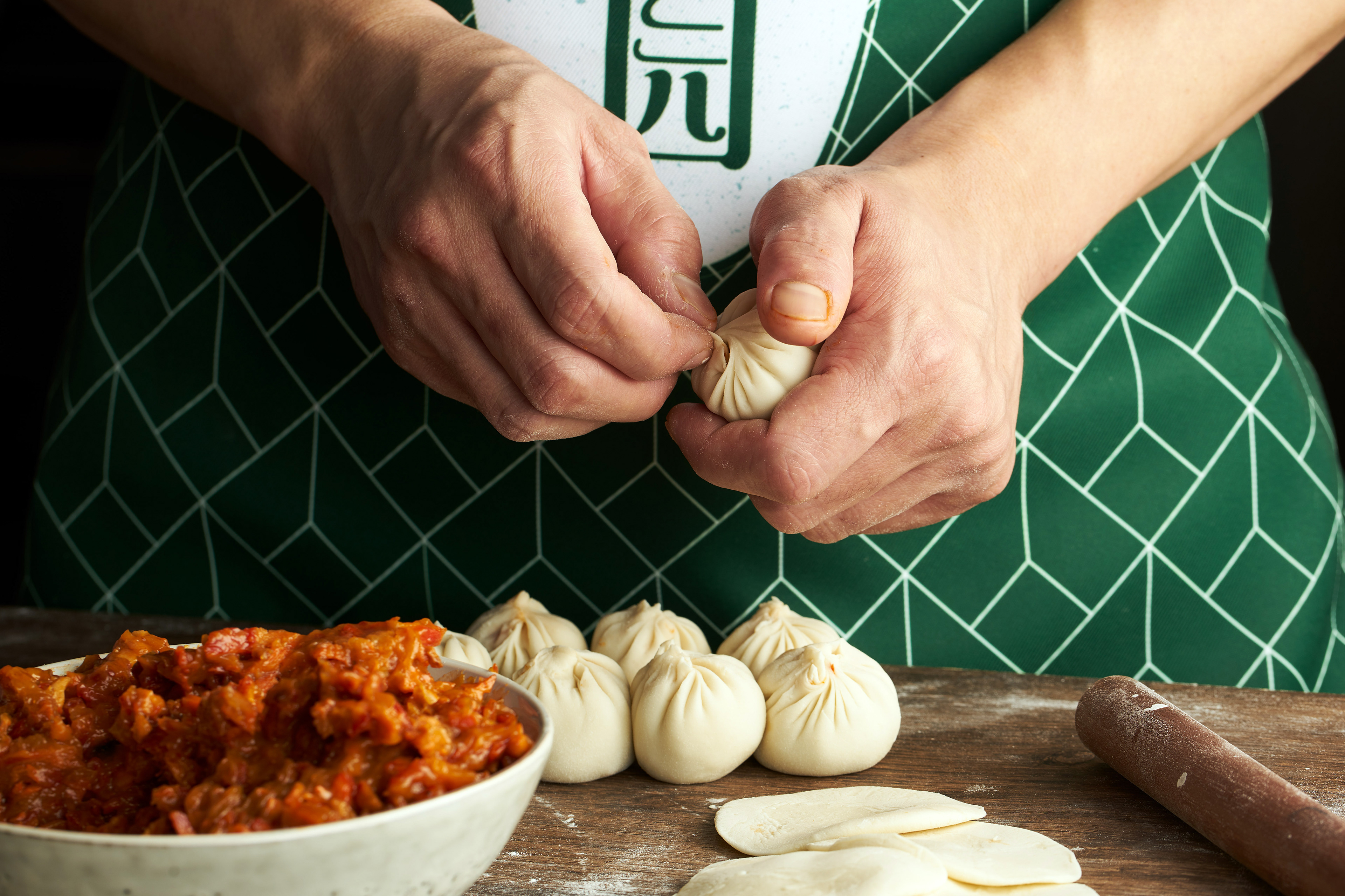
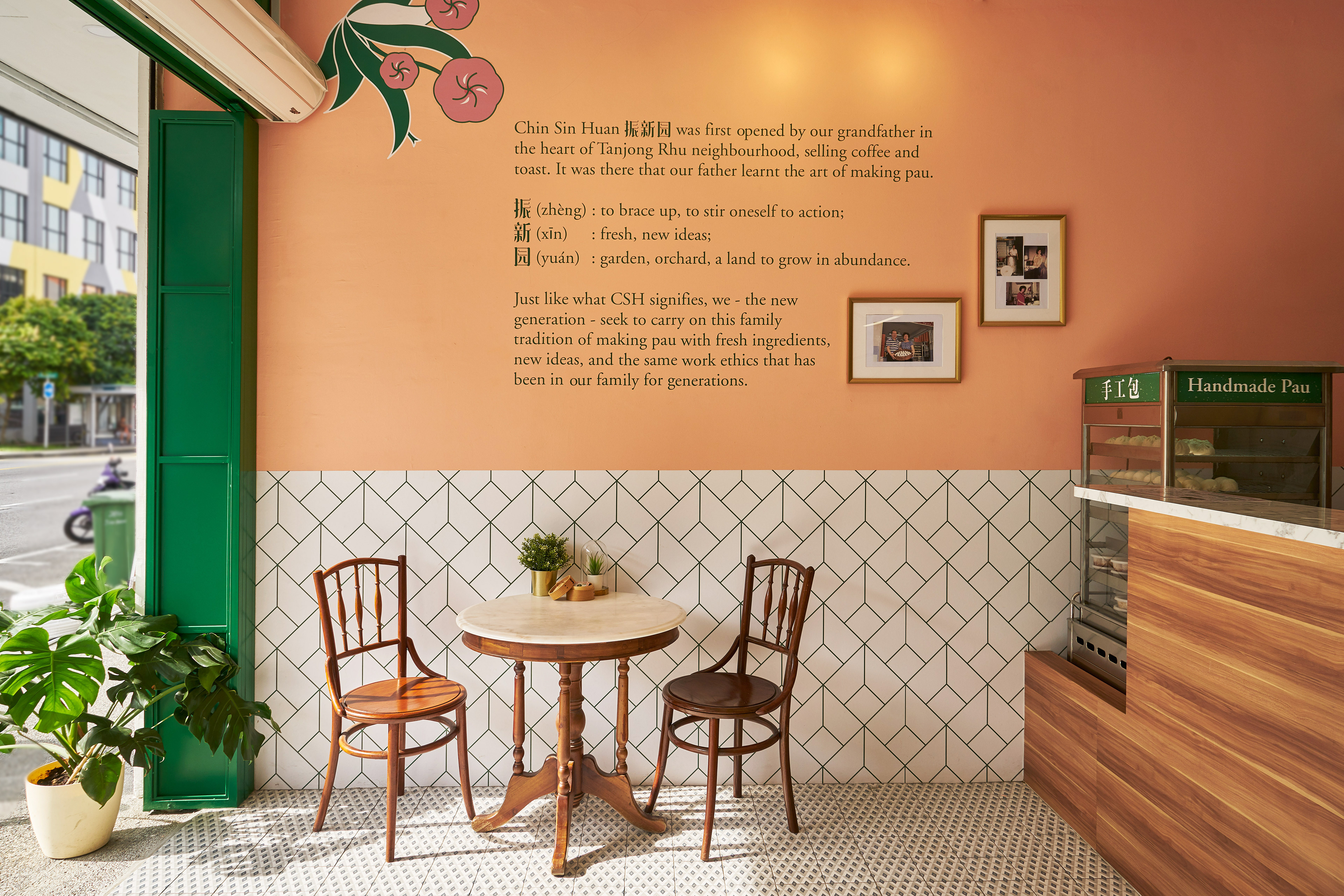
Chin Sin Huan 振新园 was first opened by their grandfather in the heart of Tanjong Rhu neighbourhood, selling coffee and toast. It was there that their father learnt the art of making pau.
振 (zhèn): to brace up, to stir oneself to action;
新 (xīn): fresh, new ideas;
园 (yuán): garden, orchard, a land to grow in abundance.
新 (xīn): fresh, new ideas;
园 (yuán): garden, orchard, a land to grow in abundance.
Just like what Chin Sin Huan signifies, they - the new generation - seek to carry on this family tradition of making pau with fresh ingredients, new ideas, and the same work ethics that has been in their family for generations.
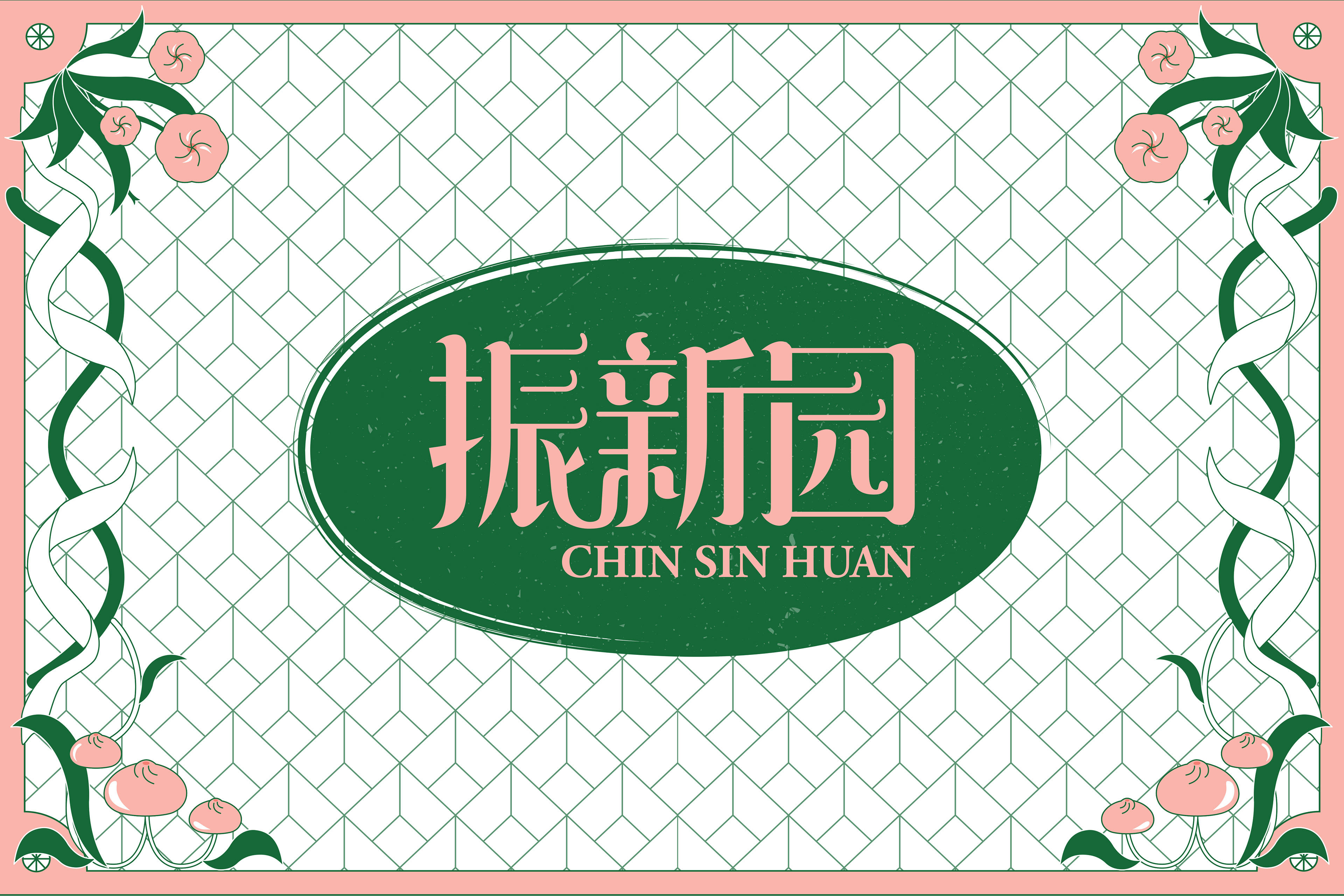
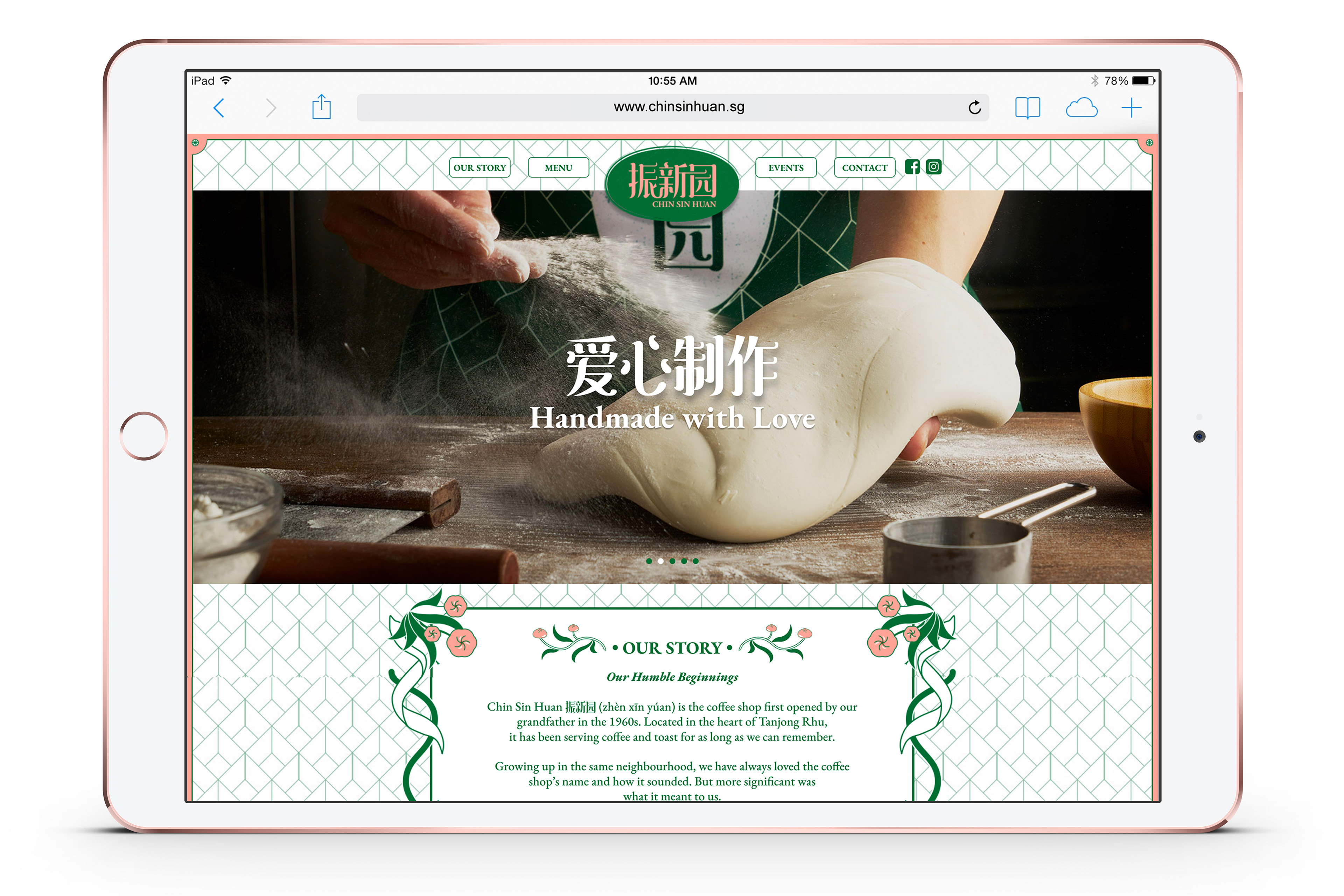
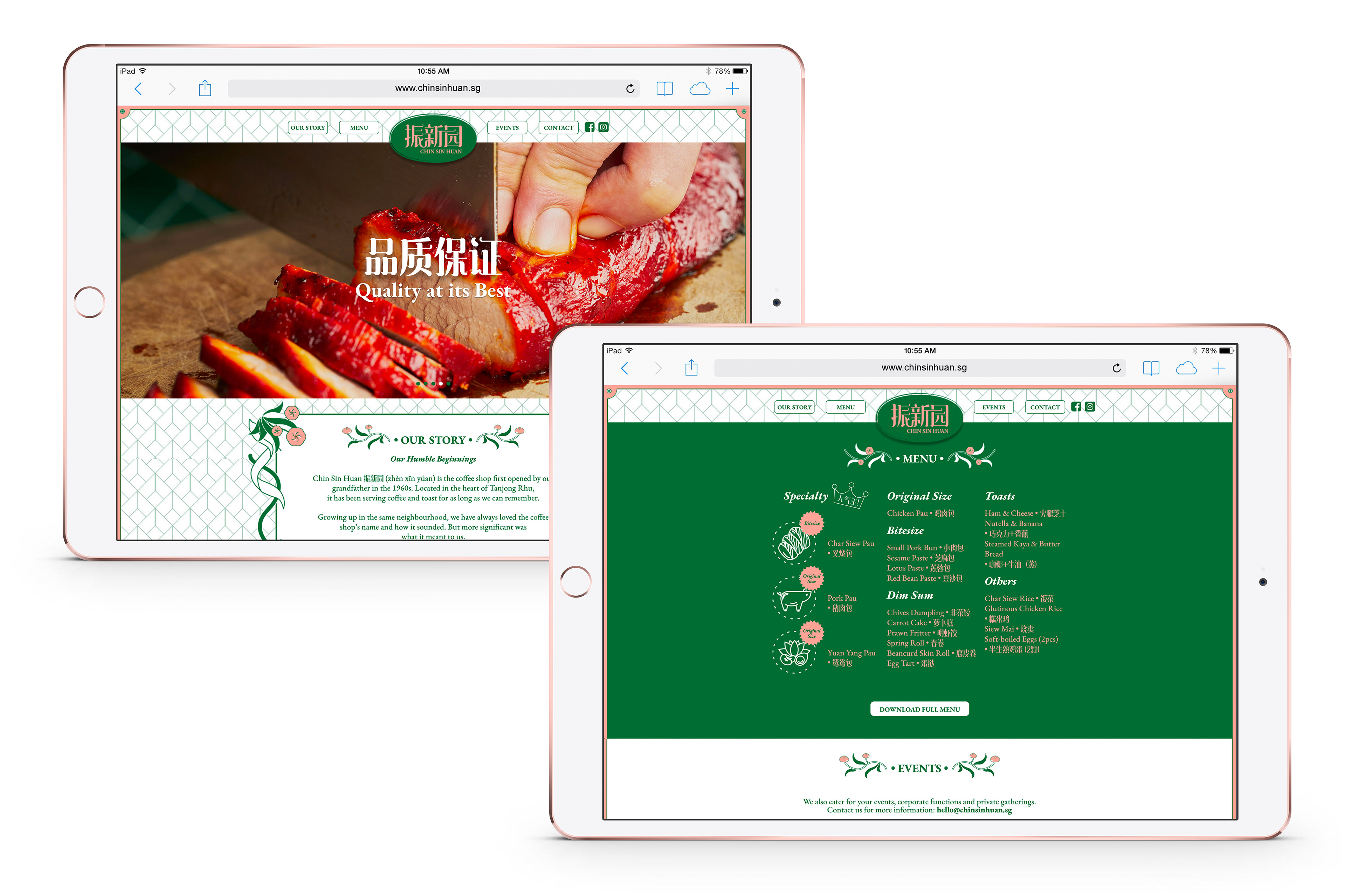
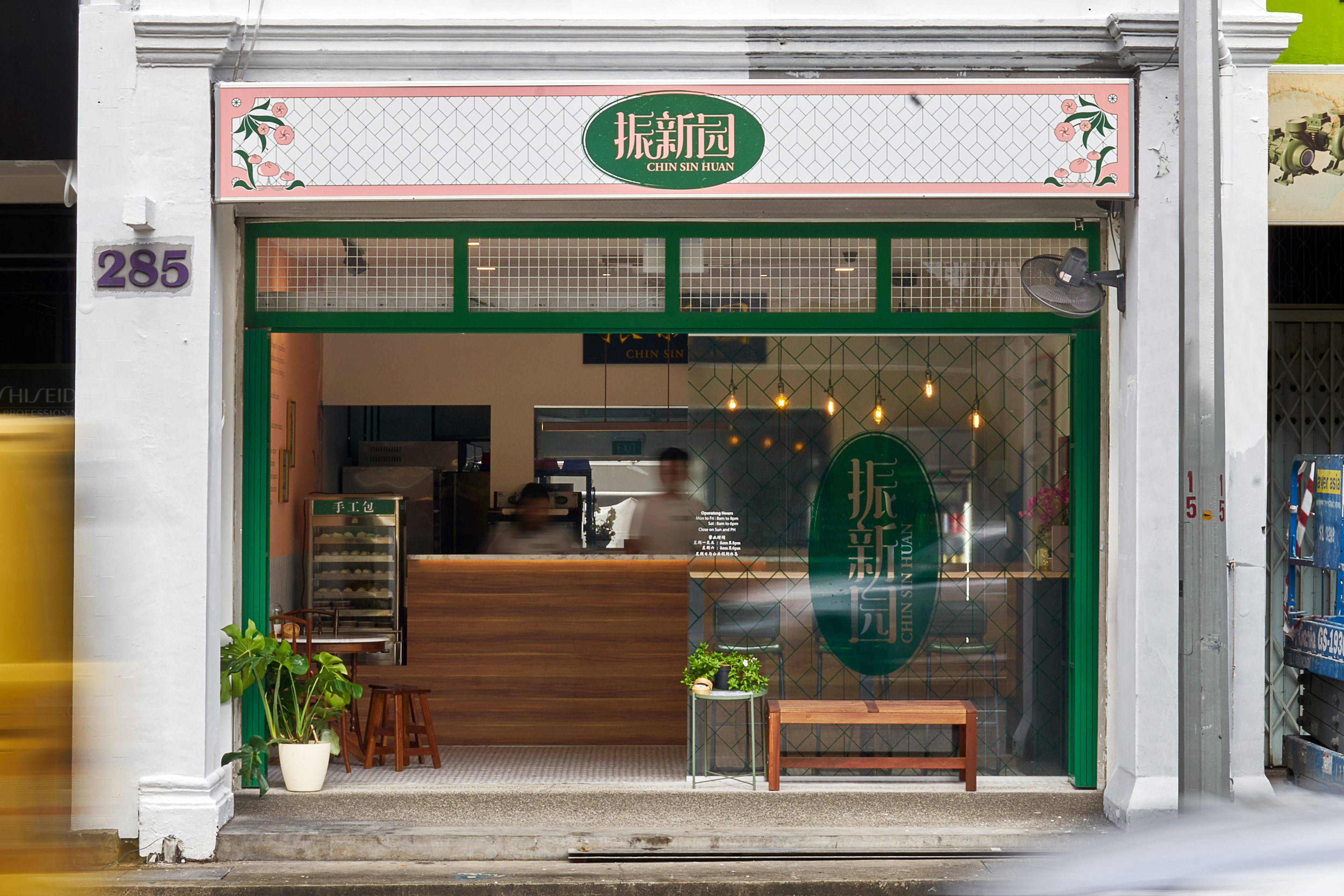
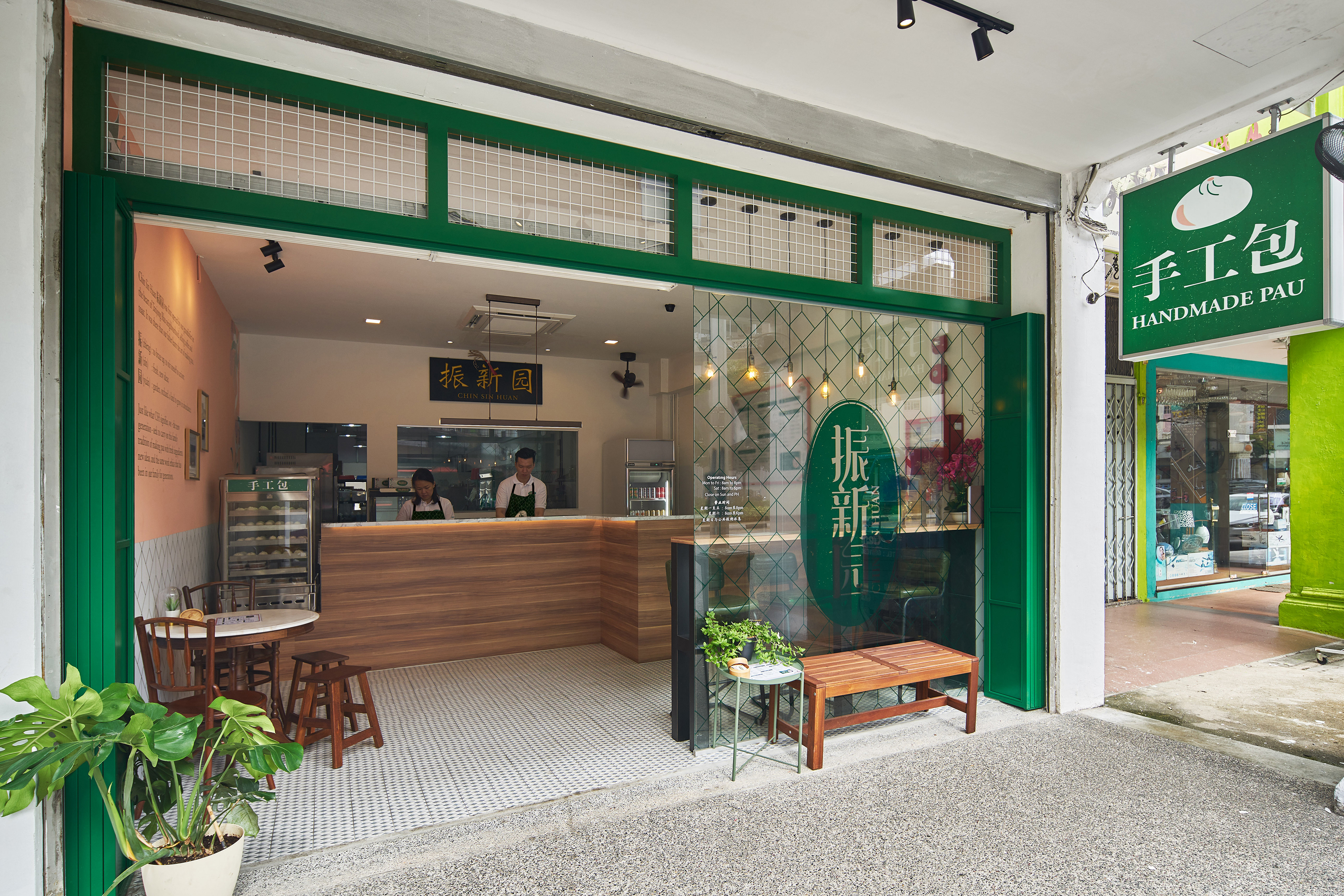
Our design concept is inspired by “海派”, which refers to the avant-garde but unique Shanghai’s East-meets-West culture that is popular in the 1930s. “飲水思源” is a Chinese idiom which means to feel gratitude for our blessings, to remind us to show respect to the source of our happiness and success. As a brand name that has lived through generations, Chin Sin Huan is recognised for its original taste because of the recipe that has been passed down since the 1930s. Our goal is to give Chin Sin Huan a new contemporary twist that would be timeless, while not forgetting where its roots came from.
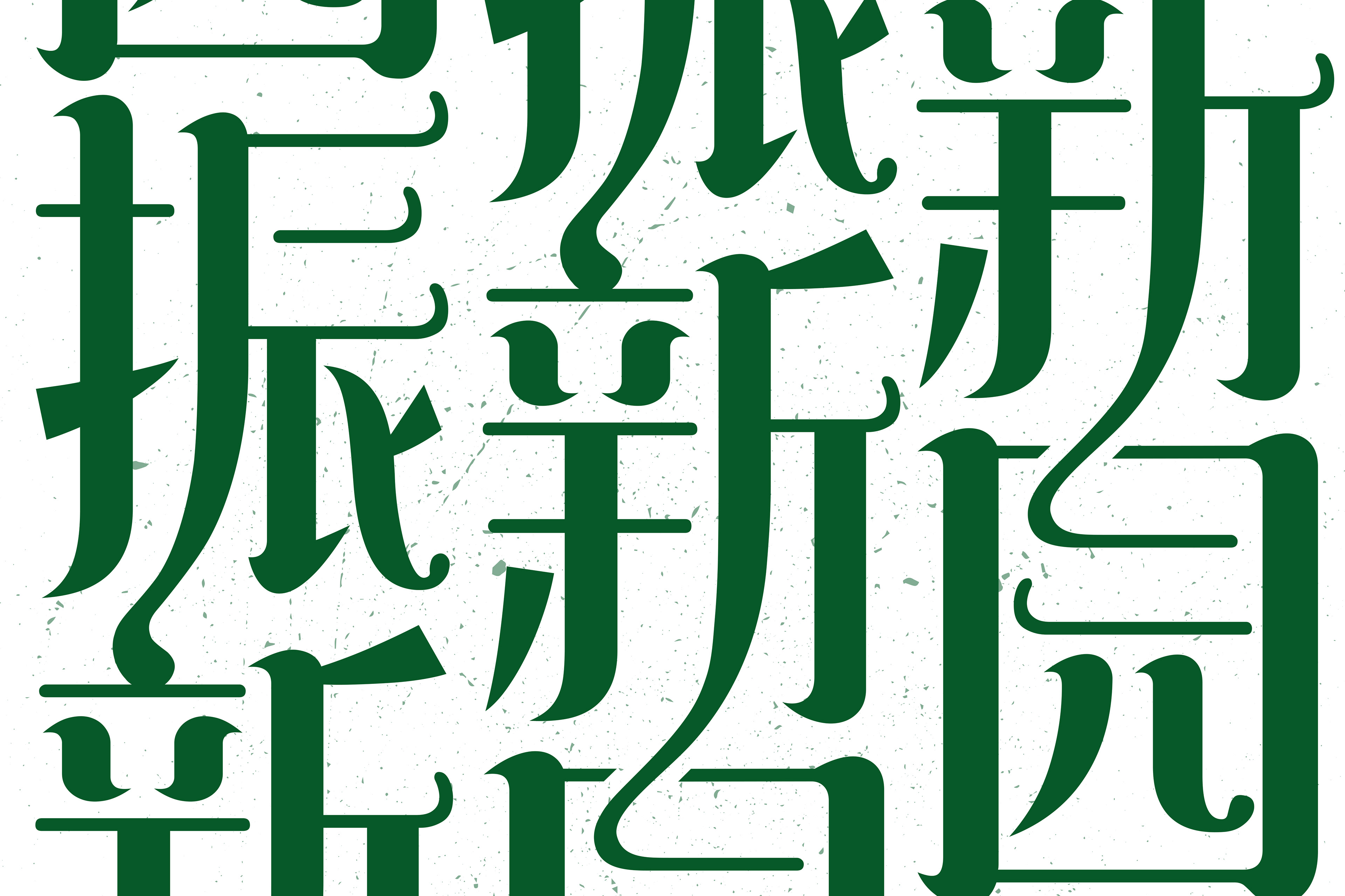
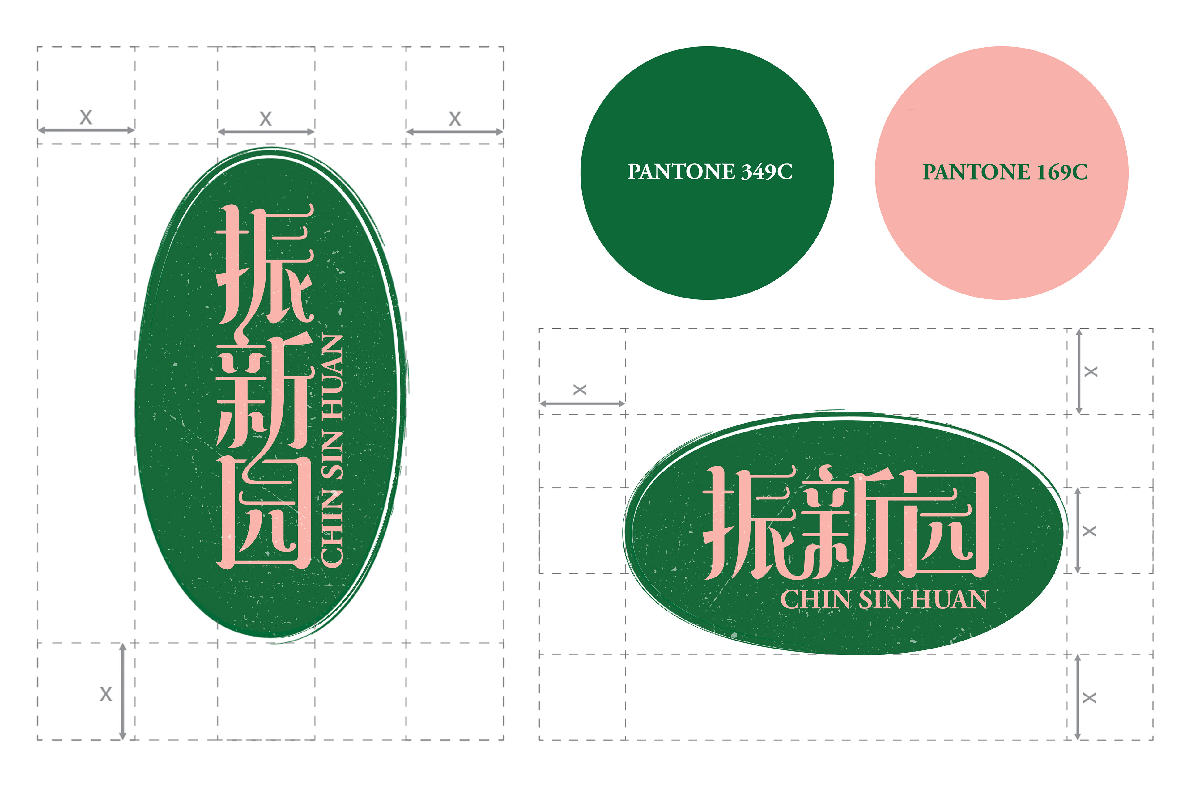
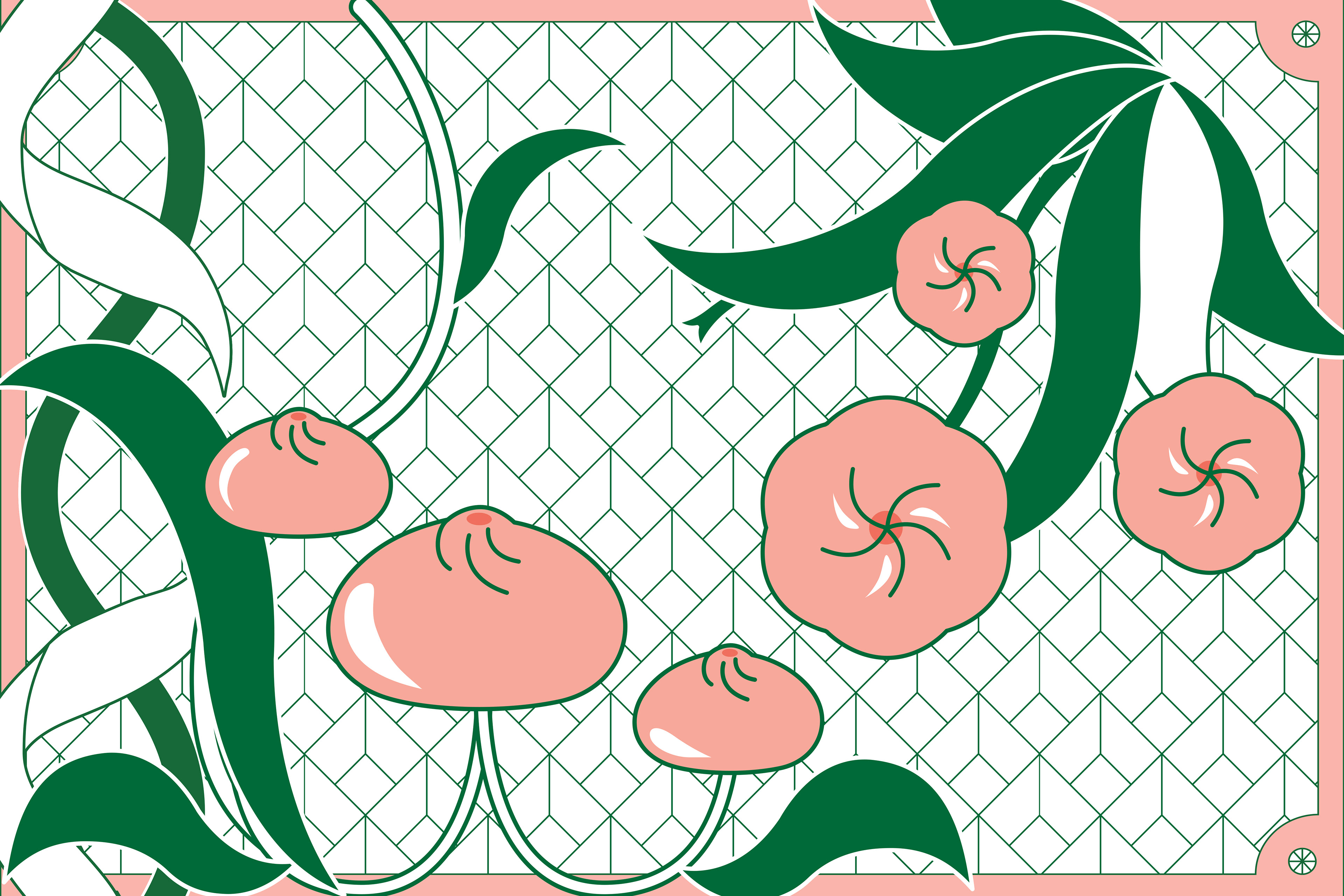
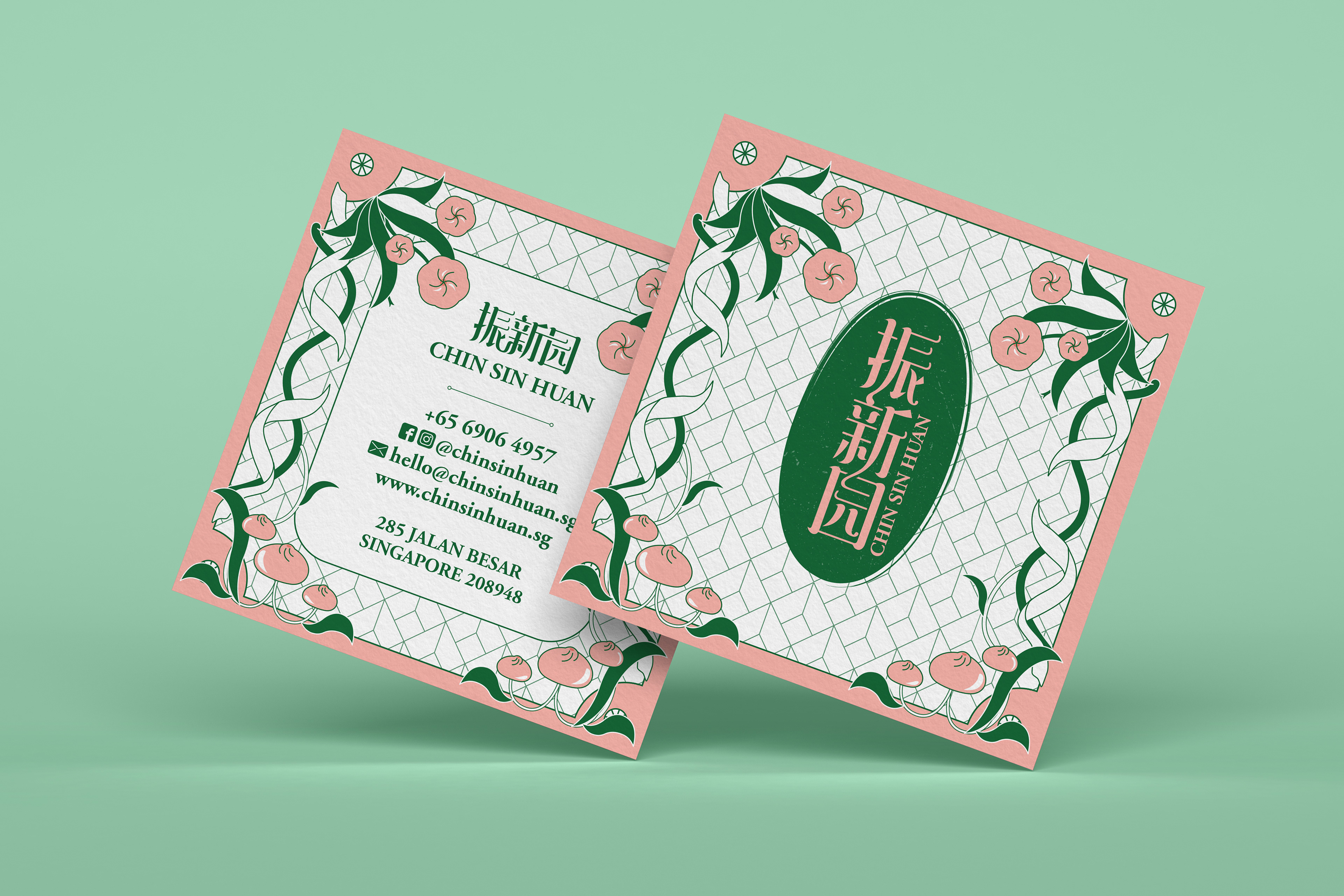
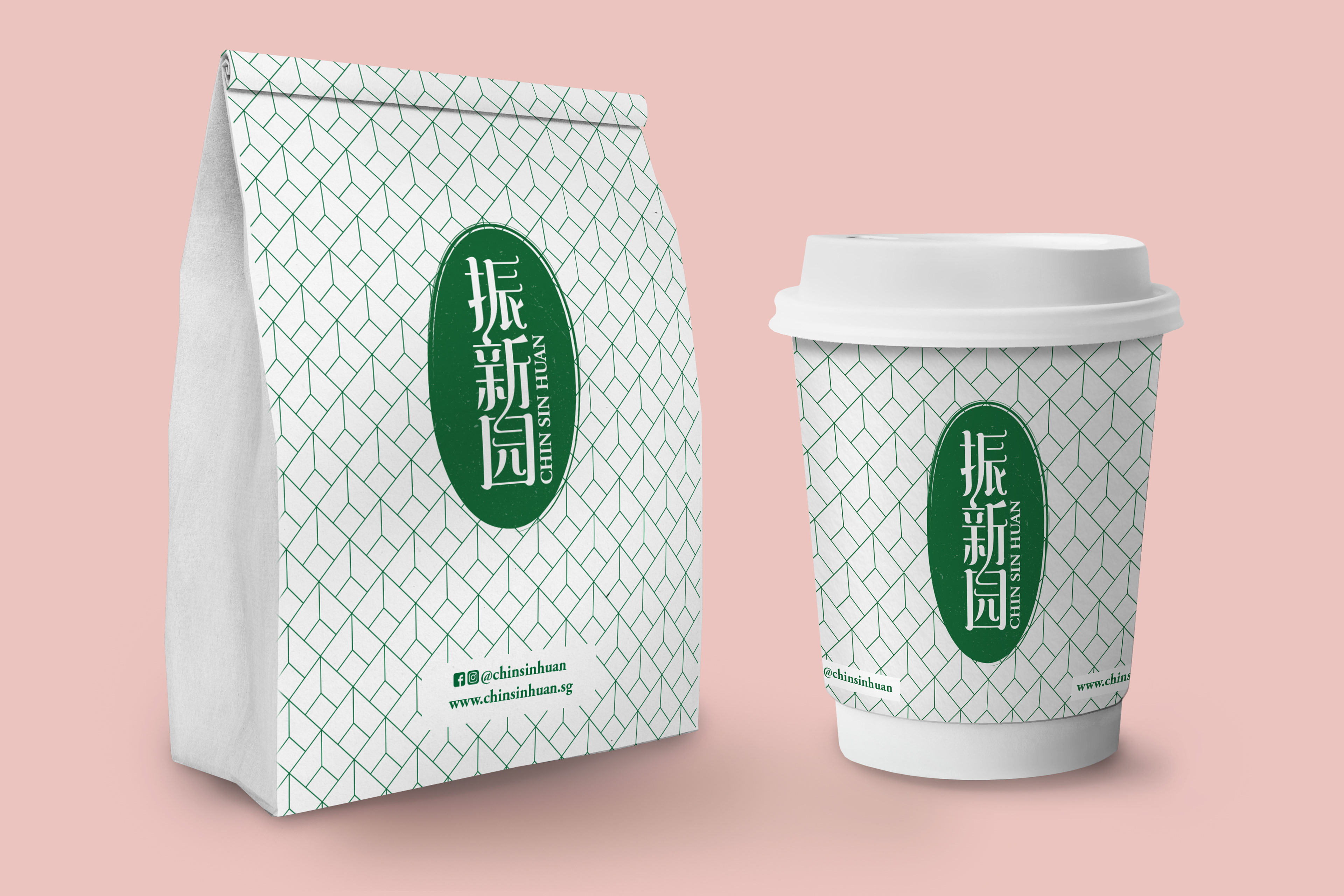
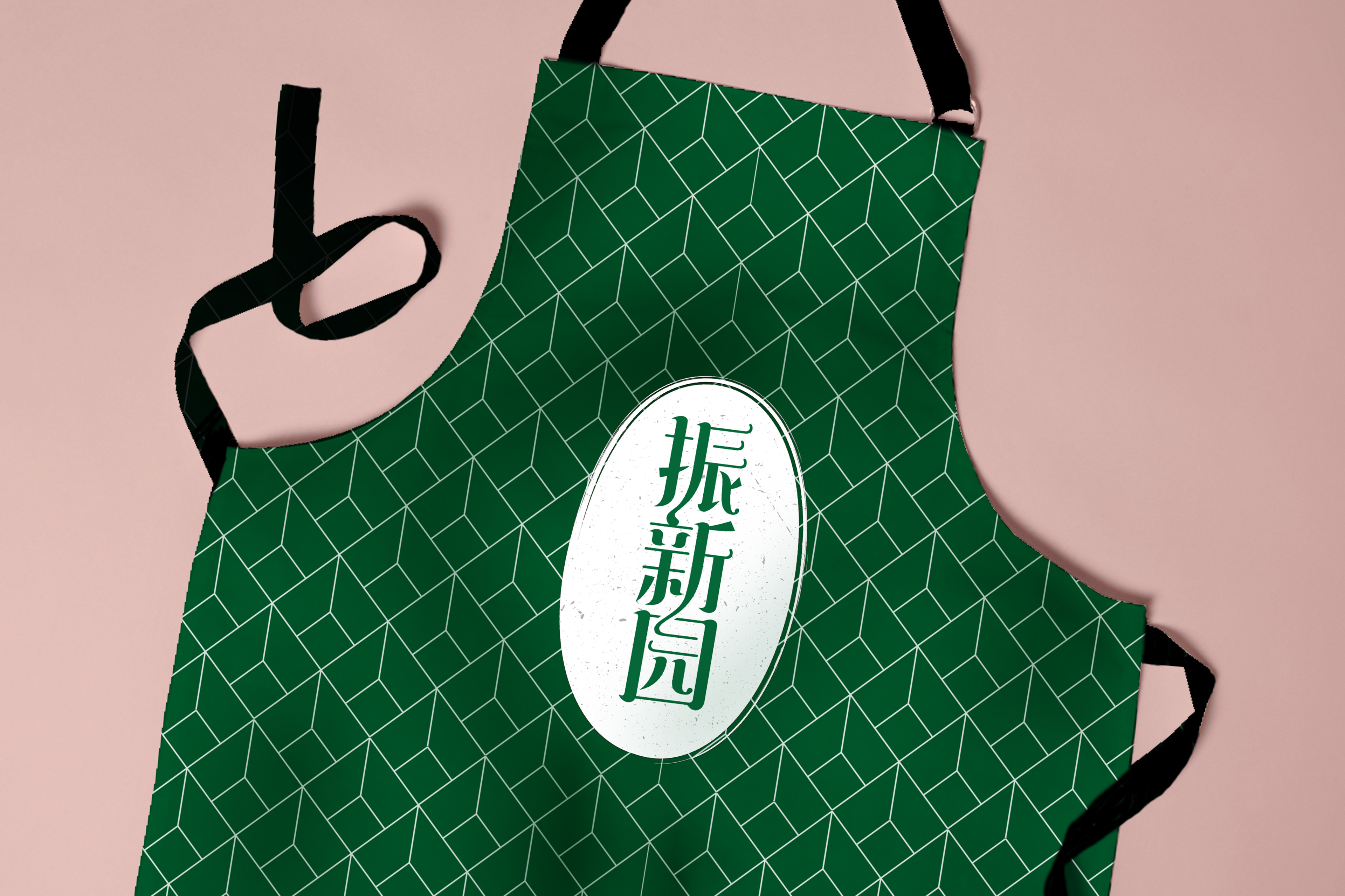
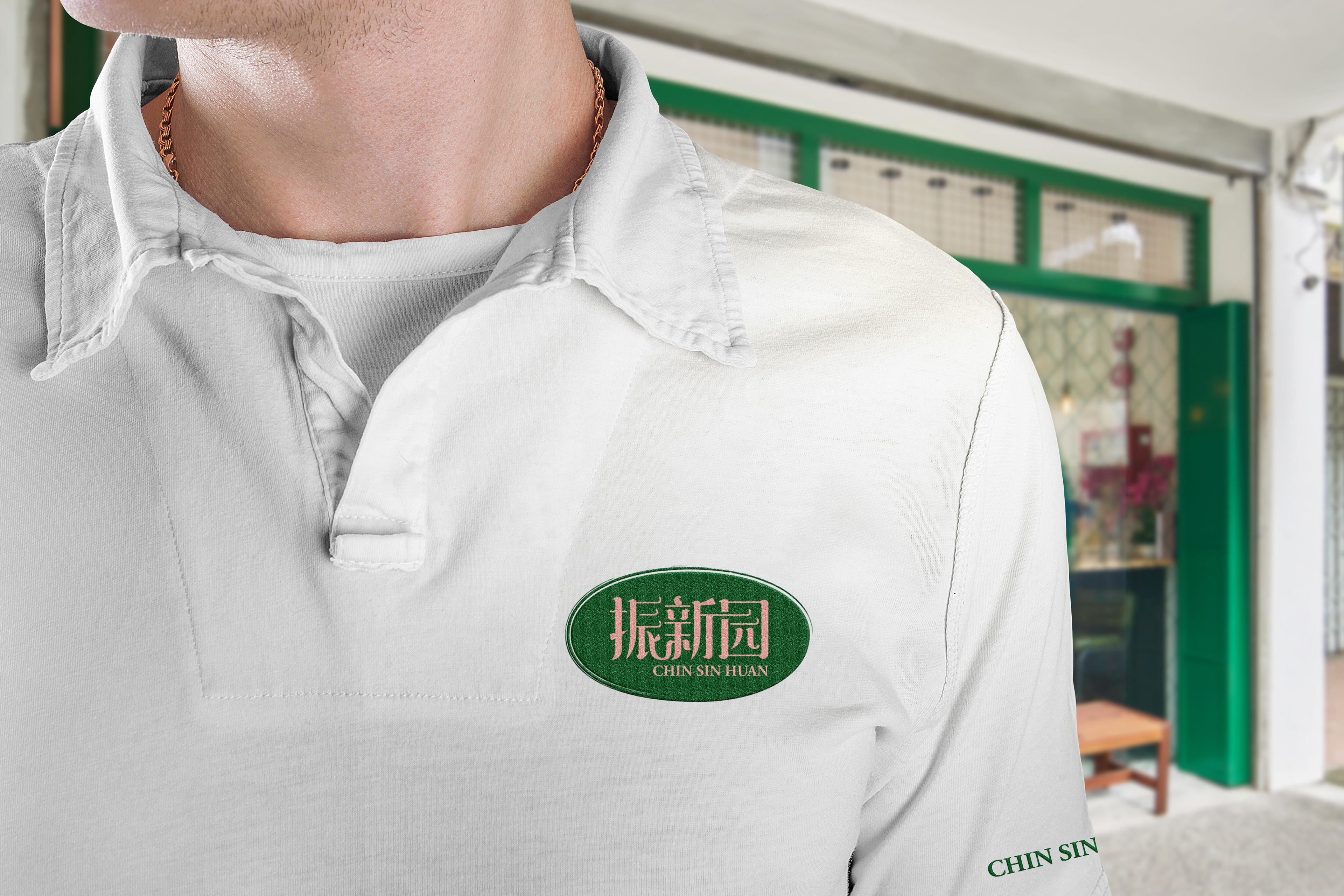
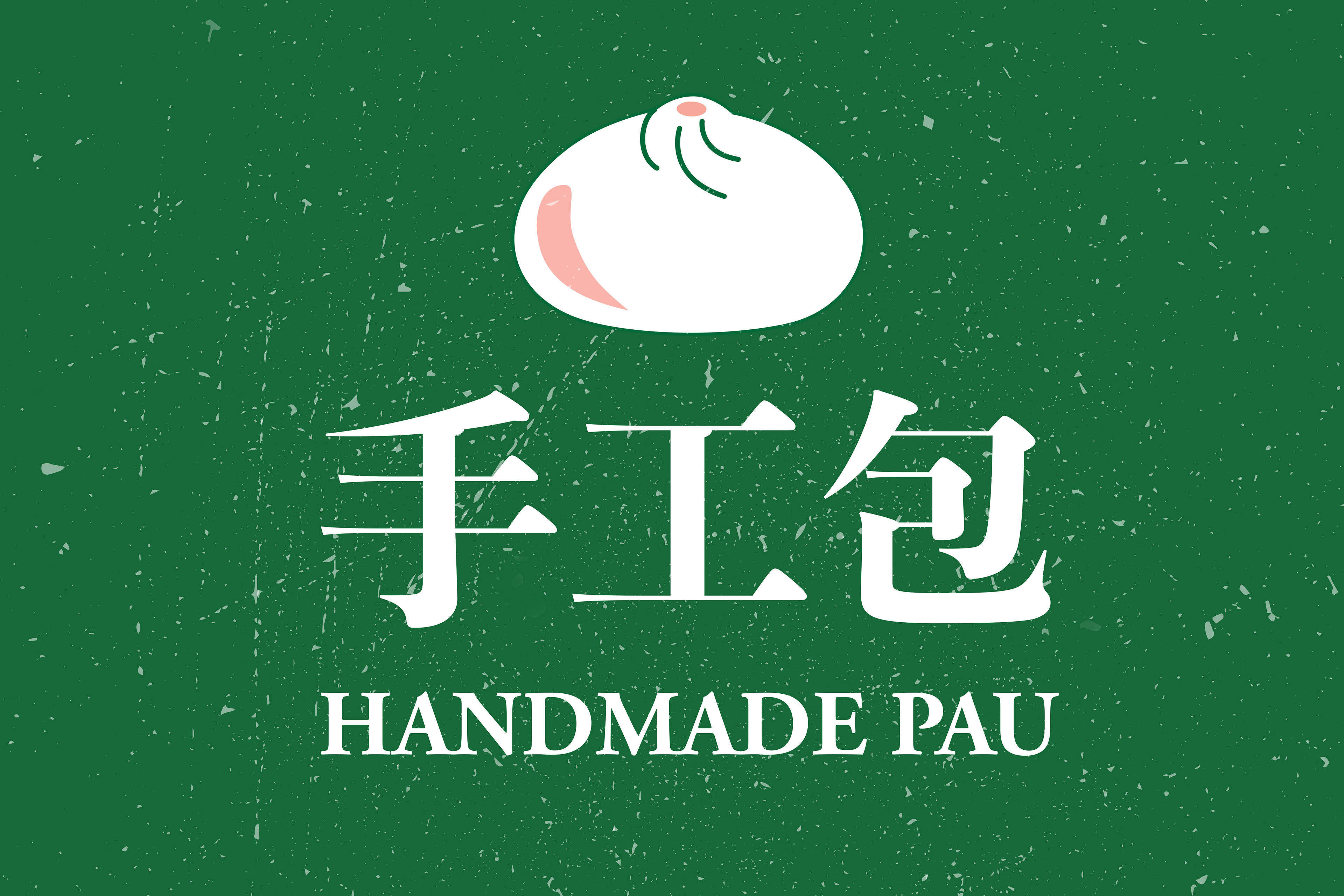
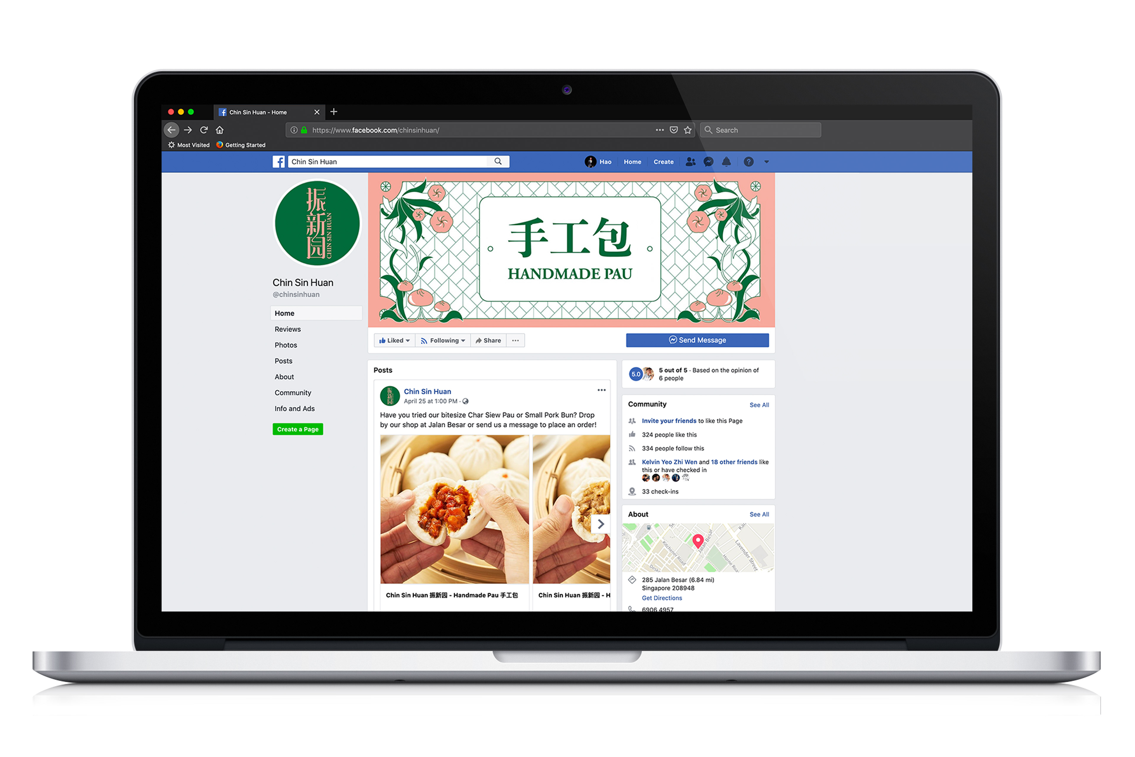
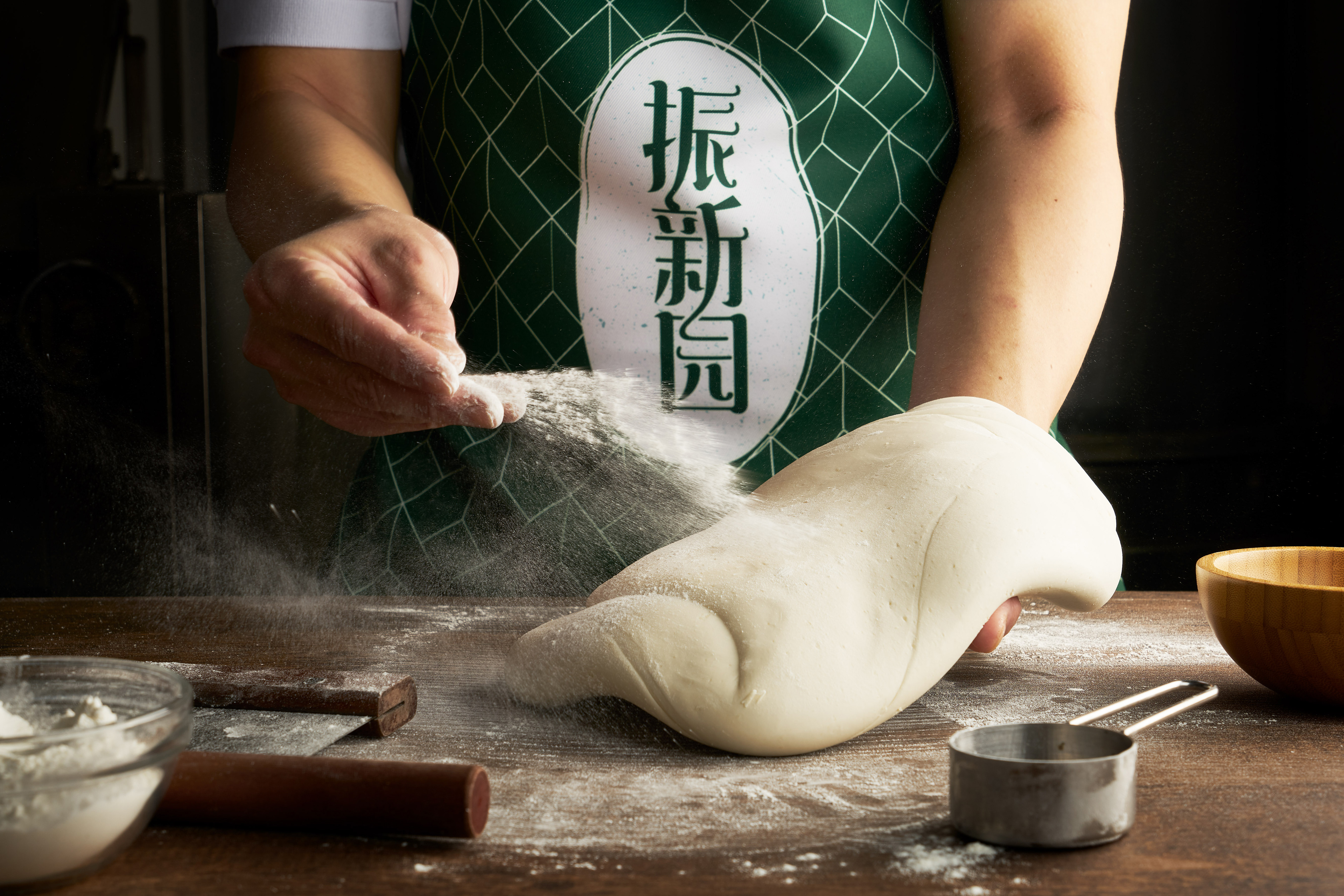
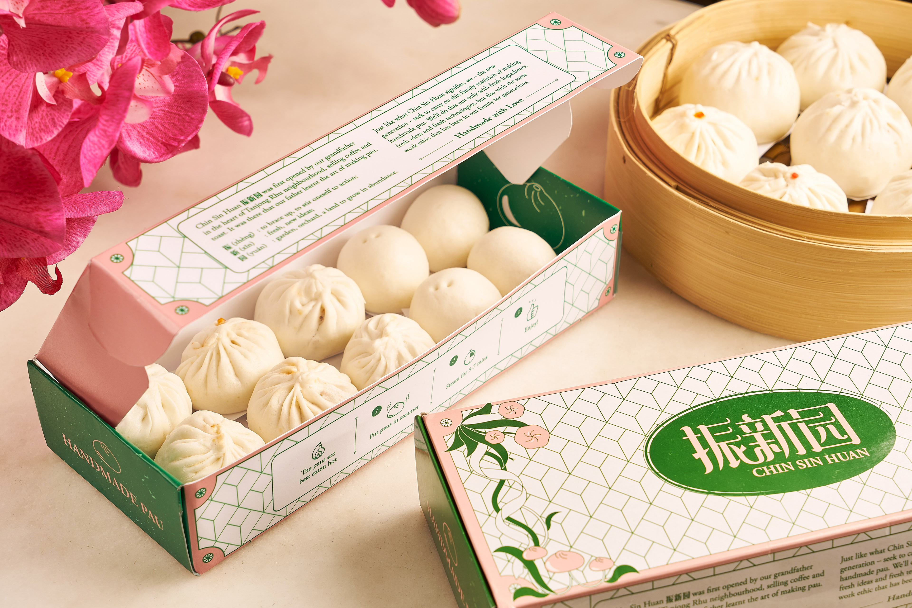
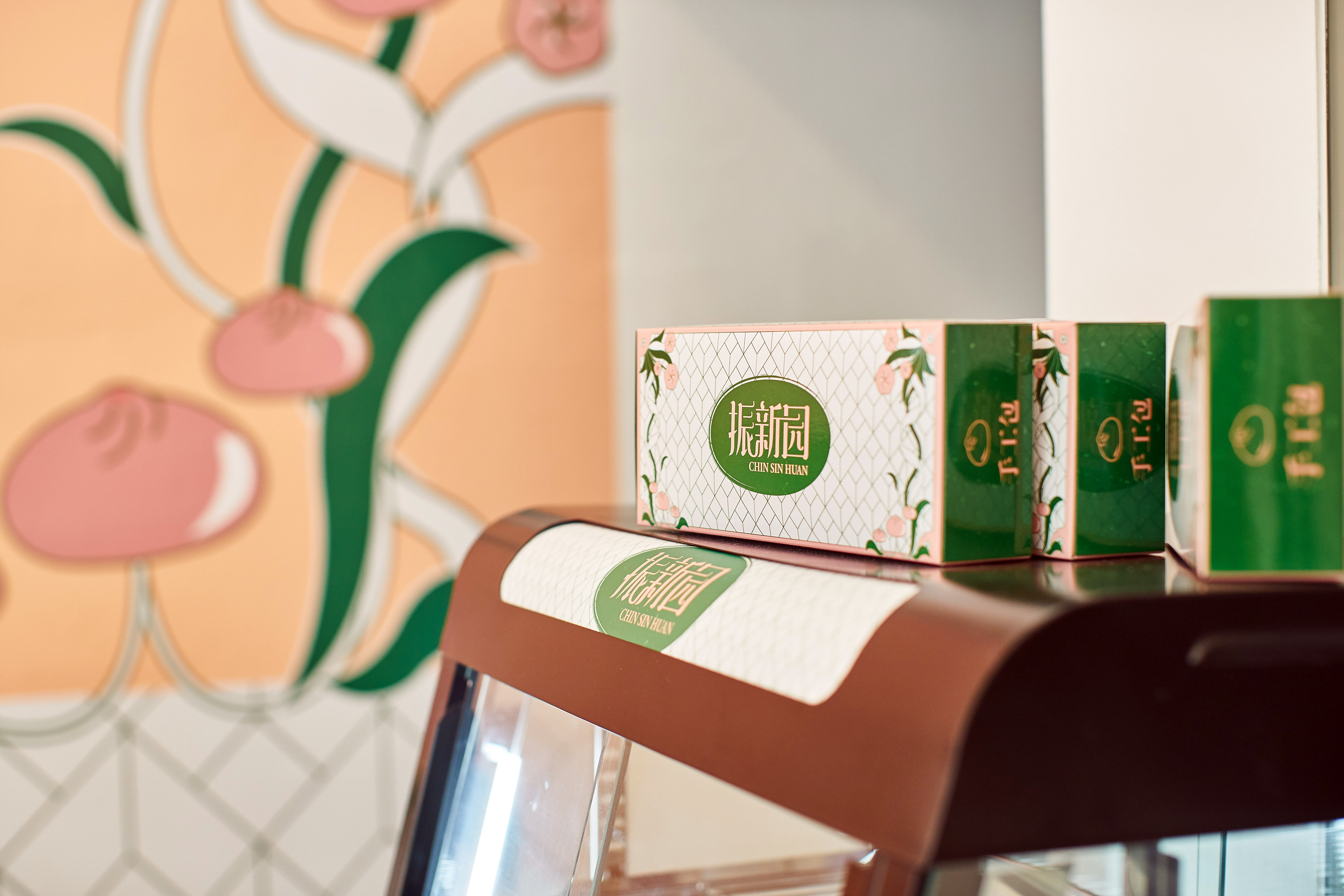
The strokes of the words “振新园” are interconnected showing a sense of unity while being framed in an oval shape as a seal of excellence. Supporting visual elements are inspired by Art Deco patterns movement where the flowers resembled paus. Emerald green and salmon pink serves to give the identity a sense of humility and growth while being fresh, lively and modern. From here, we expanded the brand platform to various collaterals and communications to truly deliver the Chin Sin Huan brand experience.
Awarded FINALIST at The Gong Awards 2019 for Design Gong category - Branding & Identity Design.
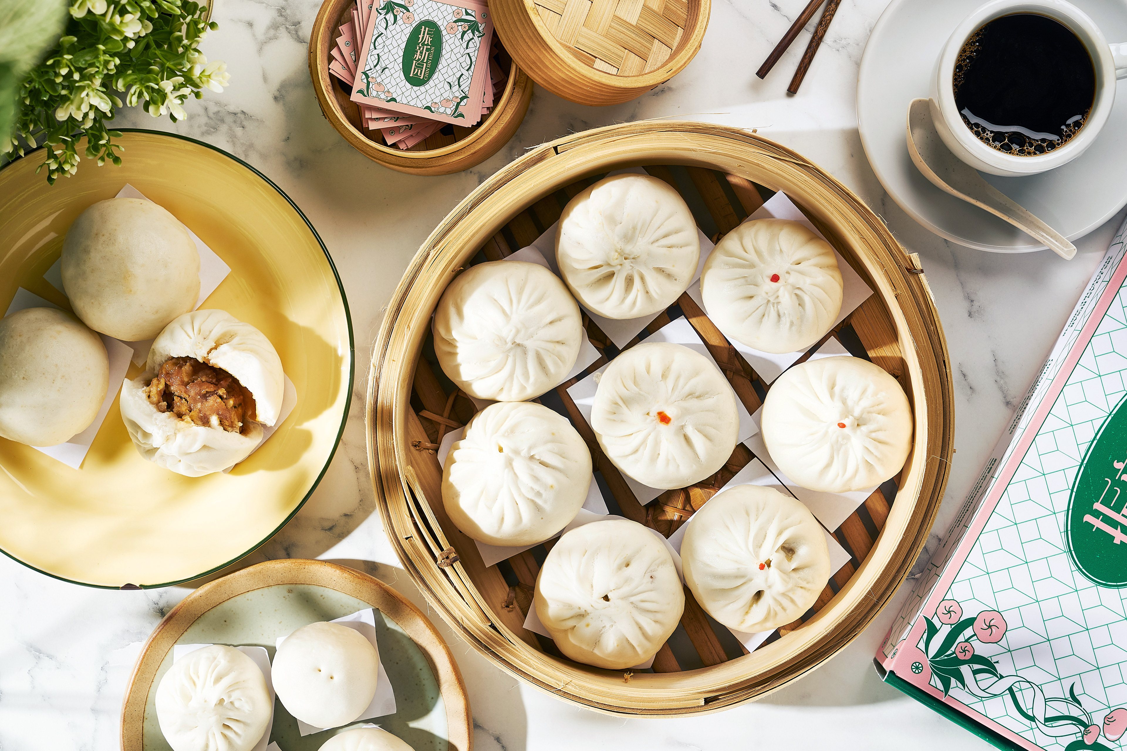
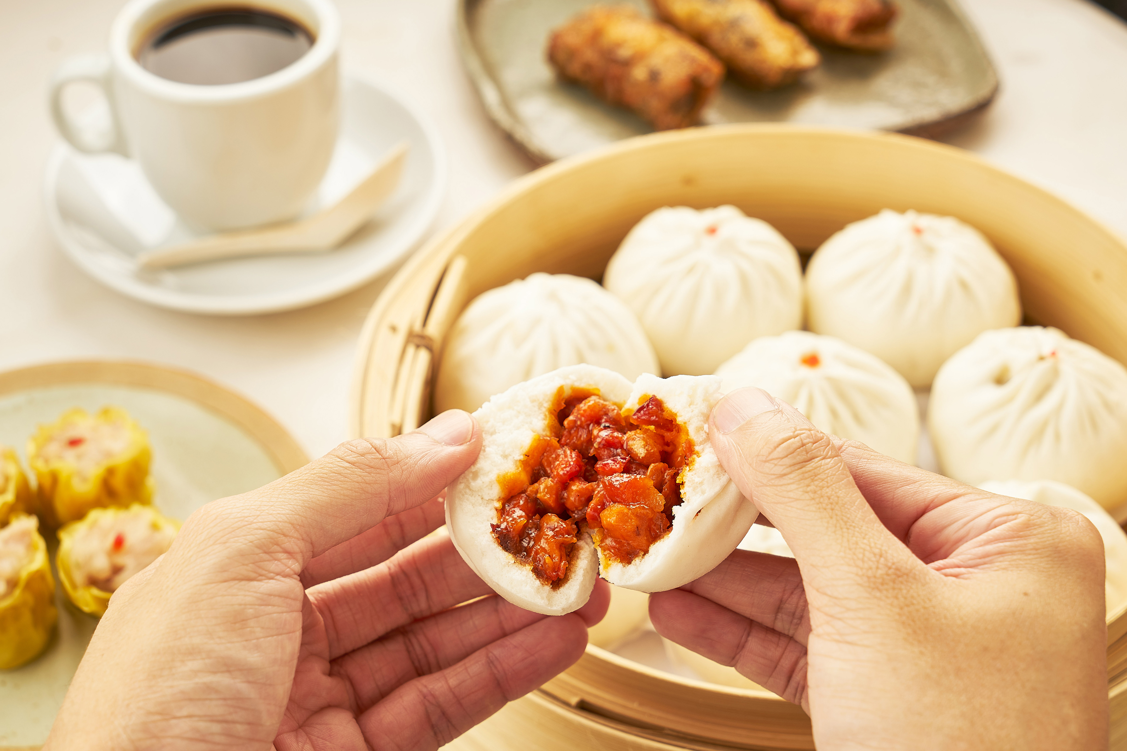
Food and thematic photography by Studio W.