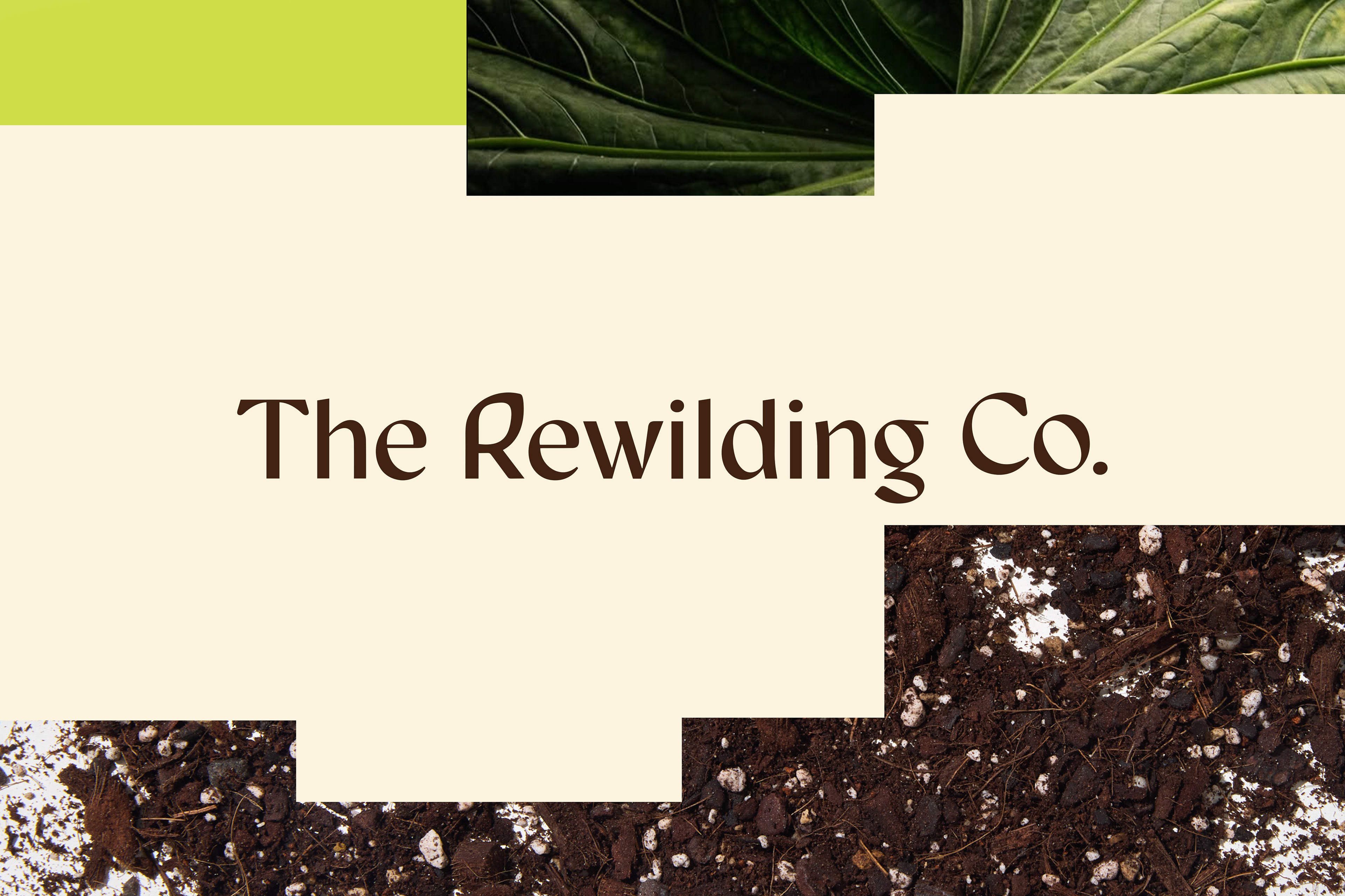
Client: The Rewilding Co.
Year: 2025
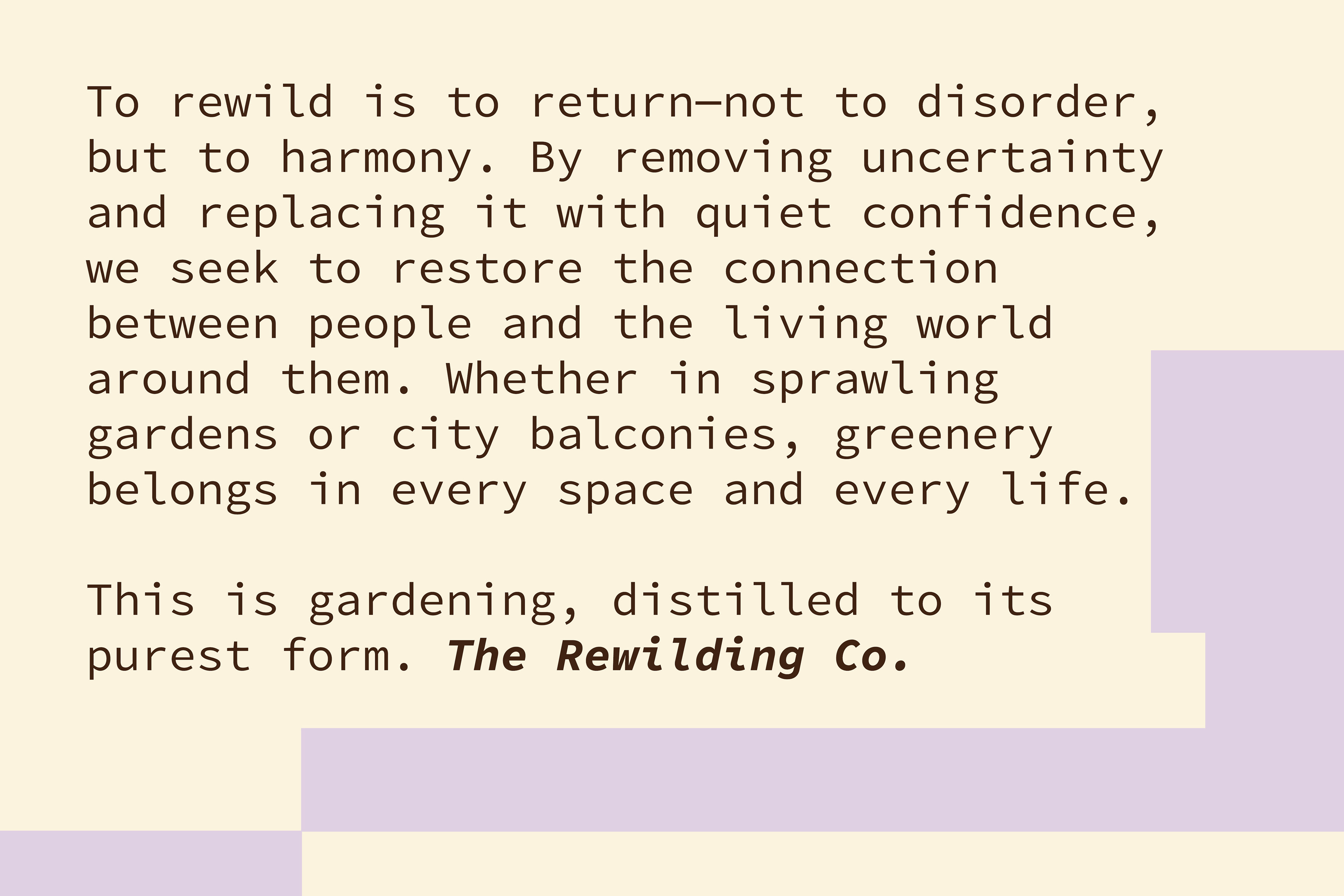
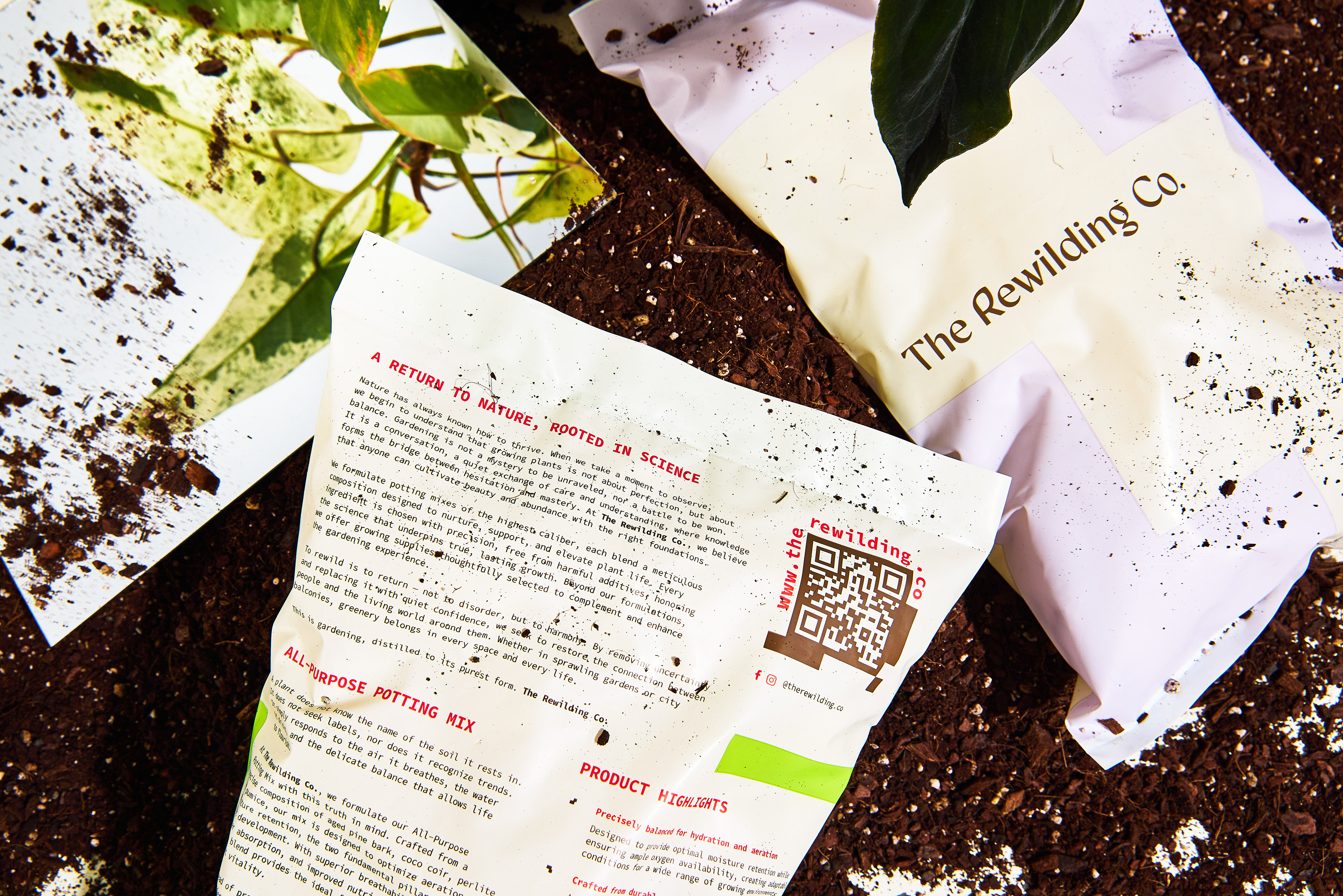
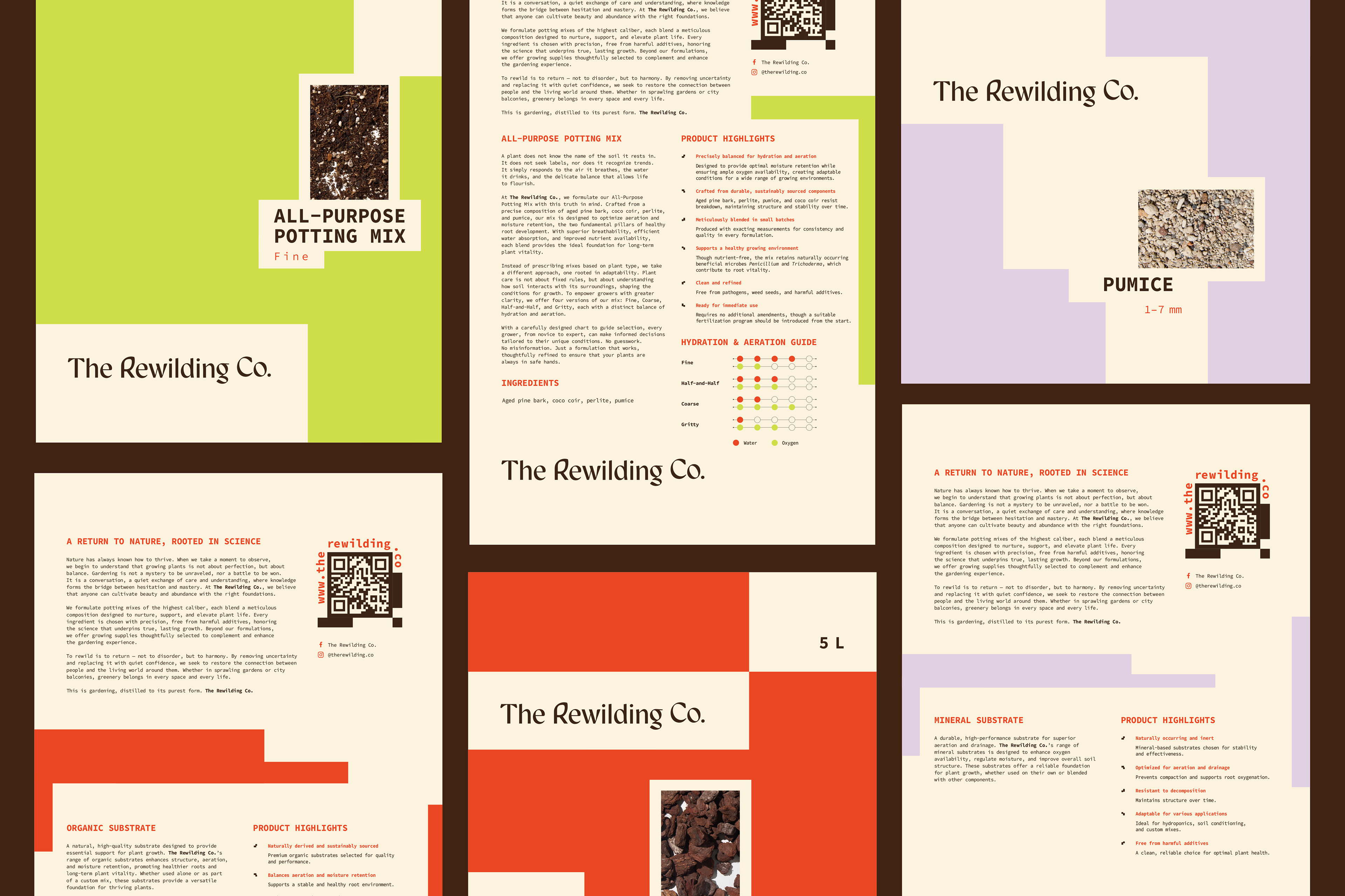
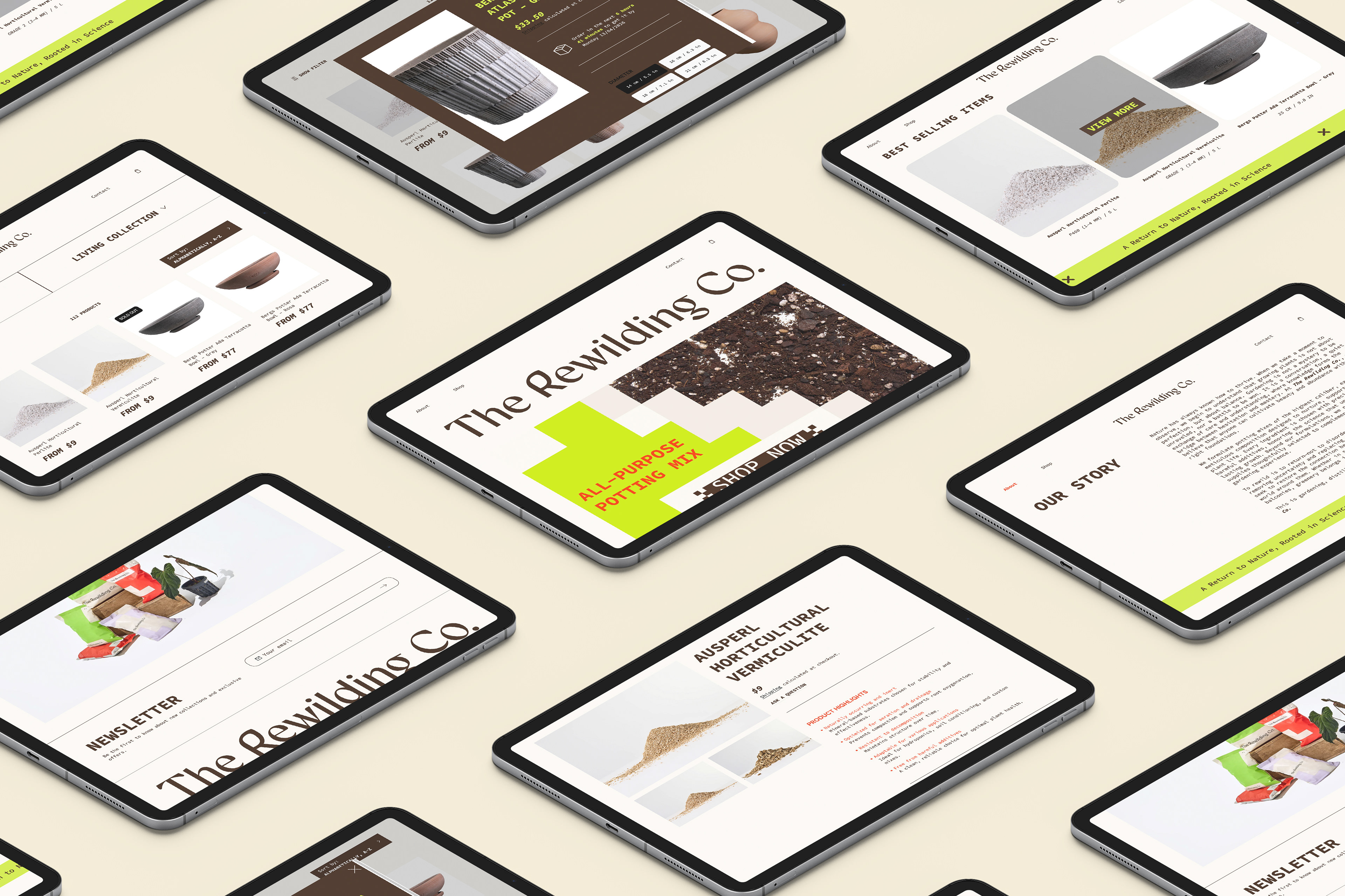
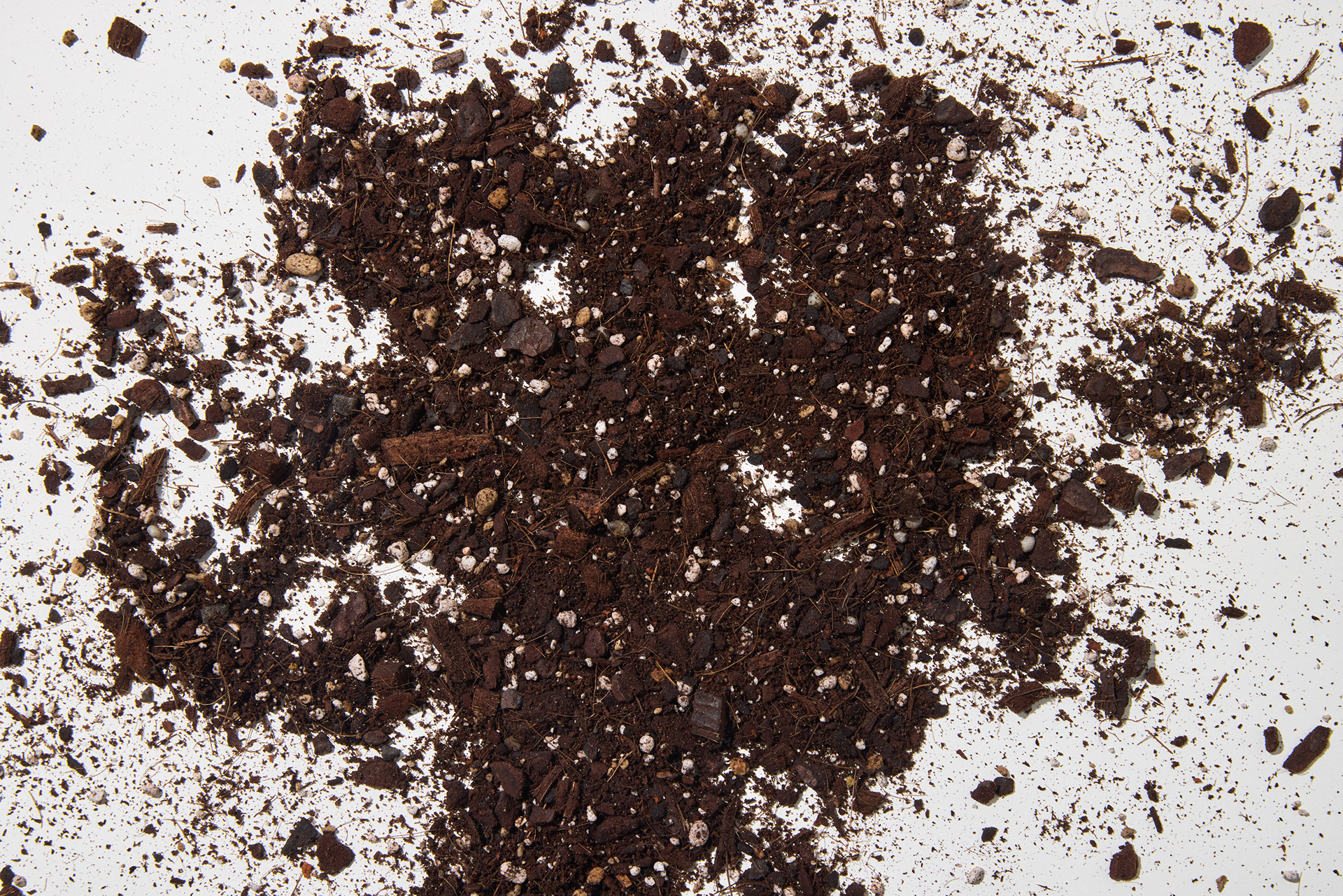
Nature has always known how to thrive. When we take a moment to observe, we begin to understand that growing plants is not about perfection, but about balance. Gardening is not a mystery to be unraveled, nor a battle to be won. It is a conversation, a quiet exchange of care and understanding, where knowledge forms the bridge between hesitation and mastery. At The Rewilding Co., they believe that anyone can cultivate beauty and abundance with the right foundations.
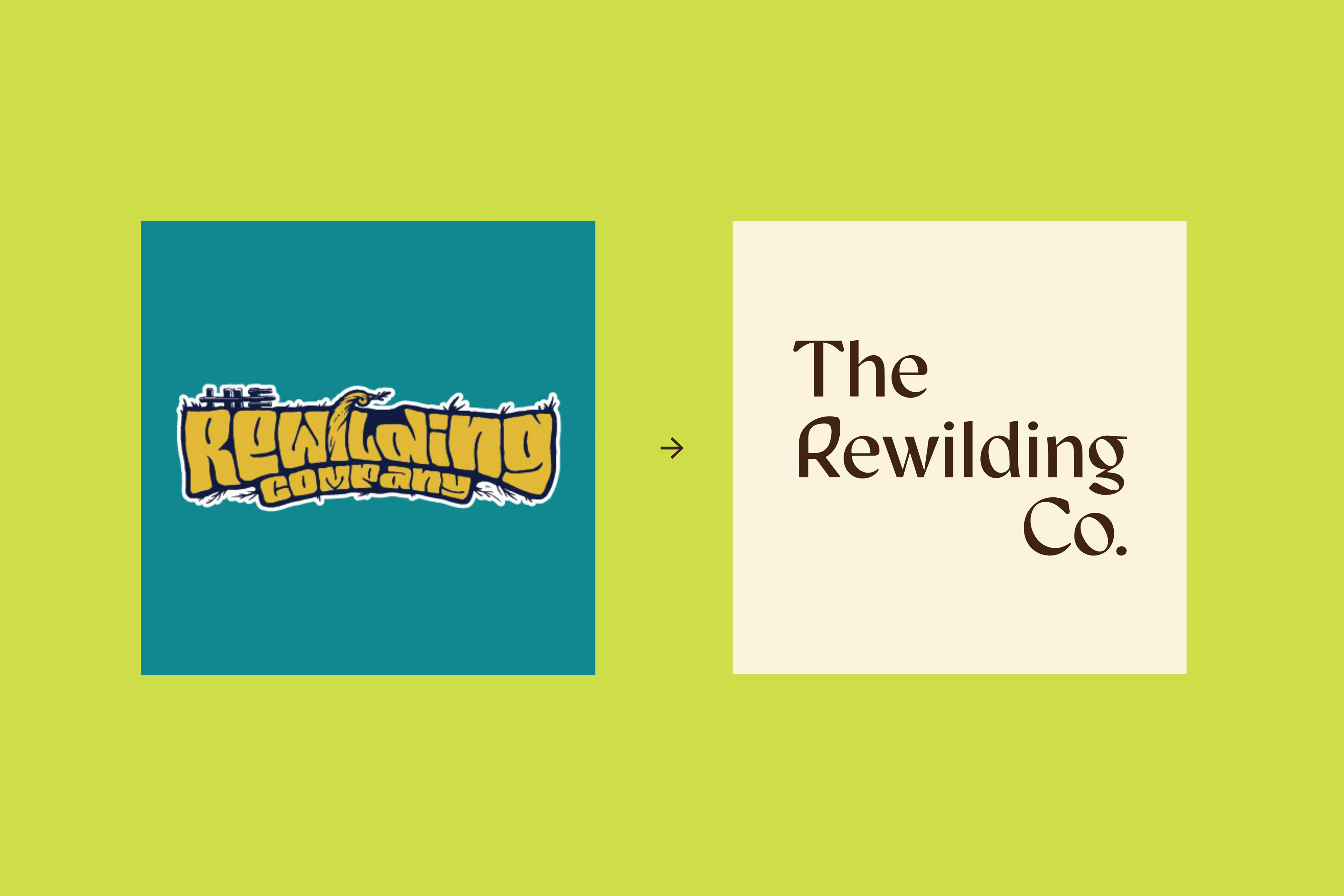
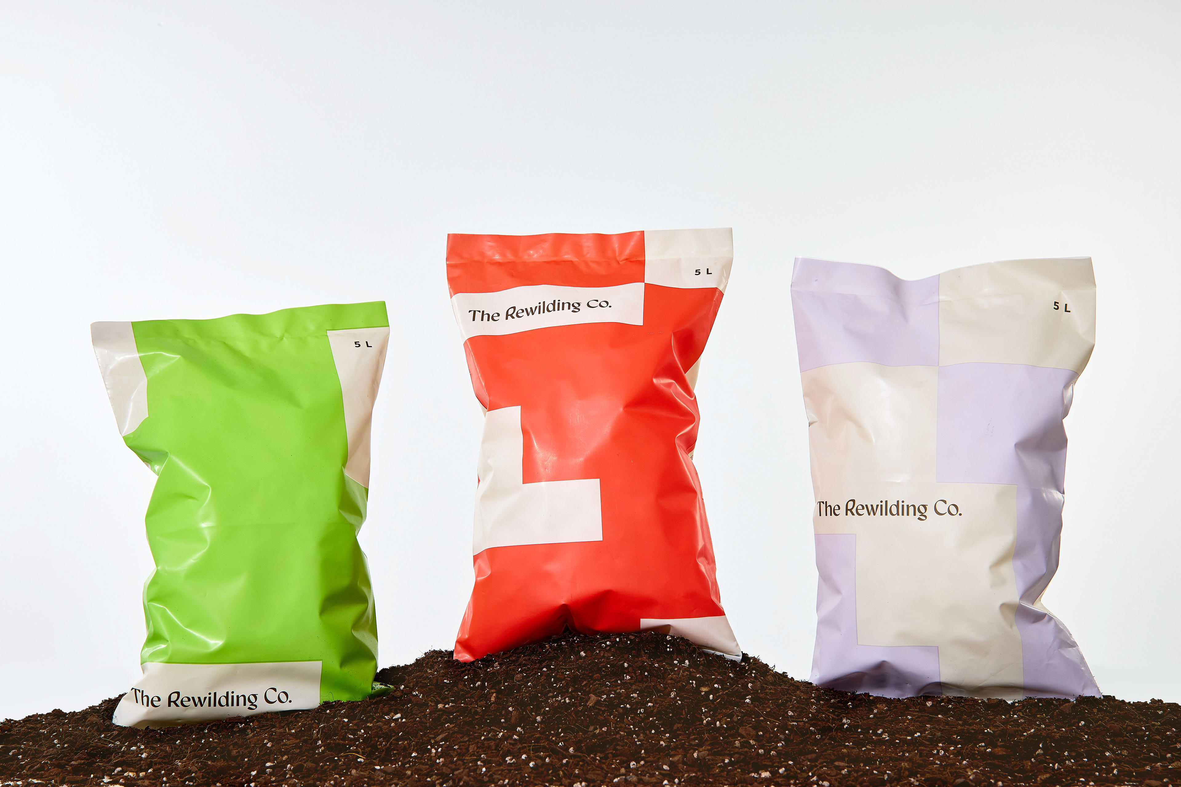
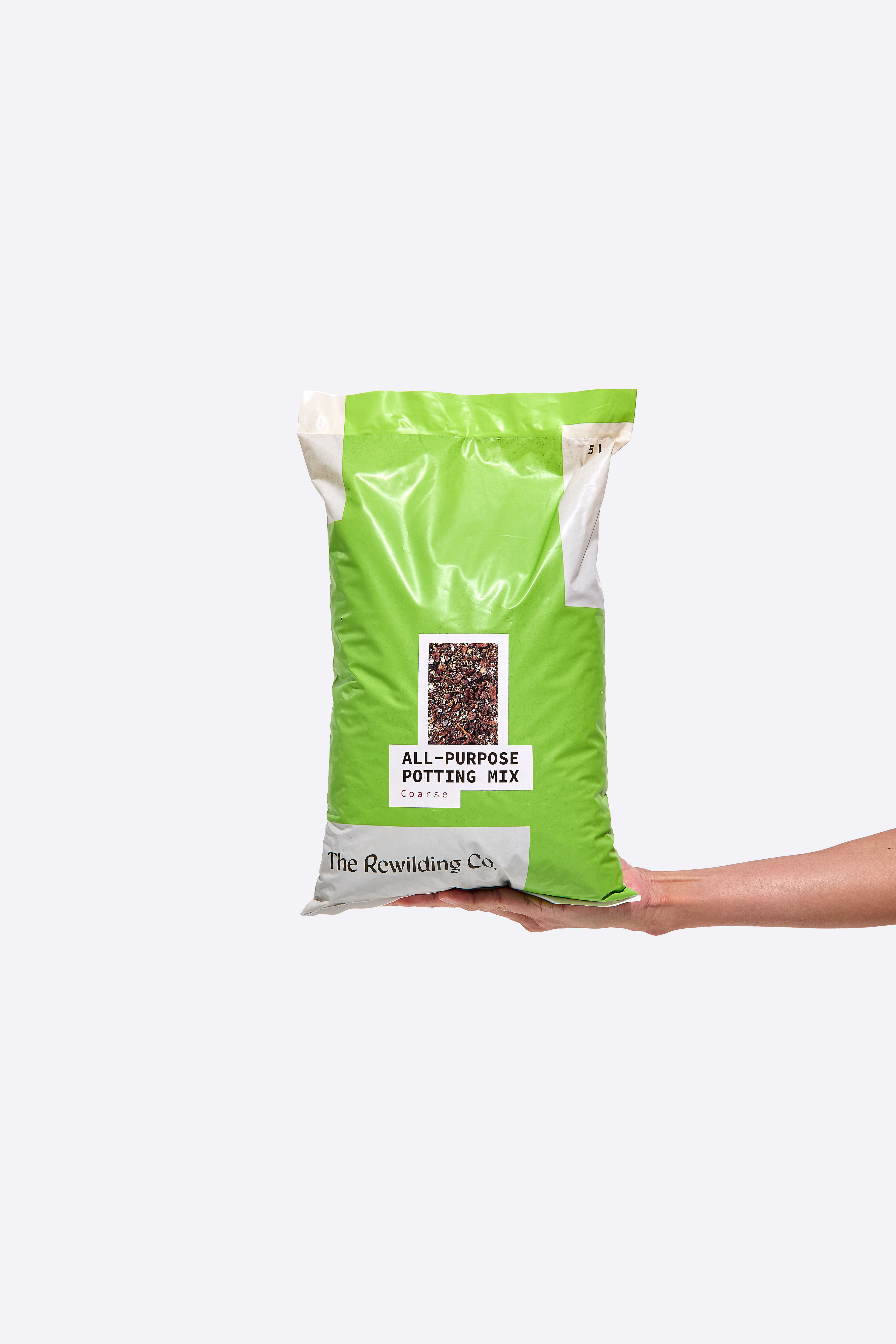
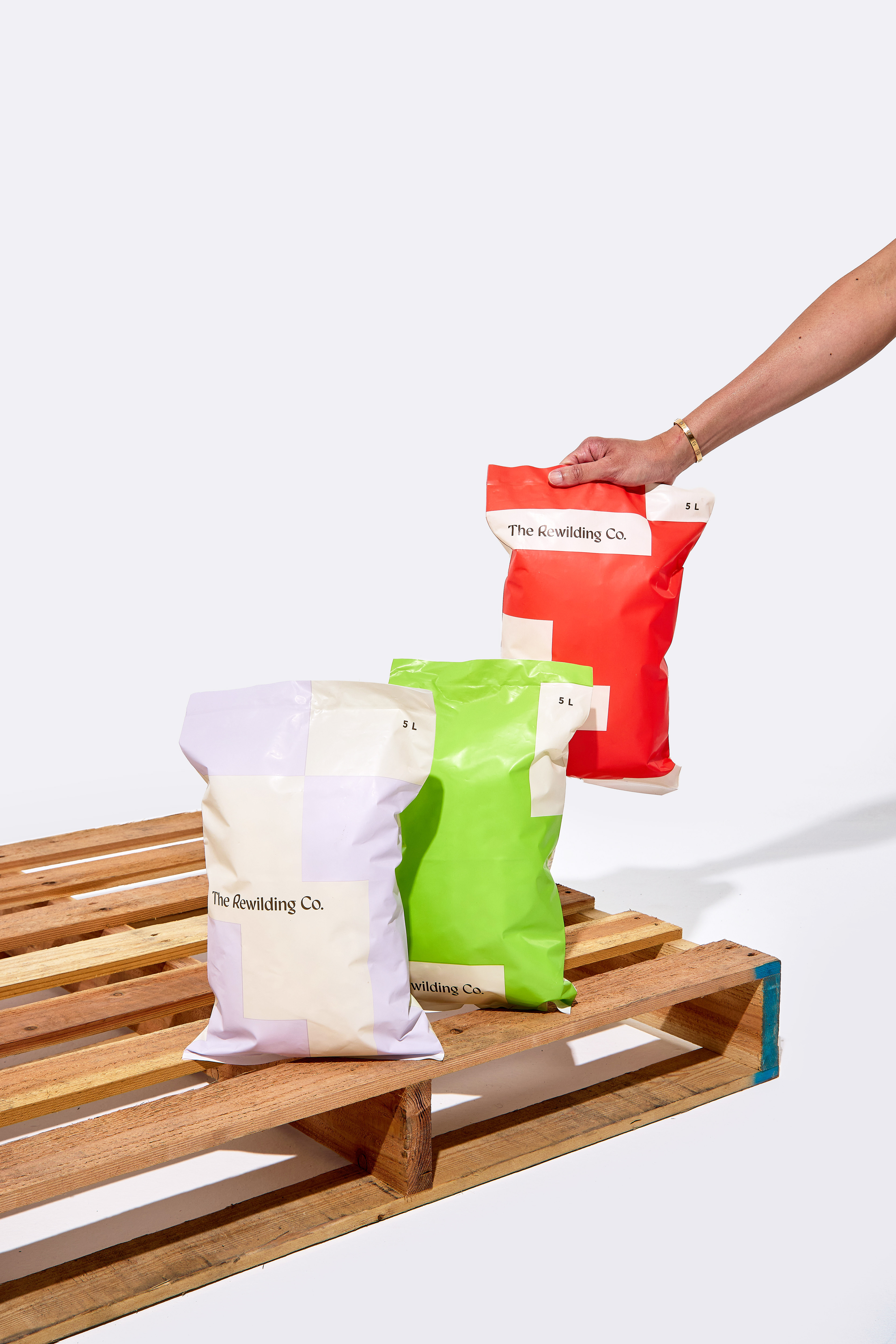
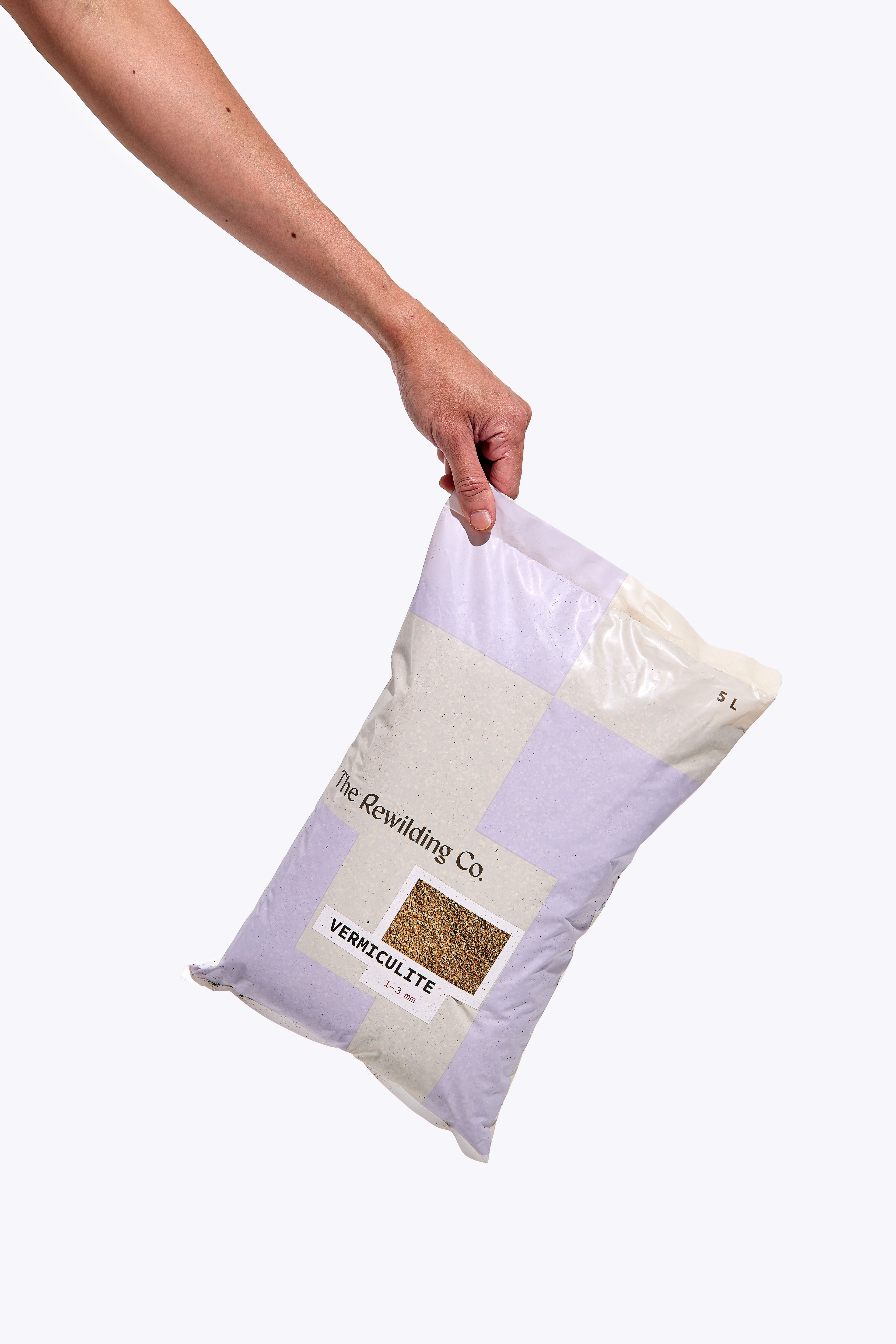
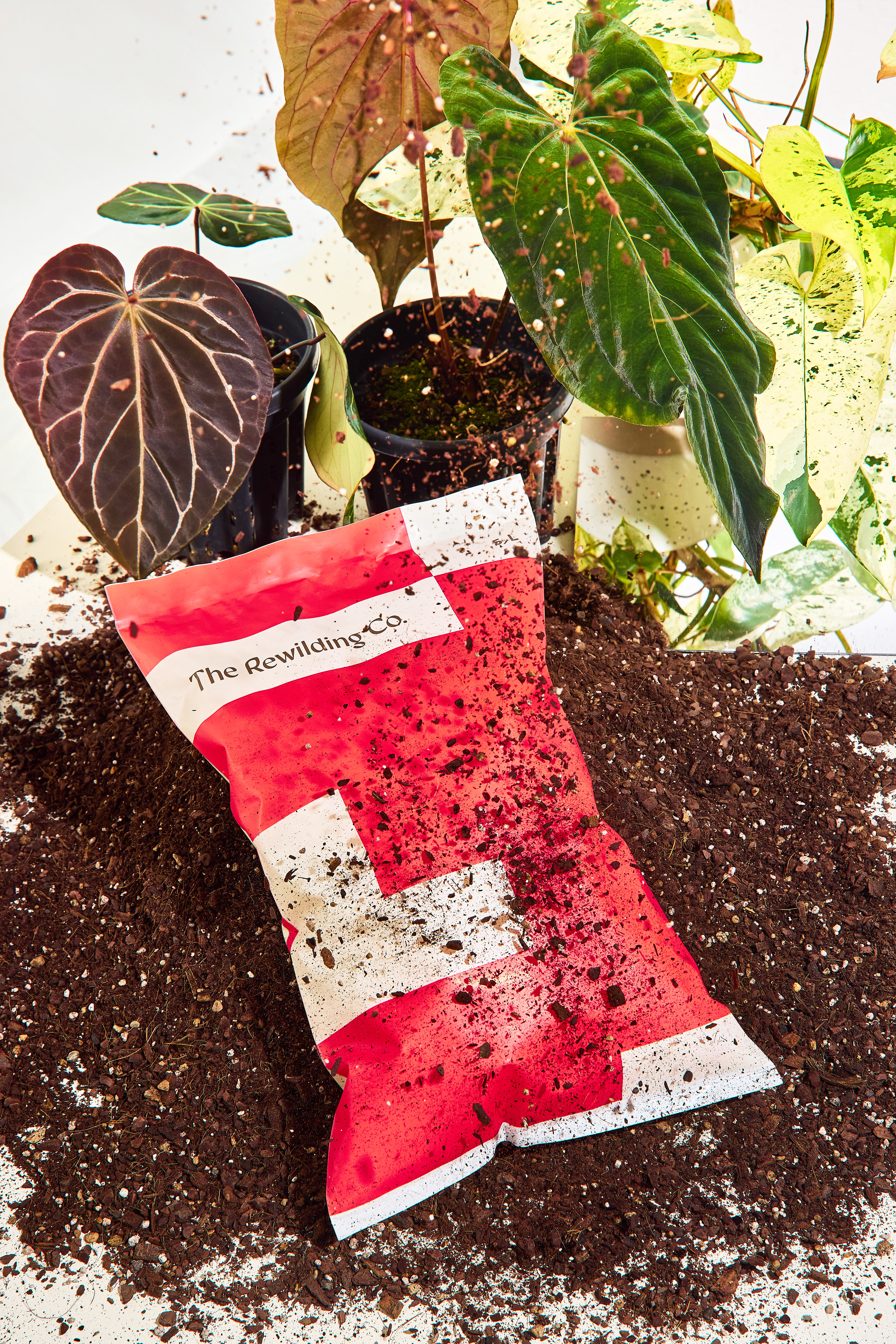
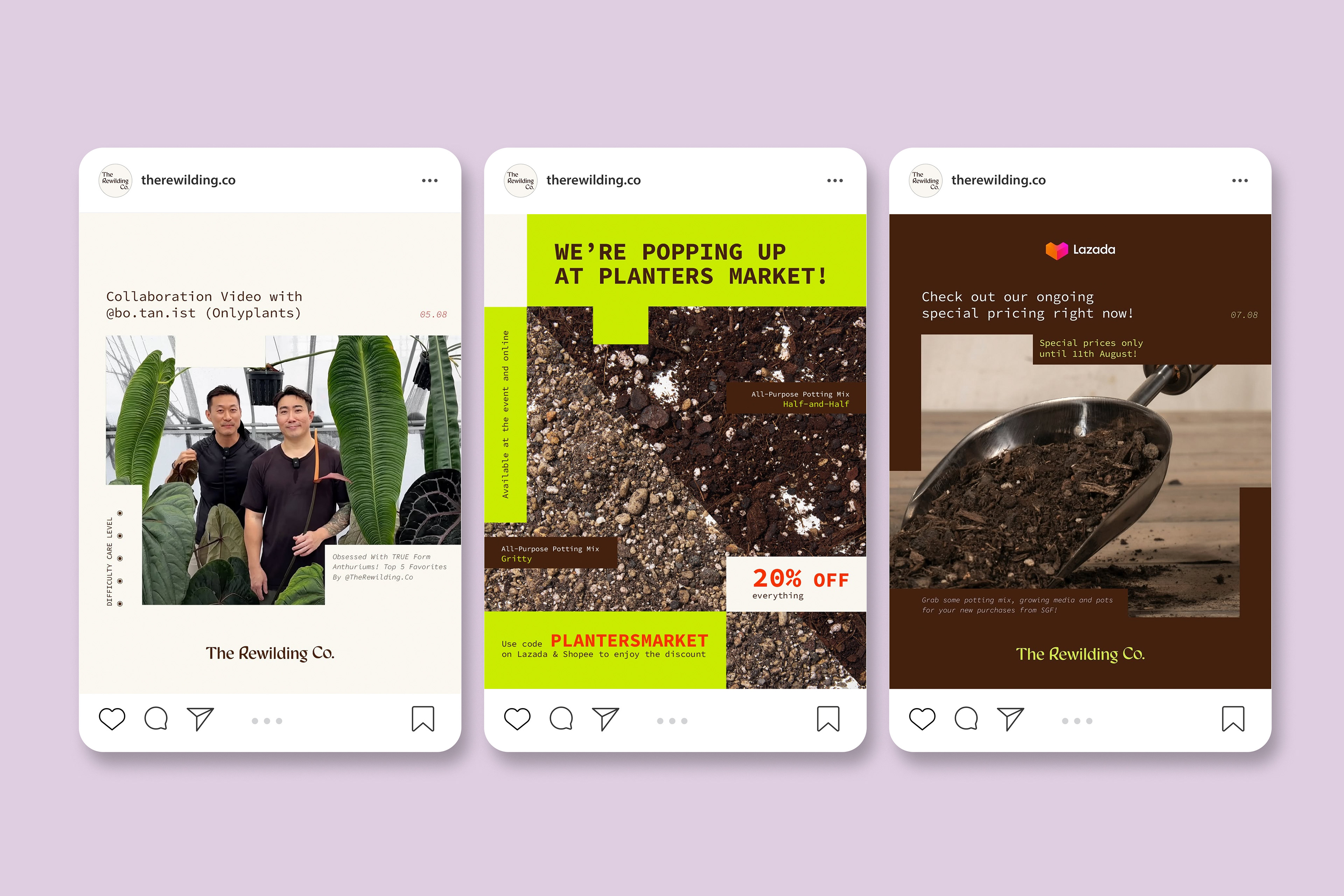
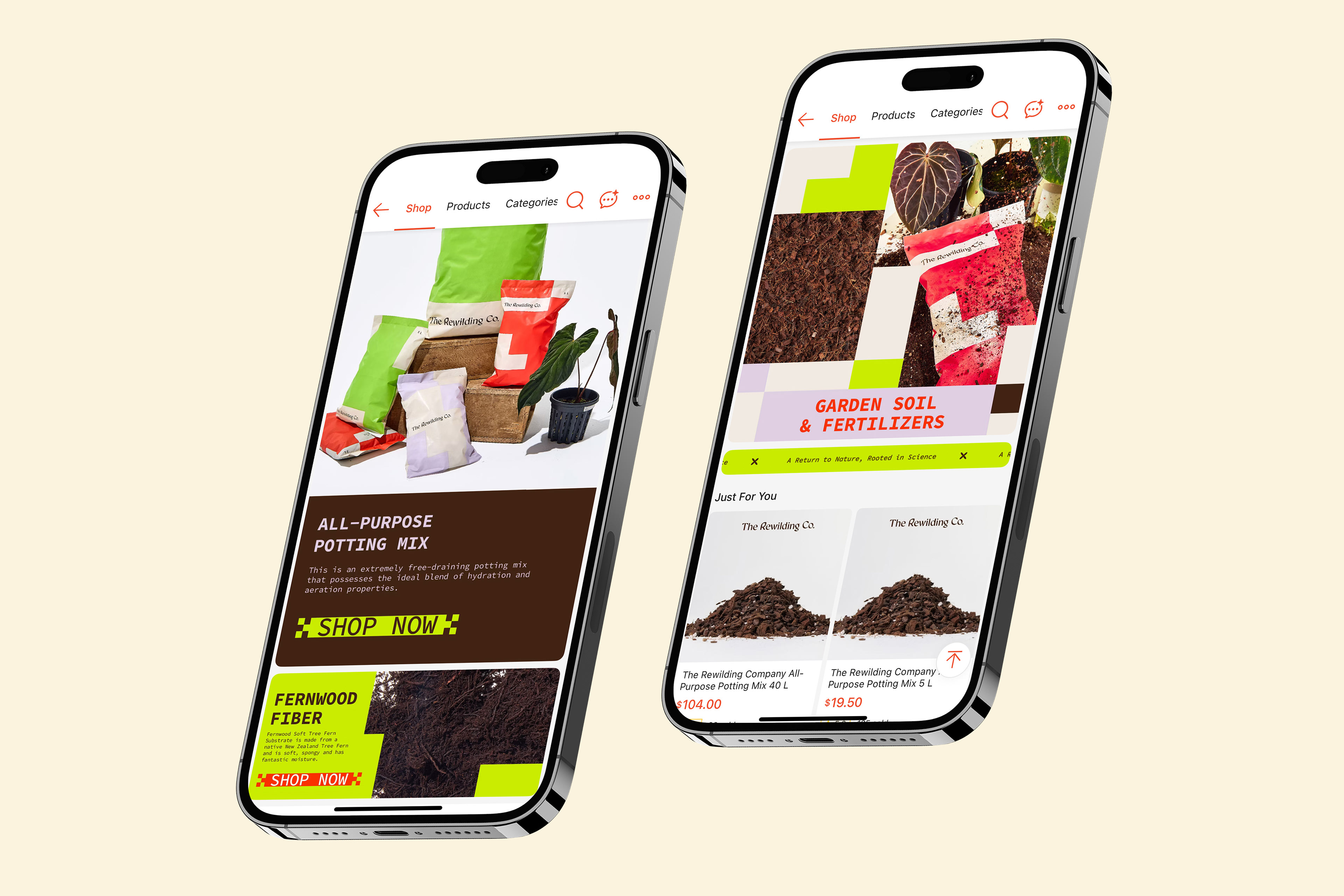
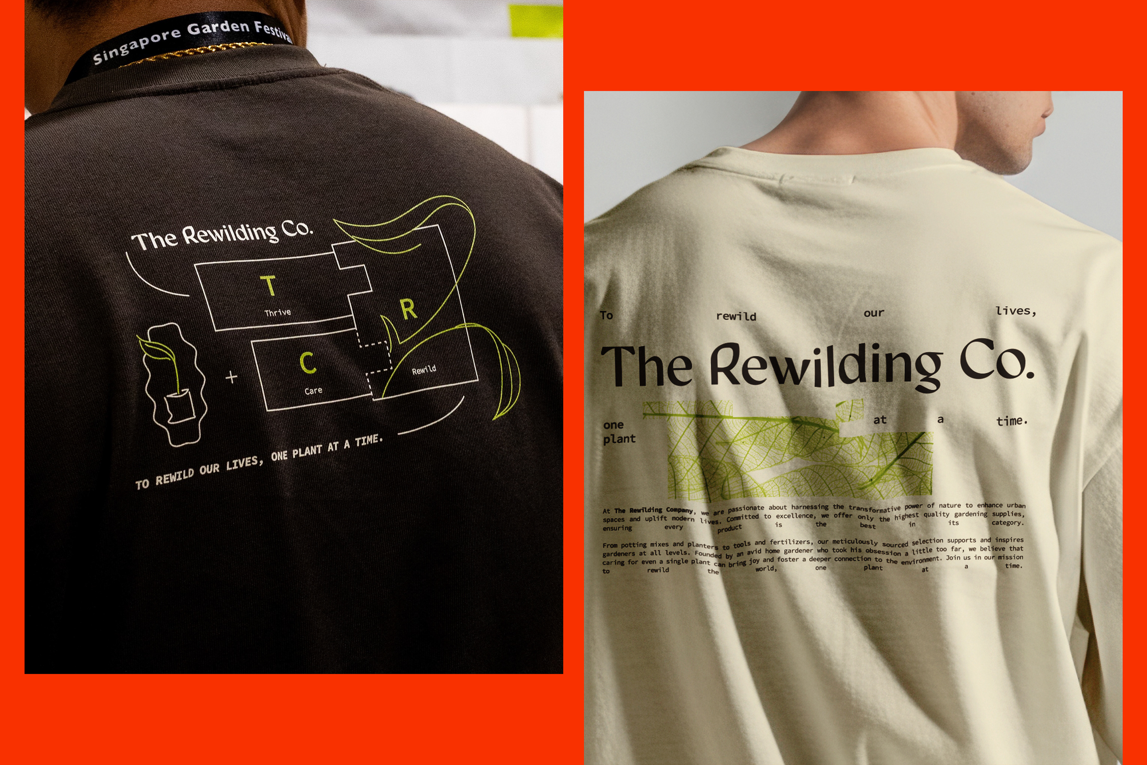
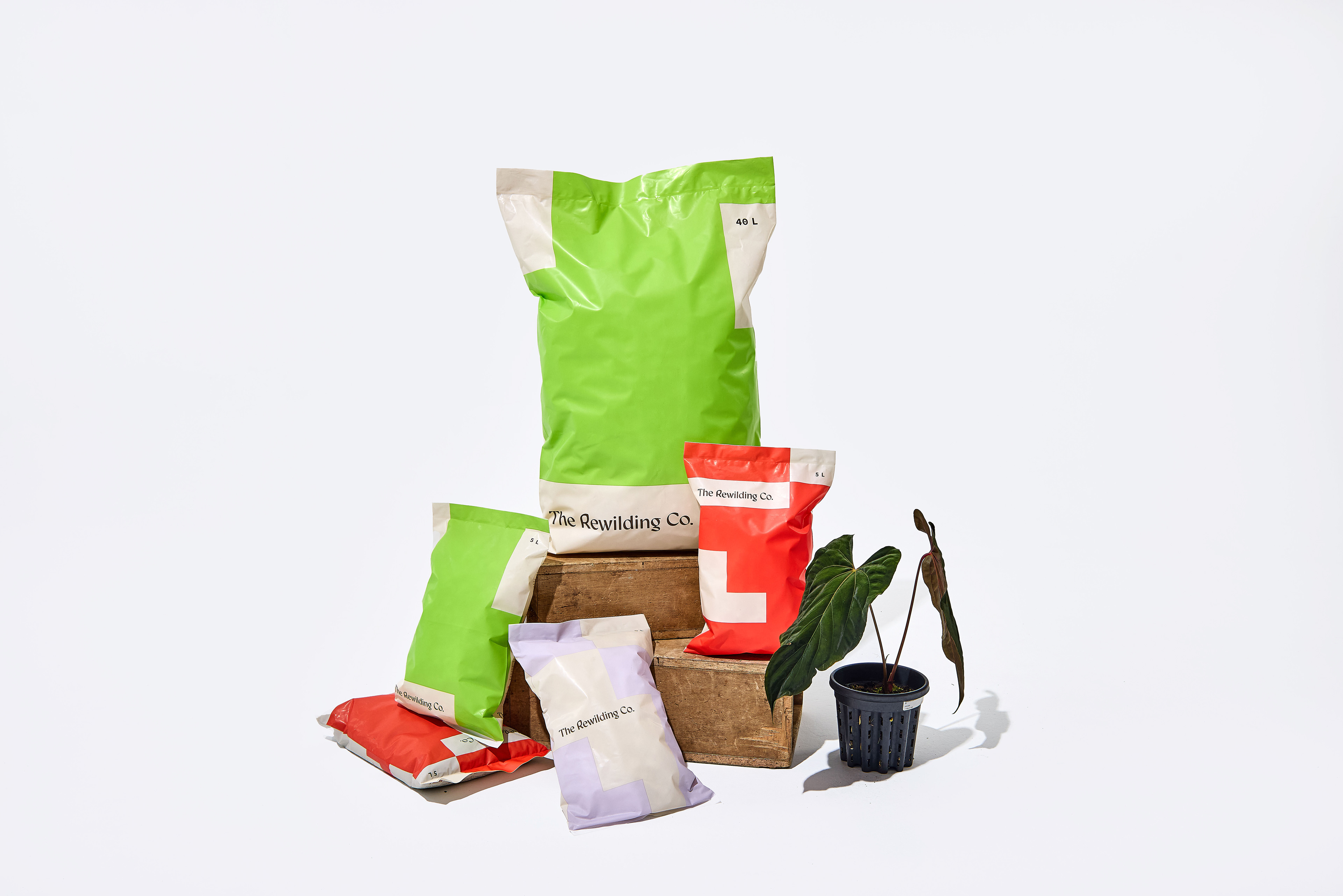
Taking cues from the structured logic of scientific periodic tables, the identity system explores clean, contemporary typography paired with a bold, modular layout to create a distinctive visual language. A deliberate emphasis on the letter “R” anchors the identity, serving as both a focal point and a symbolic representation of Rewilding — reinforcing brand recall while adding conceptual depth.
The typographic treatment draws inspiration from elemental grid systems, featuring framed compositions that echo the order and precision of scientific classification. This introduces a subtle “scientific” undertone that aligns with the brand’s ethos of knowledge-led growth and understanding.
Graphic elements derived from periodic table structures form a flexible, modular system. These blocks can function independently or expand into layered compositions, creating visual rhythm and adaptability across applications. The resulting design language is modern yet grounded, structured yet organic, minimal yet expressive.
The new identity balances an avant-garde sensibility with clarity and restraint, allowing it to seamlessly integrate with photography while maintaining a clean, uncluttered aesthetic. This creates a cohesive brand experience that feels both forward-thinking and deeply connected to nature.